Most artists don’t really think about gesture when it comes to portrait drawing. Recently during a video critique session I noticed a recurring theme. It was the missing ingredient in three separate images. The portrait drawings were are pretty cool. They were all just missing that loose gestural quality.
It’s so very easy to get caught up in all of the typical portrait drawing techniques. Drawing techniques like angles, value matching shading etc etc. I know I do all the time. Gesture is equally important. It places the head on the shoulders in a natural way. It helps you to focus on the tilt of the head and shoulders. Sometimes this can be very subtle.
Just being conscious of incorporating or at least just seeing gesture when you are about to start a portrait drawing is huge.
Let’s say you are starting to work on a portrait drawing. You have set aside a few hours on your Saturday to dive into rendering and shading. Take a moment at the beginning of the drawing to complete a quick portrait gesture sketch at the top corner of your piece of paper. This will help you to find the big gesture lines.
You certainly don’t have to spend a lot of time of this. Again this is all about trying to loosen up your portrait drawings. It’s about seeing the movement of the head and shoulders in tandem.
So the next time you start a portrait drawing, find the gesture of the head. This drawing technique could be a difference maker in the quality and feel of your next drawing.
Like our free content? Click here to get the best of what DTO has to offer!
Are you really good at drawing portraits? Are you pretty good at drawing a likeness of the person too? However there is that one little thing about your portrait drawing that does not look quite right. Perhaps there is a dark under the person’s eye.
However in reality if they had that dark under their eye they would have a bruised eye?
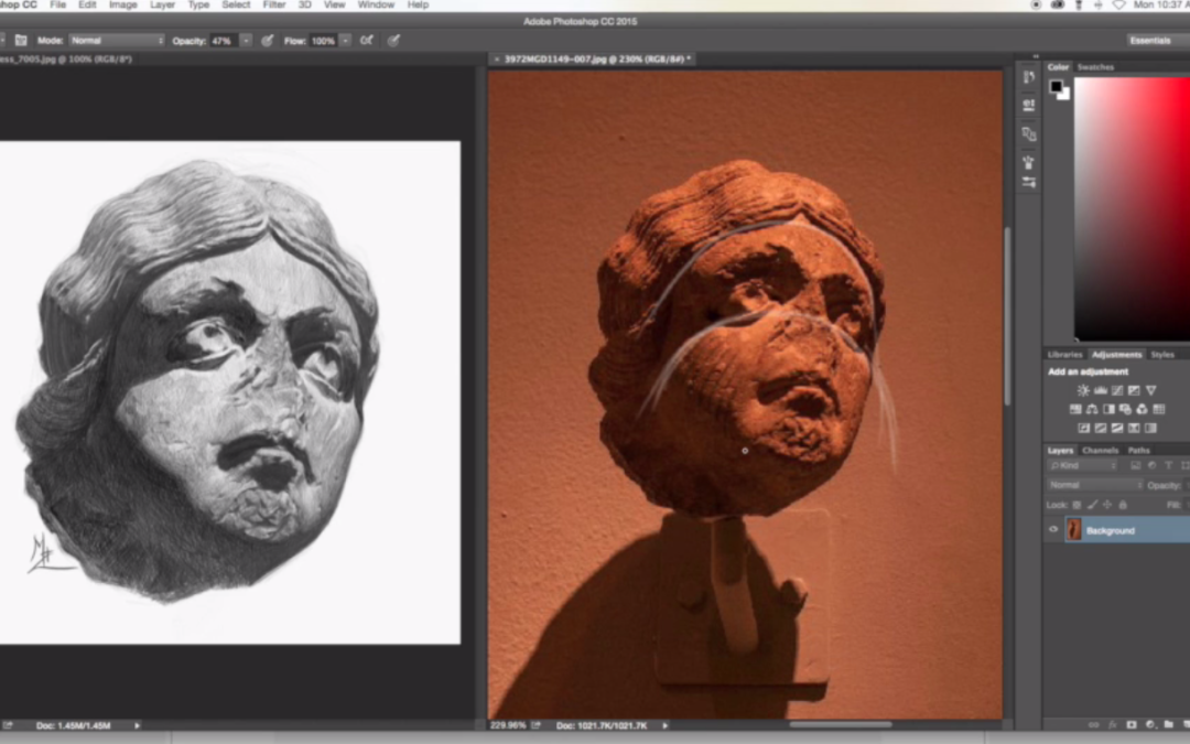
The dirty little secret about drawing killer portraits is being able to match values.
Back in the day when I first started painting book covers for various publishing companies I struggled big time with matching values. I would drop off a painting and the art director would tell me the face was too light. Or perhaps the forehead was too dark. I really struggled big time with simply being able to match the values on the persons face.
On a book cover this was a huge deal.
If the character on the cover looked like they had a black eye, well that wasn’t cool.
So the first place to start is to mainly be conscious of the value scale. For those of you who are members of Drawing Tutorials Online we have multiple tutorials on how to match the value scale.
Being aware of the value scale comes first. Then practicing matching the values on the value scale comes second. You might be super heavy handed which means your light values will look dark. Or you might be light handed which means your dark values will look too light.
You get where I am going with this?
Here is a profound statement. “All of drawing realistically in tone is being able to match the value of any particular shape”. If you can draw a shape and match it’s value you are golden.
That shape could be the shadow under the nose or the white of the eye.
So the next time you draw a portrait be highly aware of the the values. If you are attempting to draw a realistic portrait constantly analyze the values of shapes. Keep your value scale nearby, it’s a life saver.
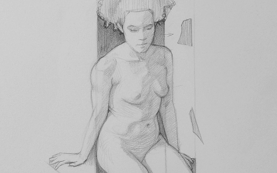
For those of you who have been around the drawing block before “Negative Space” is kind of like an old familiar friend. I think it was either fifth or ninth grade that I was introduced to this technique. Betty Edwards has certainly created a whole cottage industry around this technique. All the power to her.
I have used this technique forever. I remember getting my pre-college portfolio together and negative space helped me with my still life drawings. Negative space or shape also helped me back in my college days when I was clueless on how to draw the figure.
This technique of spiraling out from a simple negative space is golden. It’s simple and it works.
I usually like to start with the negative space between the models arm and torso. If the model has their hand on their hip this shape will most likely come in the form of a triangle. I then measure across the torso to the other side of the models torso drawing in two angles. I then draw a little in the middle, usually the spine.
So in essence it’s sort of like you are spiraling out from the center of the first simple negative space you see.
The other beautiful thing about this drawing technique is that it tricks your brain. Anyone can draw a funky looking negative shape, however drawing a complicated figure, that’s hard. A lot of artists always start with the head first. That’s a great place to start. However starting with an abstract negative shape gives you options. Especially if you are drawing an unconventional foreshortened pose.
So the next time you are in life drawing class or even drawing from a photo try spiraling out from a simple abstract shape. It’s super fun and easy.
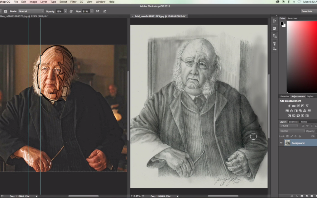
It sounds so trivial, drawing shadow shapes. But the fact is a lot of artists struggle with drawing, or shading in shadow shapes. A different term for this is “blocking in”. Some artists simply just don’t see shadows. They cannot see blocks of tone.
We’re all good at one thing right? I have always had an easy time of seeing shadows shapes. Line however was really tough for me. How about you, do see more with line instead of tone?
The goal is to become balanced with the way we see. Of course you can make something really dimensional with just line. However when you can add line with tone things get a little more interesting.
For those of you who struggle with seeing the proper shadow value here are a couple of tips.
Always squint at your reference to see the simple shadow and light shapes. Squinting takes away all of the detail.
Go into every drawing, if you are trying to draw with tone, understanding there should always be a three value set up. Try to structure your drawings with a dark, middle tone and light value. This will force you be more conscious of shadow shapes.
Ask yourself the question, where is the light coming from? If you understand your light source, you will ultimately understand where the shadow shapes are.
Lastly, shade your shadow shapes with a solid tone. Don’t let patches of white paper show through, this will muddy up your lights and darks.
If you enjoyed watching the critiques I would encourage you to get your drawings looked at. Sometimes we get so close to our own artwork that we cannot see what we are struggling with. Worst yet we don’t know how to get past the roadblock.
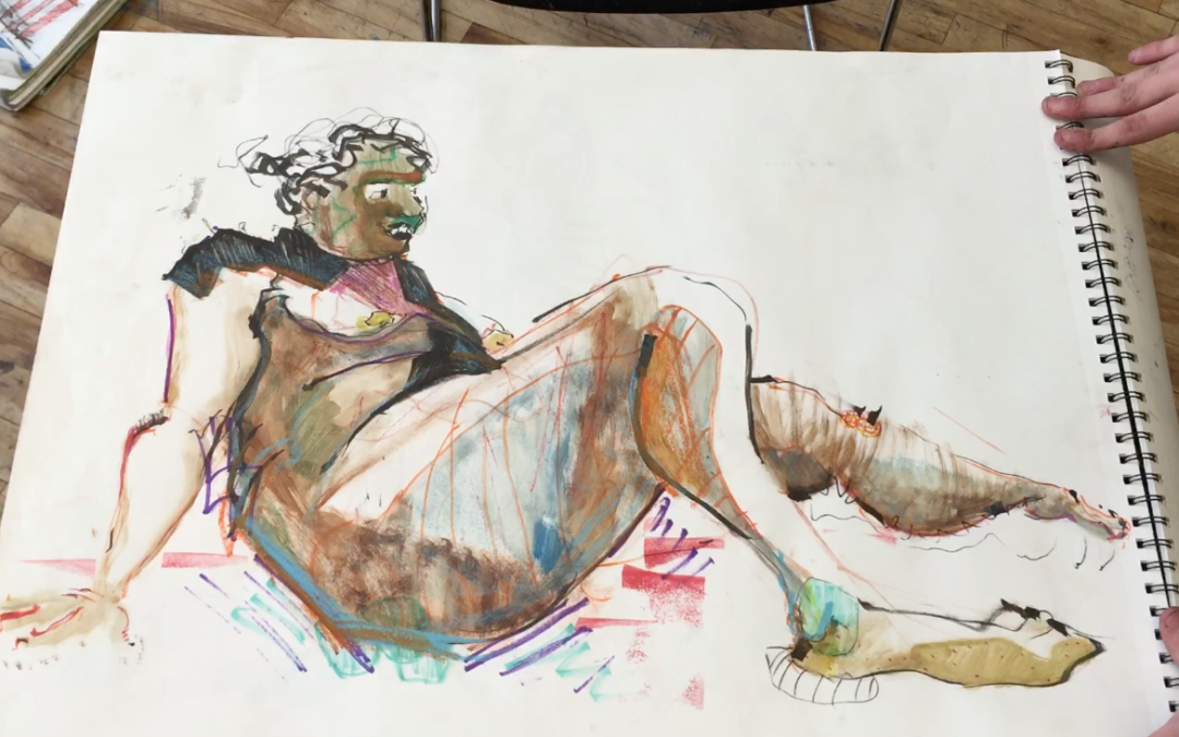
I as gear up for a new semester of teaching at the School of Visual Arts my mind brings me back to Jack. Every new semester brings the uncertainty of new students. Last year I was blessed with an amazing class of twenty-one incredible students. Jack was the different student. At first glance I wasn’t sure what he was all about. But as the weeks progressed I became to realize he was in a class all his own.
The energy Jack brings to the table is truly incredible. Jack definitely got the most feedback on YouTube when I posted his first sketchbook. People loved him or really hated him. The comments were out of control.
He handled the negative comments like a trooper. I told him to screw the negative comments and stick to what he loves. That is the only way to succeed and have fun as an artist.
As you know I’m as traditional as they come with my style. I love realistic figurative art. However, I also love different. Jack’s work is certainly different. As you glance through his sketchbook what is the one thing that inspires you?
Is it the way he uses color? Is it the way he fills every page? Or is it Jack’s crazy 1970’s hair style?
Either way I’m so grateful to have students like Jack in my class. I wonder what the new class vibe will be like this September? Who will be the new Jack?
Leave a comment below letting us know what you think about his work.