I wanted to take a moment to share part of a Master Class lesson featuring the sketches of Isaac Levitan. As you know I am a big fan of landscape painting. Most likely because most of my past illustrations had a landscape in the background.
I usually painted a portrait on the book cover of the main character with a landscape as the back drop.
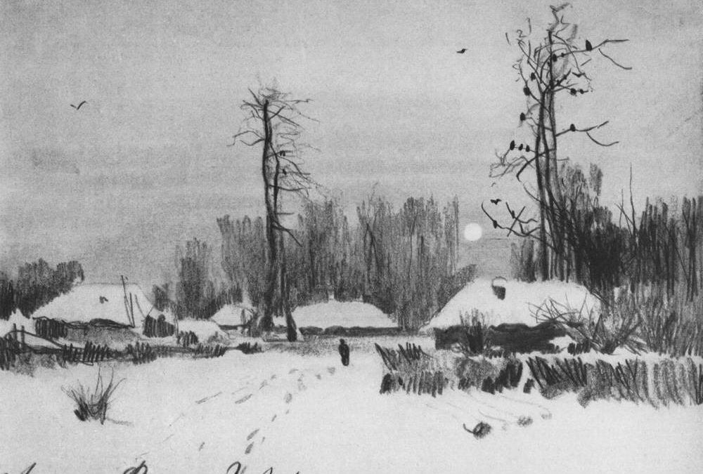
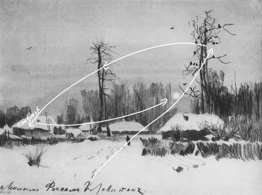
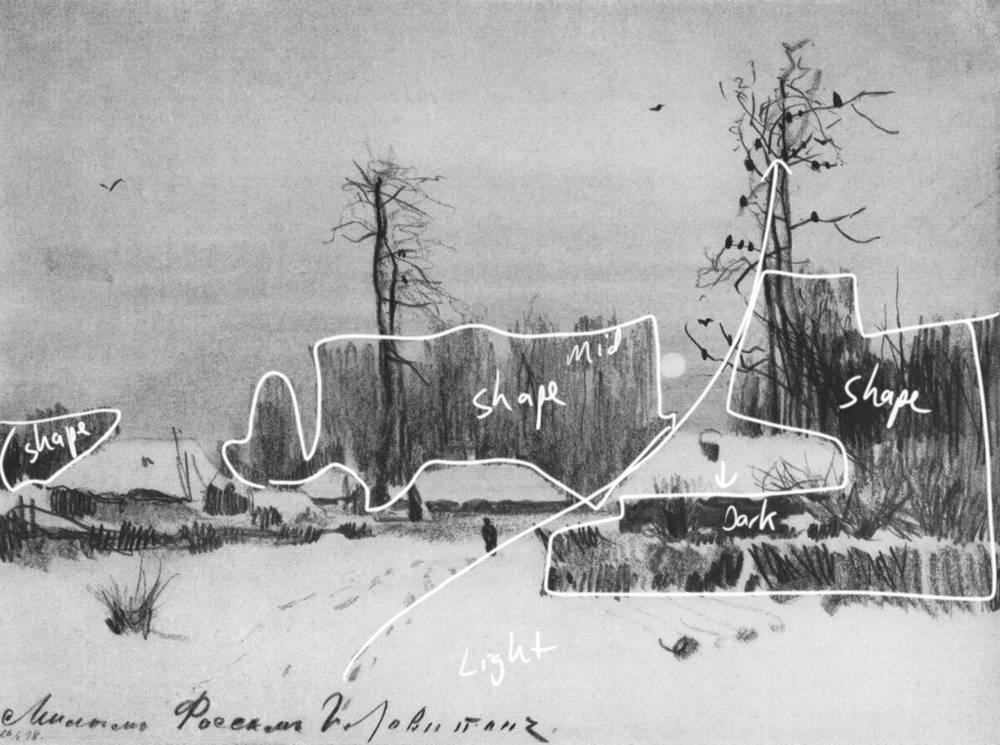
This particular video below analyzes how Isaac Levitan takes his viewers on a journey though his landscape sketch. He almost always takes the viewer on a journey through his scene via a lead in of some sort. In this case it’s the footprints in the snow.
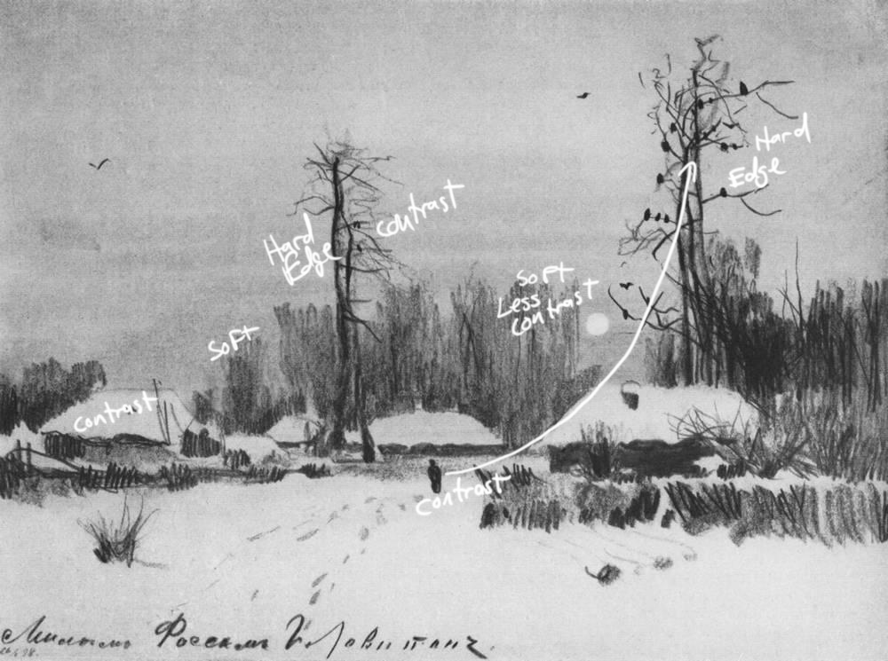
He then uses contrast in tandem with hard edges to lead the viewer to various parts of the landscape sketch. Levitan uses a nice compliment of hard and soft edges to control where the viewer looks first second and third. He also uses a balance of hard and soft edges to create a foreground and background.
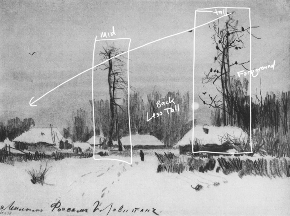
Lastly Levitan certainly understood the power of shape. A lot of artists get too caught up with texture leaving powerful shapes out of their landscape sketches. Do your best to use a light, middle tone and dark shape somewhere in your scene.
The next time you set out to compose a landscape use all of these techniques to your advantage. Use contrast, edges, as well as shape to take the viewer of your imagery through a cool little journey.
To see our of our Master Class videos consider a membership to Drawing Tutorials Online. Thanks so much for taking the time to check out this lesson.
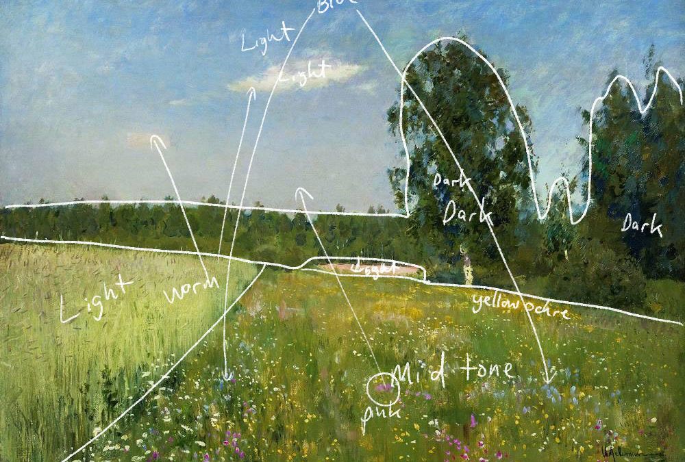
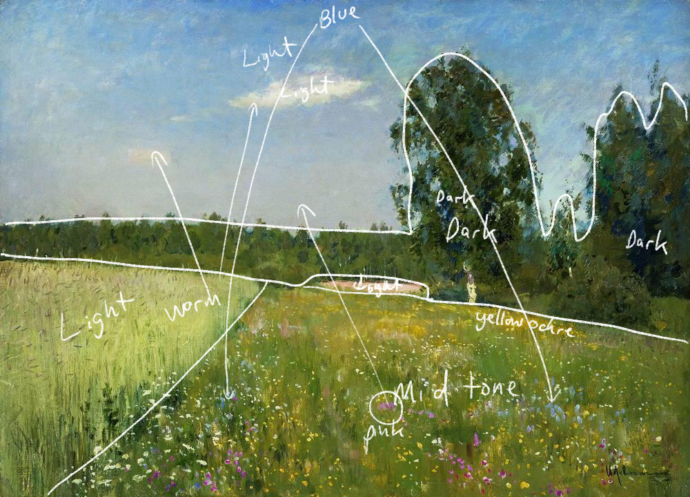
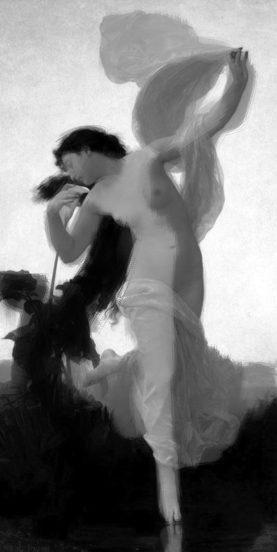
I discovered the work of Isaac Levitan roughly one year ago. I wish I knew of his work back in the day when I first started working as a freelance illustrator. Isaac Levitan is a master landscape painter. You can really see in this one painting how he captures light, squint at it.
He is really known for capturing both mood and light. One of my biggest struggles as a painter when first starting out was capturing light. I simply didn’t know what to do.
I discovered later that incorporating shadows was one way to capture light. Without shadows there can be no light. However what I didn’t realize is that you have to incorporate both shadows and cast shadows. Cast shadows are really where it’s at in terms of capturing light.
As an image maker you always want to think about the time of day. In this particular Levitan painting it is mid day, therefore there are no long cast shadows. One would incorporate long cast shadow during the late afternoon. Makes sense right, however this is really easy to overlook when we sit down to create our art whether with brush or pencil.
I just recently finished a brand new master class lesson showcasing the work of Isaac Levitan. In this master class series I do my best to analyze the work of different artists. Analyzing the work of these old masters is a great way to learn different techniques. When you study a multiple pieces of the artist’s work, that is when you discover trends.
Most artists tend to use the same techniques over and over again. We like to feel comfortable when creating.
Take a moment to study your own work. Not just one piece but a bunch of them. Do you see shadows and cast shadows? If you don’t then you will want to study the work of Isaac Levitan further.
If you would like to watch this MasterClass in it’s entirety along with nine others consider a membership to Drawing Tutorials Online.
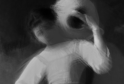
Every so often I film a Master Class lesson. What is a Master Class lesson you say? It’s where I analyze the work of an old master. In this case it’s the work of Albert Bierstadt. It’s a great way for members of Drawing Tutorials Online to hone their image making skills.
In this particular video below you will learn why this image works. You will also start to understand why some of your images work and why some don’t. I’m super passionate about image making. Throughout my eighteen year illustration career I was always trying to create an image that made sense to the viewer. I was always looking for ways to improve my picture making skills.
This video below is just a short sample of what our Master Class lessons have to offer you. If you would like to see many more videos just like this one check out my course listings page.
I’m passionate about helping artists improve their craft in both drawing and image making.
Thanks so much for watching. Leave a comment below, let me know if you learned something from this Master Class lesson. Click on the image below to enlarge the images from this lesson.
Do you know how to tell stories with your images? Whether it be a drawing or a painting, being able to control where the viewer looks first, second and third is crucial for storytelling. A lot of artists don’t even take into consideration where the viewer looks first. Now I’m not talking about a figure drawing, although this applies there too.
I’m talking about a finished piece of art.
A finished illustration, a commissioned portrait as well as fine art for a gallery show. The difference between a beautiful piece of art and one that tells a story is all about controlling the viewers eye. How do you control where the viewer looks first? Well there are many ways, controlling color, texture and edges are a few.
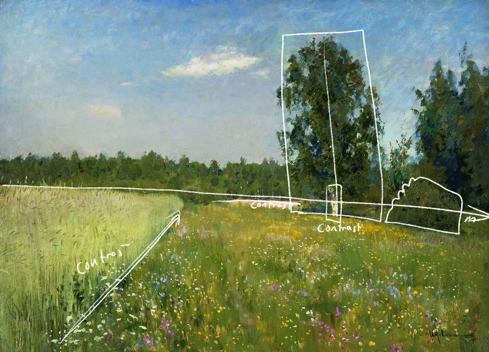
But for today we are talking to value contrast. You control where the viewer looks first by placing a light next to a dark. A lot of artists do this by accident. A person within their painting could have white socks with black shoes. Where do you think the viewers eye is going? You bet, the persons shoes. Unless those shoes are telling a story, you do not want the viewer to look at the bottom of your image first.
Pyle was a master illustrator. Illustrators tell stories usually with one image. It’s hard. But just by utilizing this simple image making technique you gain some sense of control. You can see it right away. The pirate with the dark hat against the empty sky is where the viewer looks first. Now if his hat was a middle tone next to a light middle tone sky, well, you get the picture.
So just remember. To control where the viewer looks first in your image, drawing or painting, place your lightest light right next to your darkest dark. Where you want the viewer to look last, use similar values, middle tone next to middle tone.
Try analyzing some of your own artwork. The first thing you can try is to turn your image upside down. Where do you look first?
Try placing your image on an easel or on the floor leaning against a wall. Now walk at least ten to fifteen feet away, turn around, where do you look first?
Lastly do the same thing, maybe place your image at the end of dark hallway, dim the lights. Which part of your image attracts your eye? If you said the elbow, you need to start rethinking how you approach image making. Everything counts.
If you need help in this area there is help on the way. I put together a package of three Master Class videos. I analyze the work of three incredible artists breaking some of their best images down in detail. You will learn how to incorporate these very cool compositional techniques into your own art.
Plus I made it incredibly inexpensive for you with no monthly commitment.
Thanks for reading. Now get working on telling some really inspiring stories!
A question I get asked all the time, why does my art look flat? Why doesn’t my image have any pop?
Most members of Drawing Tutorials Online draw and or paint for a hobby. It’s terrible to put so much time and effort into a piece of art only to realize it has that flat faded look. Of course you most likely notice this when the drawing or painting is complete. After that you feel as though you wasted your time working on something that you are not happy with.
There are multiple factors that can contribute to your artwork looking flat and faded. Paper pencil combinations are a major contributing factor. Perhaps you are drawing with a 2H pencil on paper that has no texture for the pencil to grab onto.
Concerning a painting there too could be a multitude of reasons why your image looks flat and faded. Perhaps you haven’t cleaned your palette nor brushes during a long painting session. That could contribute to everything becoming muddy, therefore flat.
The antidote to a flat faded image is planning out a value study ahead of time. You don’t have to spend a lot of time doing this. You literary can sketch out a small one inch by two inch value study in your sketchbook. You’ll definitely want to use a soft 2B pencil.
When you work on your value study force yourself to use only three values. Use a dark, middle tone and a light value. At first this might seem super difficult to condense everything into three values. However the goal is to simplify, figuring everything out ahead of time. So when you start working on your final there won’t be any disappointing surprises.
If three values is too restricting for you then try a five value study.
Just be self aware. Are you light handed or heavy handed? Just being conscious of the three value system will solve this issue.
Now of course I can go on forever here about art materials. But the three value study transcends art materials. It works with any traditional medium, even digital.
So the next time you spend you Saturday working on a drawing or painting, take a moment to plan out a value study. You can spend five minutes on it or fifty. Depending on your process and style.
If you want in depth instruction on how to utilize three value studies, color studies, value patterns, compositional shapes and a whole lot more take a closer look at our Master Class Series.
For the price of two Starbucks coffees you can learn some pretty incredible image making techniques. Your drawings and paintings will never look flat and faded again.