Do you know how to tell stories with your images? Whether it be a drawing or a painting, being able to control where the viewer looks first, second and third is crucial for storytelling. A lot of artists don’t even take into consideration where the viewer looks first. Now I’m not talking about a figure drawing, although this applies there too.
I’m talking about a finished piece of art.
A finished illustration, a commissioned portrait as well as fine art for a gallery show. The difference between a beautiful piece of art and one that tells a story is all about controlling the viewers eye. How do you control where the viewer looks first? Well there are many ways, controlling color, texture and edges are a few.
But for today we are talking to value contrast. You control where the viewer looks first by placing a light next to a dark. A lot of artists do this by accident. A person within their painting could have white socks with black shoes. Where do you think the viewers eye is going? You bet, the persons shoes. Unless those shoes are telling a story, you do not want the viewer to look at the bottom of your image first.
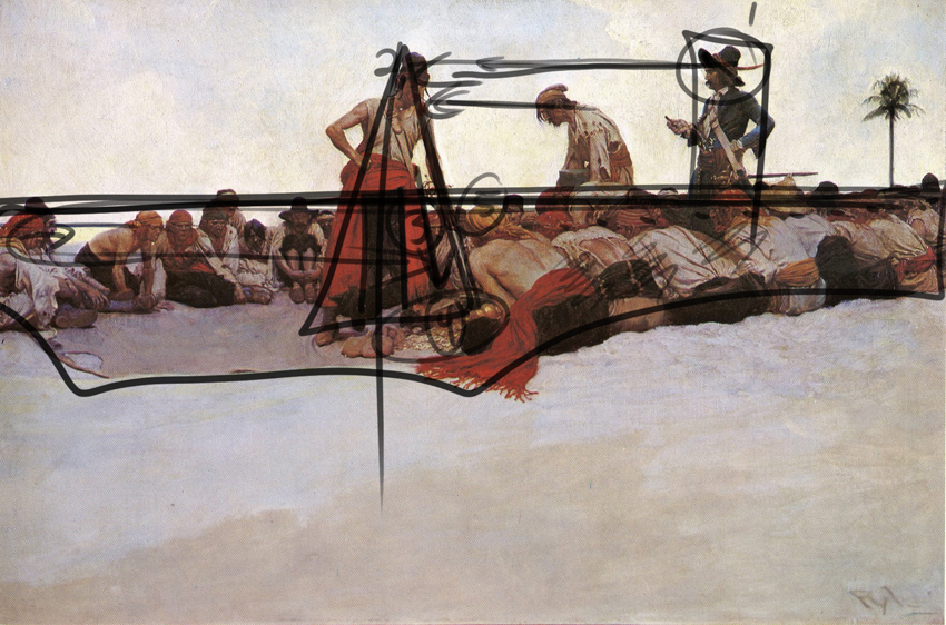
Pyle was a master illustrator. Illustrators tell stories usually with one image. It’s hard. But just by utilizing this simple image making technique you gain some sense of control. You can see it right away. The pirate with the dark hat against the empty sky is where the viewer looks first. Now if his hat was a middle tone next to a light middle tone sky, well, you get the picture.
So just remember. To control where the viewer looks first in your image, drawing or painting, place your lightest light right next to your darkest dark. Where you want the viewer to look last, use similar values, middle tone next to middle tone.
Try analyzing some of your own artwork. The first thing you can try is to turn your image upside down. Where do you look first?
Try placing your image on an easel or on the floor leaning against a wall. Now walk at least ten to fifteen feet away, turn around, where do you look first?
Lastly do the same thing, maybe place your image at the end of dark hallway, dim the lights. Which part of your image attracts your eye? If you said the elbow, you need to start rethinking how you approach image making. Everything counts.
If you need help in this area there is help on the way. I put together a package of three Master Class videos. I analyze the work of three incredible artists breaking some of their best images down in detail. You will learn how to incorporate these very cool compositional techniques into your own art.
Plus I made it incredibly inexpensive for you with no monthly commitment.
Thanks for reading. Now get working on telling some really inspiring stories!
A question I get asked all the time, why does my art look flat? Why doesn’t my image have any pop?
Most members of Drawing Tutorials Online draw and or paint for a hobby. It’s terrible to put so much time and effort into a piece of art only to realize it has that flat faded look. Of course you most likely notice this when the drawing or painting is complete. After that you feel as though you wasted your time working on something that you are not happy with.
There are multiple factors that can contribute to your artwork looking flat and faded. Paper pencil combinations are a major contributing factor. Perhaps you are drawing with a 2H pencil on paper that has no texture for the pencil to grab onto.
Concerning a painting there too could be a multitude of reasons why your image looks flat and faded. Perhaps you haven’t cleaned your palette nor brushes during a long painting session. That could contribute to everything becoming muddy, therefore flat.
The antidote to a flat faded image is planning out a value study ahead of time. You don’t have to spend a lot of time doing this. You literary can sketch out a small one inch by two inch value study in your sketchbook. You’ll definitely want to use a soft 2B pencil.
When you work on your value study force yourself to use only three values. Use a dark, middle tone and a light value. At first this might seem super difficult to condense everything into three values. However the goal is to simplify, figuring everything out ahead of time. So when you start working on your final there won’t be any disappointing surprises.
If three values is too restricting for you then try a five value study.
Just be self aware. Are you light handed or heavy handed? Just being conscious of the three value system will solve this issue.
Now of course I can go on forever here about art materials. But the three value study transcends art materials. It works with any traditional medium, even digital.
So the next time you spend you Saturday working on a drawing or painting, take a moment to plan out a value study. You can spend five minutes on it or fifty. Depending on your process and style.
If you want in depth instruction on how to utilize three value studies, color studies, value patterns, compositional shapes and a whole lot more take a closer look at our Master Class Series.
For the price of two Starbucks coffees you can learn some pretty incredible image making techniques. Your drawings and paintings will never look flat and faded again.
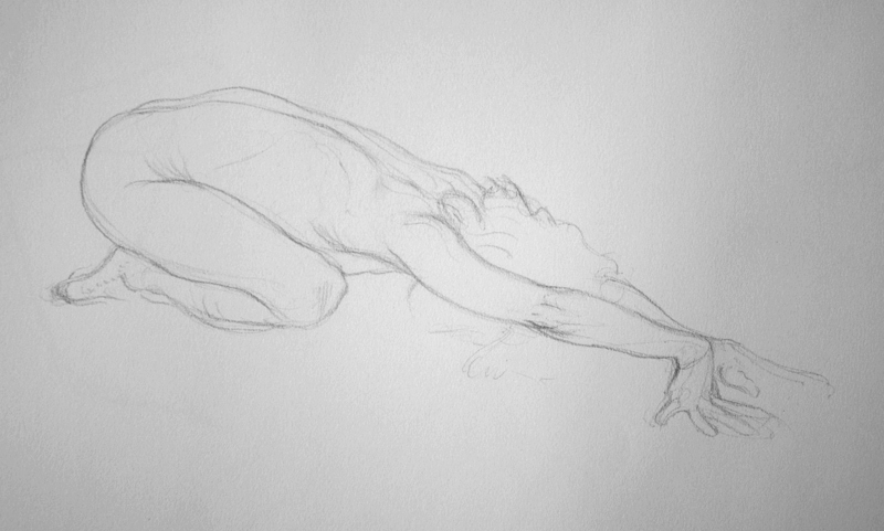
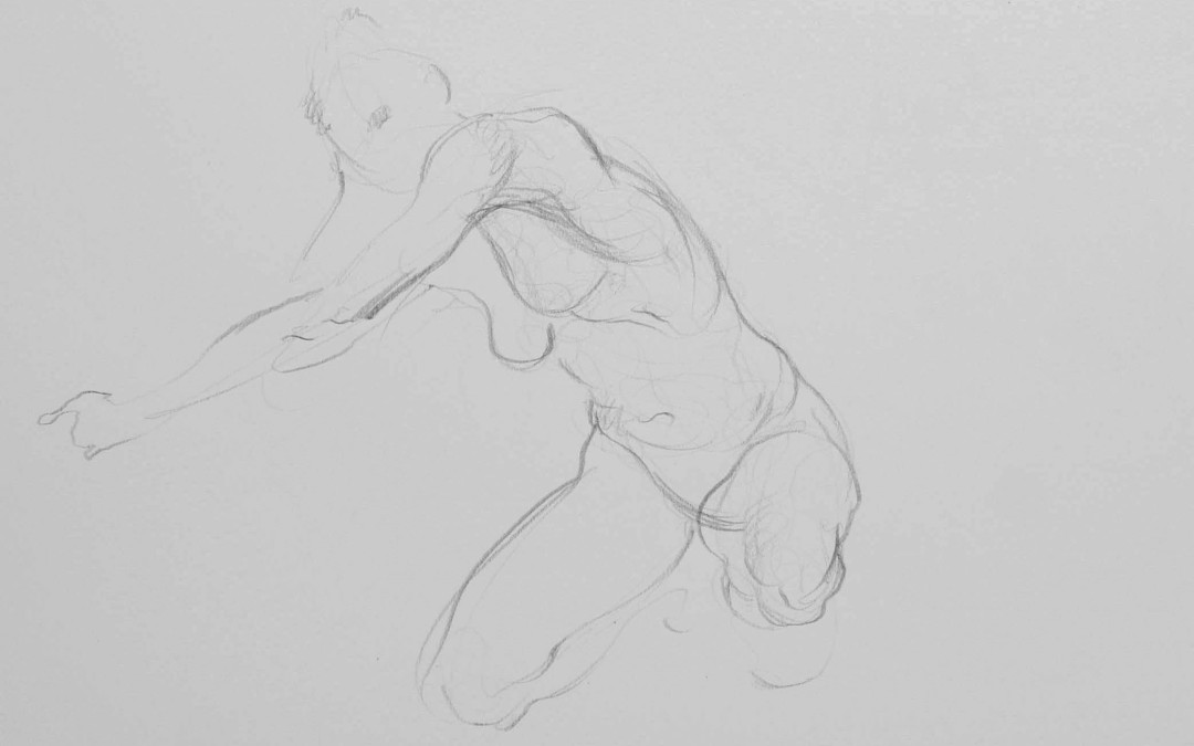
In this drawing tip of the week we focus on an easy way to draw ten minute gesture poses. Ten minutes is kind of that in between type drawing. It’s not super short, but yet you still have to draw pretty fast to draw a full figure. There is that little bit of pressure to finish the drawing in ten minutes.
The first thing you want to do is decide upon whether or not you want to finish the entire pose from head to toe. If you do utilizing the “Opposite C” technique will make your job much easier.
There are hard techniques and easy techniques. The Opposite C technique is an easy one. How do I know this? I see the Opposite C technique immediately help students draw the figure better. The technique just flows.
When I teach this technique students seem to relax. They seem to draw the figure from head to toe in a much more relaxed way.
Now the one thing you want to also keep in mind with this drawing technique is this, you want to economize your line. What do I mean?
Do your ten minute figure drawings look a little messy? A little sloppy might be a different way to explain this. Now I don’t mean using a continuous line that looks busy. I mean a messy edge. Do you use way too much line to describe the edge of the model?
You see you want to try to slow down when you draw even during a ten minute gesture drawing. Breathe, slow down your hand movements. Make every line that you draw count. Your drawings will look much more elegant.
Two things. This is hard. Does this always work for me, no way. Especially when I haven’t been practicing.
Economizing your line might not fit with your personal style. Your style might be super messy on purpose, if so that’s cool. Go with what works for you. I ask my students to try to economize the line in a small section of their figure drawing. This provides them with a way to balance out the look and feel of their drawings.
So the next time you try to draw a short ten minute gesture pose incorporate two general ideas. One, use the Opposite C technique, and two, economize your line.
Show more detail with less line. In this case less is more elegant.
The question gets posed to me all the time, how do I handle drawing one minute gesture poses?
Well, there really is no one right way to draw the model within a one minute time frame. You really do not want to put all of this pressure on yourself to draw the perfect drawing within sixty seconds.
Every artist has a complete different approach. An animator might want to get the emotion of the pose, not concentrating on the likeness. For someone like myself, I use the one minute pose to warm up. The pose as well as my state dictates how I will draw and with what technique.
If I’m feeling a little rusty I might use a certain technique that I find easy that morning. If I’m feeling good then I won’t use any technique. I’ll just draw what I see. Using more of a natural organic line for a likeness.
Here are a few techniques you can employ in a classroom setting.
Focus one the contour. Totally slow down. Focus on drawing just one edge of the models body. Look way more at the model than you do at your paper. Keep your pencil on the paper for as long as you can. You can also try at least one or two drawings using the blind contour technique. It will force you to look at the model more. Remember there is no rush, slow down.
Draw the skeleton. Drawing the rough skeleton during a few one minute gesture poses is a great way to warm up. It’s about finding the tilts of the shoulders and hips. It’s also about drawing the many ovals within the rough skeleton.
Yes, my favorite, the torso peanut shape. Try starting with the torso peanut shape. Then progress to using the opposite c’s for short gesture. If you have time you can also draw in some mummification lines to promote volume.
Lastly just draw what you see with no technique. Use a slow continuous line to draw in your own personal style.
There are ultimately a gazillion ways to draw the model within a one minute time frame. Try these four simple techniques first to keep things simple and easy for yourself.
Like our free content? Click here to get the best of what DTO has to offer!
Most artists don’t really think about gesture when it comes to portrait drawing. Recently during a video critique session I noticed a recurring theme. It was the missing ingredient in three separate images. The portrait drawings were are pretty cool. They were all just missing that loose gestural quality.
It’s so very easy to get caught up in all of the typical portrait drawing techniques. Drawing techniques like angles, value matching shading etc etc. I know I do all the time. Gesture is equally important. It places the head on the shoulders in a natural way. It helps you to focus on the tilt of the head and shoulders. Sometimes this can be very subtle.
Just being conscious of incorporating or at least just seeing gesture when you are about to start a portrait drawing is huge.
Let’s say you are starting to work on a portrait drawing. You have set aside a few hours on your Saturday to dive into rendering and shading. Take a moment at the beginning of the drawing to complete a quick portrait gesture sketch at the top corner of your piece of paper. This will help you to find the big gesture lines.
You certainly don’t have to spend a lot of time of this. Again this is all about trying to loosen up your portrait drawings. It’s about seeing the movement of the head and shoulders in tandem.
So the next time you start a portrait drawing, find the gesture of the head. This drawing technique could be a difference maker in the quality and feel of your next drawing.
Like our free content? Click here to get the best of what DTO has to offer!