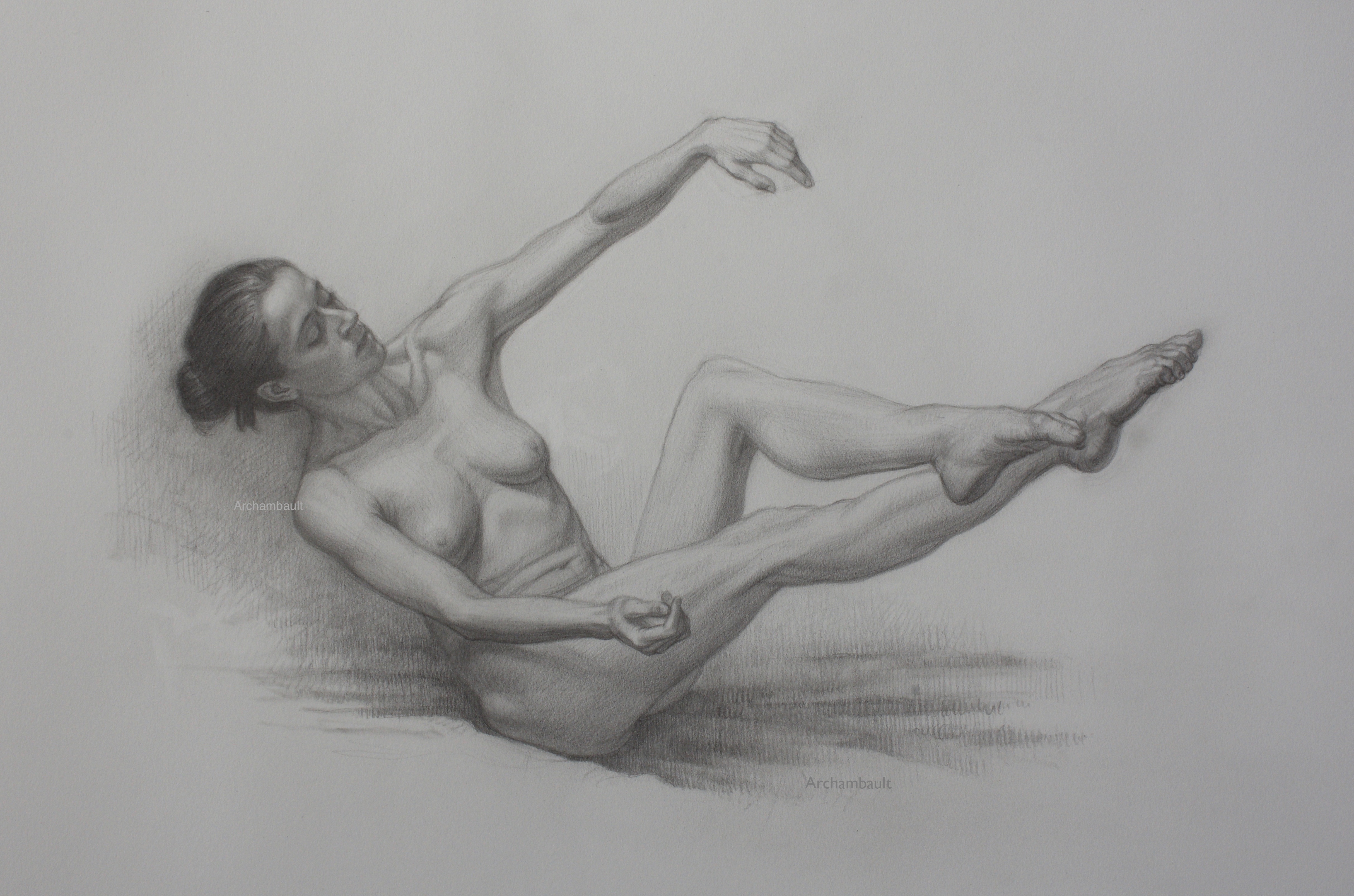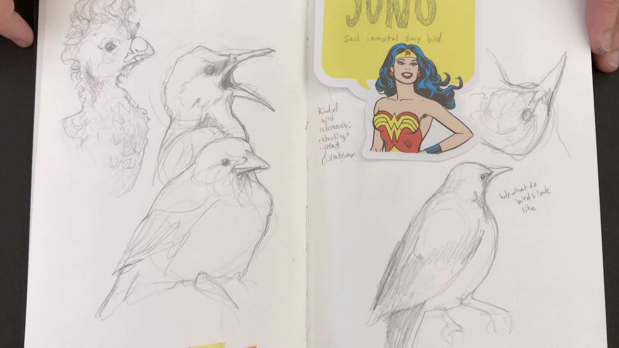
Drawing Facial Features In An Impressionistic Way
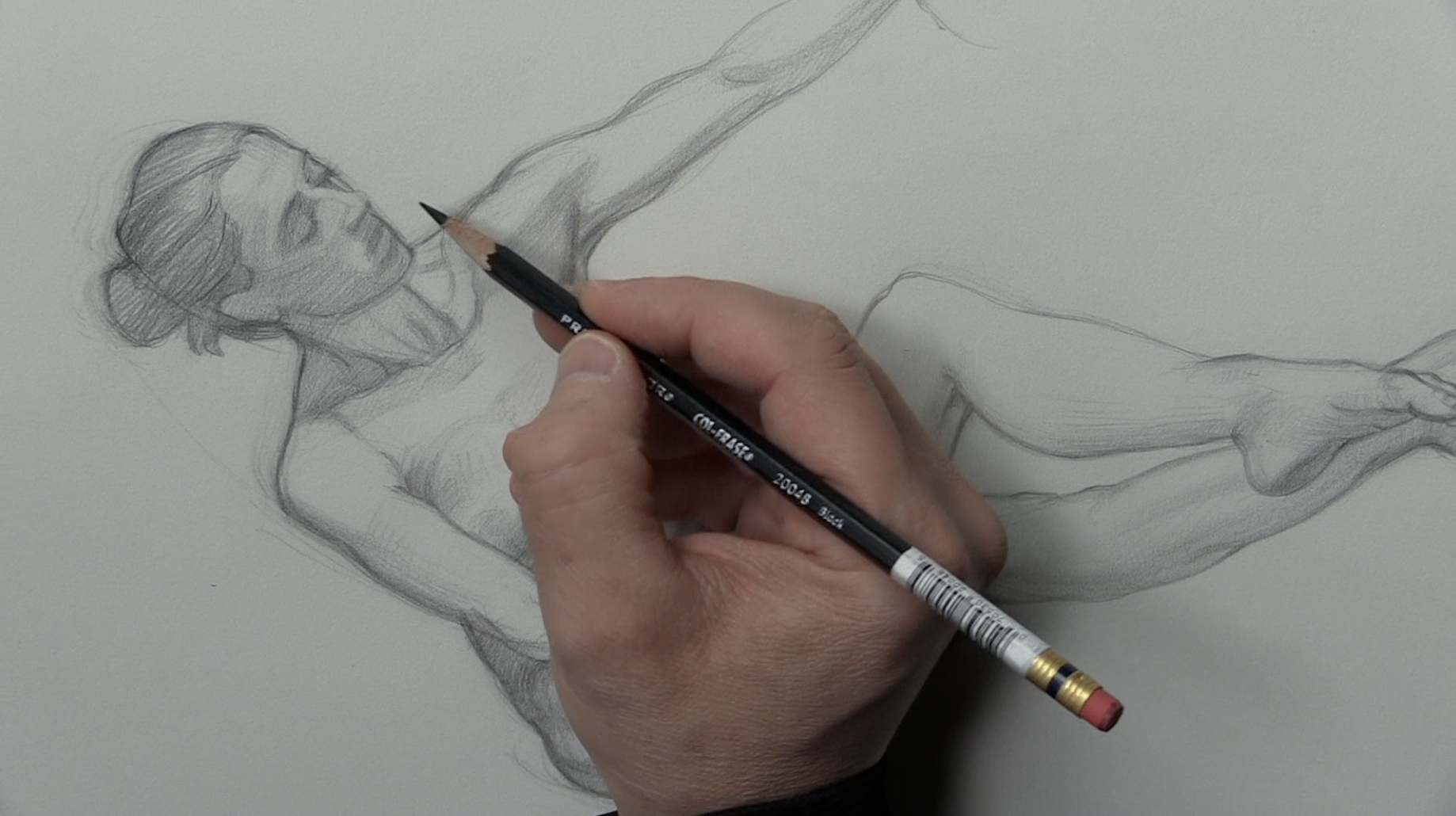
Drawing a small head on a figure it can be pretty daunting. However when it comes to drawing facial features that are mainly on the shadow side of the head, that can be even more daunting.
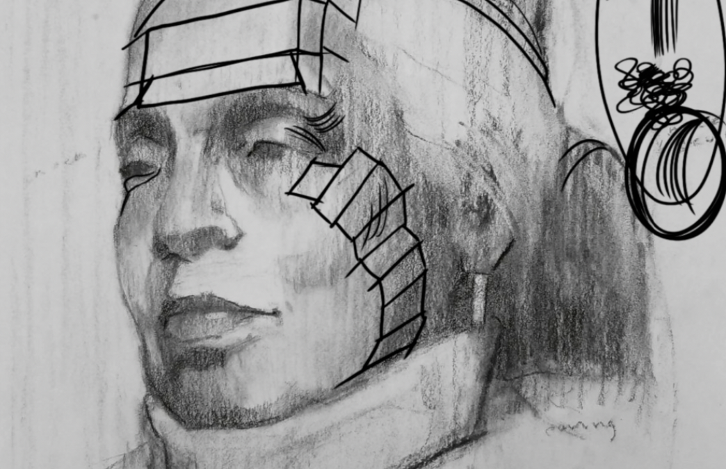
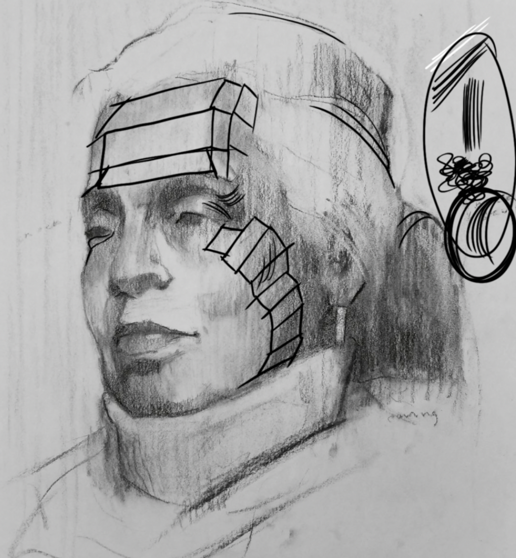
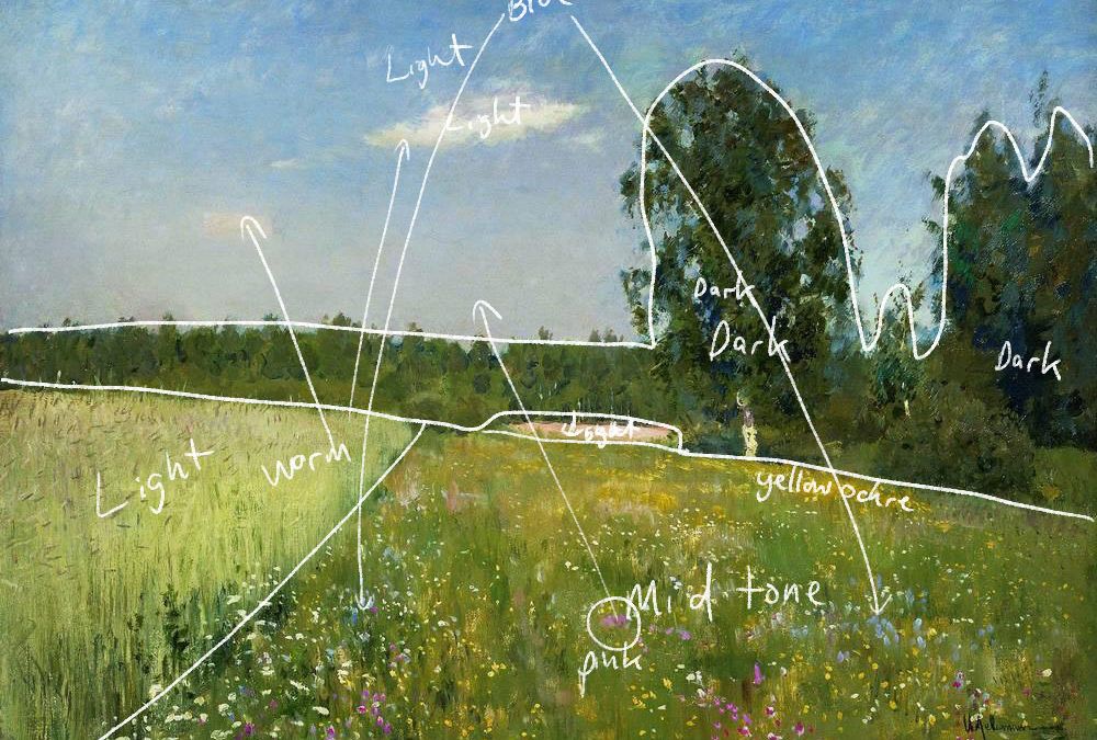
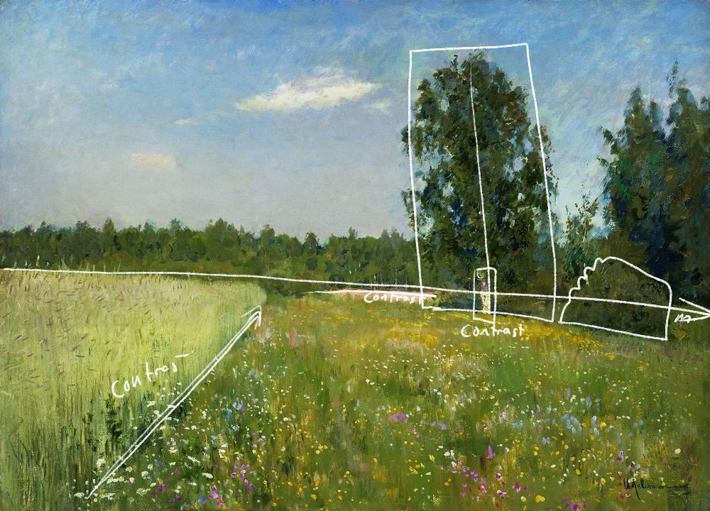
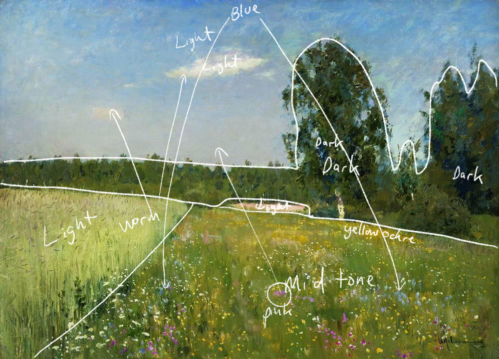
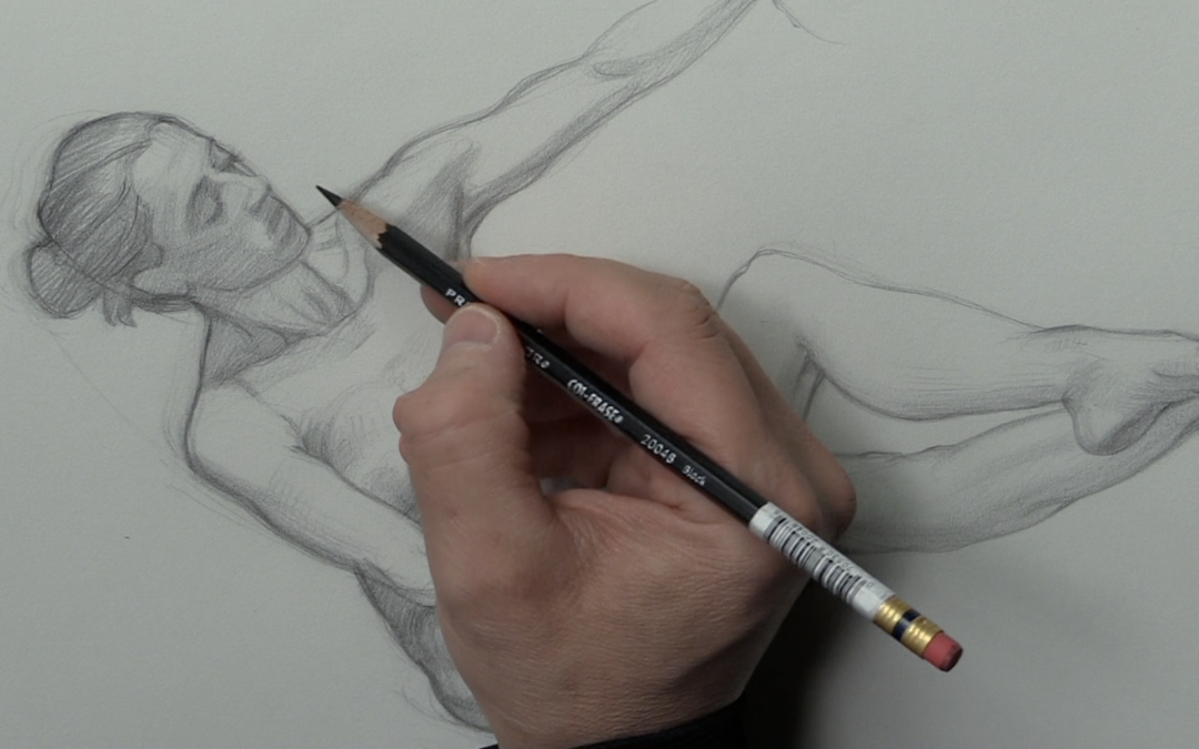
The key to drawing facial features that are mainly on the shadow side of the face is to draw them in an impressionistic way. I’m a big believer of drawing shadow shapes, not facial features. Think of them as one in the same. Getting a likeness is about seeing the shadow shapes within the features, then drawing them accurately.
You also want to think and draw in layers. Start off with blocking in light tone. Feel your way through the facial features with very soft light tone. This is where you want to practice your light touch. Diving into drawing the features with heavy dark tone at first will only create a mess.
Especially if you are struggling with measurements.
There are three key takeaways from this lesson. First, work from light to dark when applying tone. Second, don’t draw facial features, draw soft accurate shadow shapes. Third, think layers, build up the dark tone and detail gradually.
These initial soft layers of tone are a foundation for the detail that will come later.
To watch the course in it’s entirety consider a membership to Drawing Tutorials Online. Not only will you learn many new drawing techniques, you can also get your figure drawings critiqued weekly.