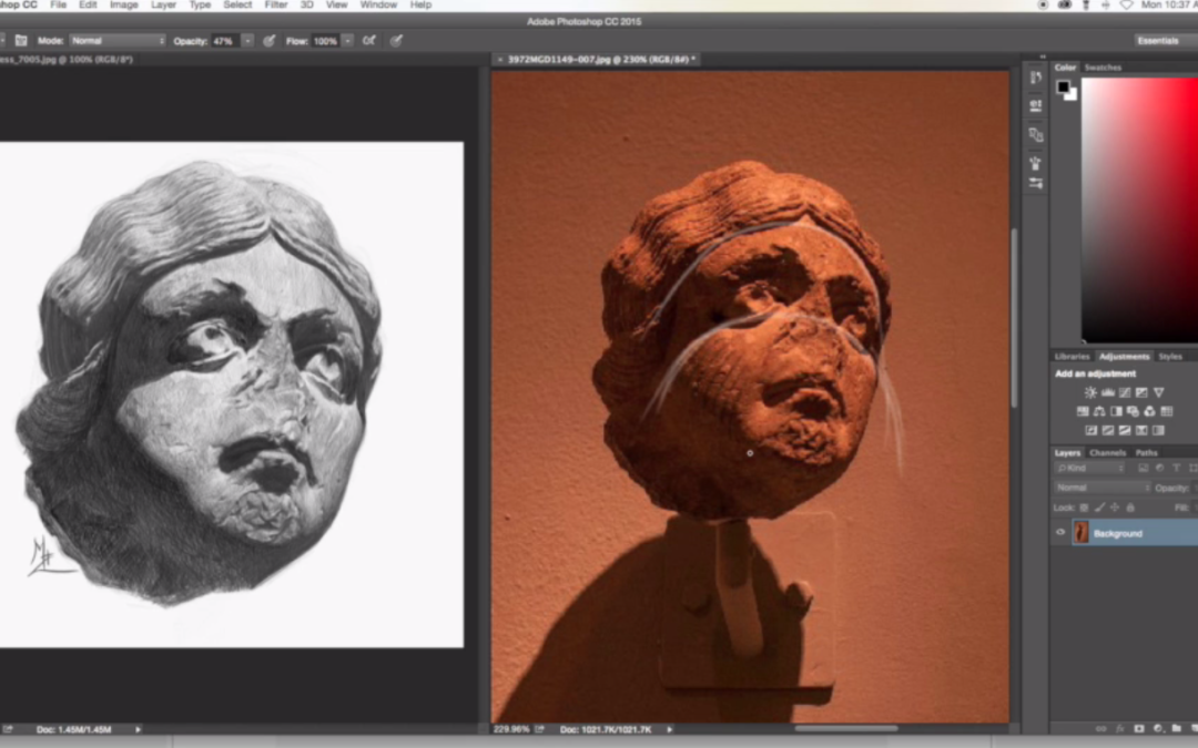
Most artists don’t really think about gesture when it comes to portrait drawing. Recently during a video critique session I noticed a recurring theme. It was the missing ingredient in three separate images. The portrait drawings were are pretty cool. They were all just missing that loose gestural quality.
It’s so very easy to get caught up in all of the typical portrait drawing techniques. Drawing techniques like angles, value matching shading etc etc. I know I do all the time. Gesture is equally important. It places the head on the shoulders in a natural way. It helps you to focus on the tilt of the head and shoulders. Sometimes this can be very subtle.
Just being conscious of incorporating or at least just seeing gesture when you are about to start a portrait drawing is huge.
Let’s say you are starting to work on a portrait drawing. You have set aside a few hours on your Saturday to dive into rendering and shading. Take a moment at the beginning of the drawing to complete a quick portrait gesture sketch at the top corner of your piece of paper. This will help you to find the big gesture lines.
You certainly don’t have to spend a lot of time of this. Again this is all about trying to loosen up your portrait drawings. It’s about seeing the movement of the head and shoulders in tandem.
So the next time you start a portrait drawing, find the gesture of the head. This drawing technique could be a difference maker in the quality and feel of your next drawing.
Like our free content? Click here to get the best of what DTO has to offer!
Are you really good at drawing portraits? Are you pretty good at drawing a likeness of the person too? However there is that one little thing about your portrait drawing that does not look quite right. Perhaps there is a dark under the person’s eye.
However in reality if they had that dark under their eye they would have a bruised eye?
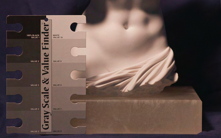
The dirty little secret about drawing killer portraits is being able to match values.
Back in the day when I first started painting book covers for various publishing companies I struggled big time with matching values. I would drop off a painting and the art director would tell me the face was too light. Or perhaps the forehead was too dark. I really struggled big time with simply being able to match the values on the persons face.
On a book cover this was a huge deal.
If the character on the cover looked like they had a black eye, well that wasn’t cool.
So the first place to start is to mainly be conscious of the value scale. For those of you who are members of Drawing Tutorials Online we have multiple tutorials on how to match the value scale.
Being aware of the value scale comes first. Then practicing matching the values on the value scale comes second. You might be super heavy handed which means your light values will look dark. Or you might be light handed which means your dark values will look too light.
You get where I am going with this?
Here is a profound statement. “All of drawing realistically in tone is being able to match the value of any particular shape”. If you can draw a shape and match it’s value you are golden.
That shape could be the shadow under the nose or the white of the eye.
So the next time you draw a portrait be highly aware of the the values. If you are attempting to draw a realistic portrait constantly analyze the values of shapes. Keep your value scale nearby, it’s a life saver.