Critique Of The Week – How To Draw A Cat

Critique Of The Week – How To Draw A Cat

Paul a member of Drawing Tutorials Online just recently uploaded one of his images for a critique.

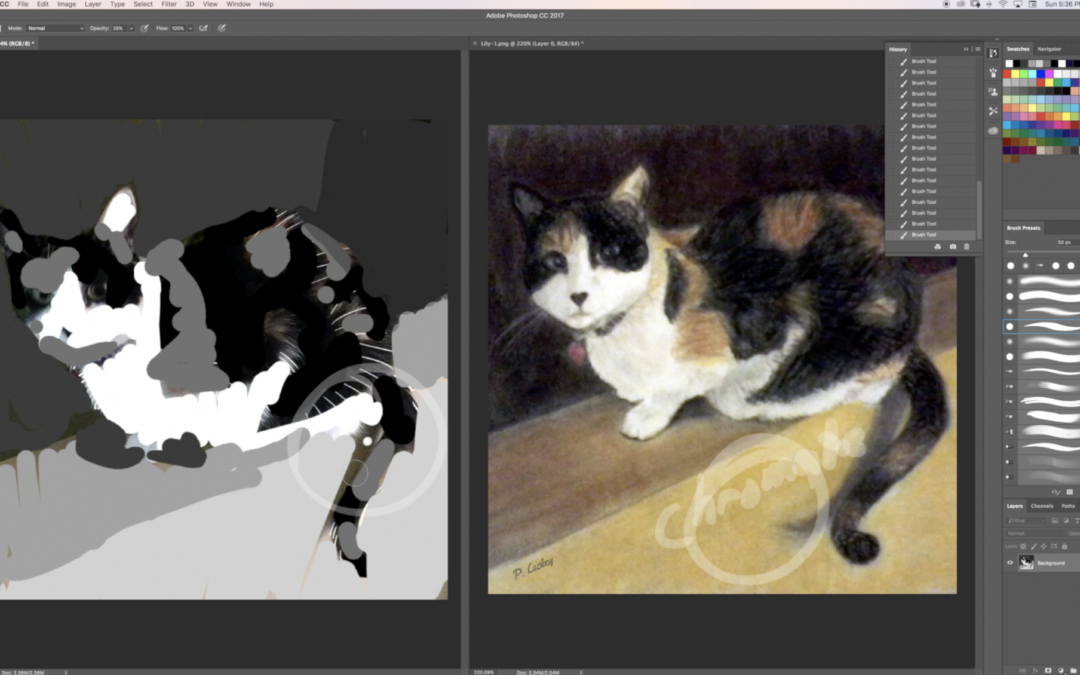
I really liked his drawing of this cute furry cat. The drawing was done in a combination of pencil, colored pencil, pastels (both pencil and stick), as well as charcoal.

I thought the piece looked great. My recommendation for Paul was to add more texture to the drawing. Specifically where the cat hair touches the background. Creating more of a jagged edge in certain areas would make the cat fur look more like cat fur.

Plus I suggested adding more pencil strokes within the interior of the cat that showing volume. That would dramatically enhance the three dimensional quality of the cat.

The other item mentioned in the critique that would enhance Paul’s art is playing around with a couple of value studies. I’m all about loosing edges however arranging the value structure in a different way would certainly improve the look and feel of this image.

When working on an image take some time to create at least two value studies before you start working on the final art. Having two diverse value studies will just provide you with more options.

Thanks Paul for sharing your art for a critique.


You can read more about our drawing courses over at our member login page. Looking forward to working together with you.

How To Make Your Drawings Three Dimensional

How To Make Your Drawings Three Dimensional

Every Monday at Drawing Tutorials Online I film three to four of video critiques. Members who take the time to upload their artwork definitely improve weekly. It’s pretty amazing what a different set of eyes can do to help you improve

Sometimes we get much too close to our drawings loosing all sense of objectivity.

Stella has been a member of Drawing Tutorials Online for a little over a month now. She is really taking the time to seek out feedback on her drawings. She is being super proactive learning new skills through our begin here step by step course. I really appreciate that.

In this short critique you can see what Stella is struggling with. She is doing too much outlining on the light side of the statue. She is separating each muscle with an outline. When you do that you compartmentalize your drawing. You chop up the muscles and bones into small stiff parts.

The second element in this critique, not shading the shadow shape in a solid dark enough way. This is a very common occurrence. For whatever reason many artists have a difficult time seeing the shadow side of what they are drawing in a solid dark way.

Stella is also showing too much crisp detail in the shadows. Shadow shapes should be left simple. If you put detail in the both the light and the shadows that creates a flat look.

So what can we all take away from this critique? Keep your shadows dark, solid with not too much crisp detail. Don’t outline each and every muscle. Keep your lights light. Be very cautious about dark outlines in the light. Yes you can and should put details in the light, just keep those details light.

Thank you Stella for sharing your artwork with us in our member critique gallery. Thank you too for reading this post.


Who can benefit from our weekly critiques? Are you putting together a portfolio to get into college? I can help you create a strong portfolio that gets you into the college of your dreams.

Is drawing your hobby? Do you have limited time? If so let me help you get the most out of your drawing time. Pointing out things you can do to improve your artwork on a weekly basis.

Sign up to Drawing Tutorials Online today and let’s start working together to improve your drawings.

Creating A Simple Value Structure Study

Creating A Simple Value Structure Study

What is one of the best techniques you can put into practice in order to create a powerful image? Creating a value study. Taking five minutes to create a simple three or five value study will do wonders for your image’s integrity.

Sometimes we get so caught up in the details, the textures that we forget to organize a simple value structure. I recommend creating a value structure study in your sketchbook with a soft 2B mechanical pencil. It should take you less than five minutes to complete.

Try using just three values to start off with. A dark, middle tone and light is a great way to create a three value study. If three values is too limiting for you try creating a five value study. The reason for this is to see if your image is working before you actually get to your final. Do your best to shade in the values as solid as possible. 

One of the worst feelings is when you are hours into creating your art only to see that your image might look too muddy. Trust me I’ve been there before. Plus creating multiple value studies will provide you with options.

Take a moment to watch the video below.


Thanks so much Simon for uploading your artwork to our member Critique Gallery! Keep up the good work.

How To Create More Mood & Depth In Your Drawings

How To Create More Mood & Depth In Your Drawings

How you ever had the situation arise where when you look at your drawing something seems flat? I certainly have.

Sometimes I’ll step away from my drawing and it looks too light. I then realize I need sit back down and put more pencil down on the paper. You see a lot of artists stop too soon. They leave so much mood and depth on the table.

If this has happened to you use this concept. When you think you are done, you really are not. You most likely will have to sit down for a few more minutes to add more tone.

Make those shadows darker. If there is not enough shadow value your drawings won’t have mood and depth.

You’ll also want to think about big surface planes. Don’t get caught up in the gazillion surface planes offered to you from the photo reference. Think big.

Take a peak at the video below. You might be leaving a lot of mood and depth on the table.


To Learn more about having your artwork critiqued check out https://members.drawing-tutorials-online.com

How To Simplify Light & Shade When Drawing A Portrait

How To Simplify Light & Shade When Drawing A Portrait

Milos recently uploaded his art to our critique gallery for the first time. I thought his drawing was pretty cool.

The main suggestion was to simplify how to apply shadow shapes. When you place shadow shapes everywhere in essence you muddy up your portrait drawing. It’s always best to simplify where you decide to put your shadow shapes.

Use a minimalistic approach when thinking about light direction. Where is the light coming from? Is it front light, side light, rim light, or form light? Form light is best for three dimension.

Once you make a decision on which direction the light is hitting your subject you start heading in the right direction.

Enjoy the video critique.

Thank so much for watching. If you are looking for a video critique just like this one for your work read more about what Drawing Tutorials Online has to offer you.

Why Are My Portrait Drawings Flat?

Why Are My Portrait Drawings Flat?

Recently Maria, a member of Drawing Tutorials Online, posted up a portrait drawing for feedback. Her main question, why is the drawing flat?

First off I want to thank you Maria for presenting this awesome teaching opportunity. There are many reasons why a portrait drawing can look flat. Let’s touch on four of them.

  • There is no background tone. With no tone in the background you have no foreground and background. Thus your portrait drawing is just sitting on white paper. Plus a tone or gradation placed in the background can provide you with an opportunity to soften the hair’s edge. Soft hair equals depth.
  • There are no gradations within the skin tone. When you have no shading from the light side to the dark side of the face your portrait drawings will look flat. There is most likely always a light hitting the model. If there is a light source there is definitely a gradation from side to side or top to bottom. Including gradations with create much more three dimension in your portrait drawings.
  • There are too many outlines. Line is awesome. However line alone can be flat in some cases. Drawing with a consistent outline will almost always create a flat outlined look. Combining tone with line promotes much more dimension.
  • There is no modeling with tone. Yes you can model with line. However modeling with line and tone is much better for creating dimension. What exactly are you modeling? You are modeling how light hits the form of the face. Understanding how surface planes work is super important. Understanding how to implement the modeling factors is vital as well.

I want to thank you so much for watching this video critique. If you are looking for a critique on your work just like this one consider a membership to Drawing Tutorials Online.

Our critique gallery is a kind nurturing place for you to learn and grow fast.

Thanks again for watching. Questions or comments, I would love to hear from you! Leave a comment below.