Phoebe’s Sketchbook Part III – Incredible Interiors

Phoebe’s Sketchbook Part III – Incredible Interiors

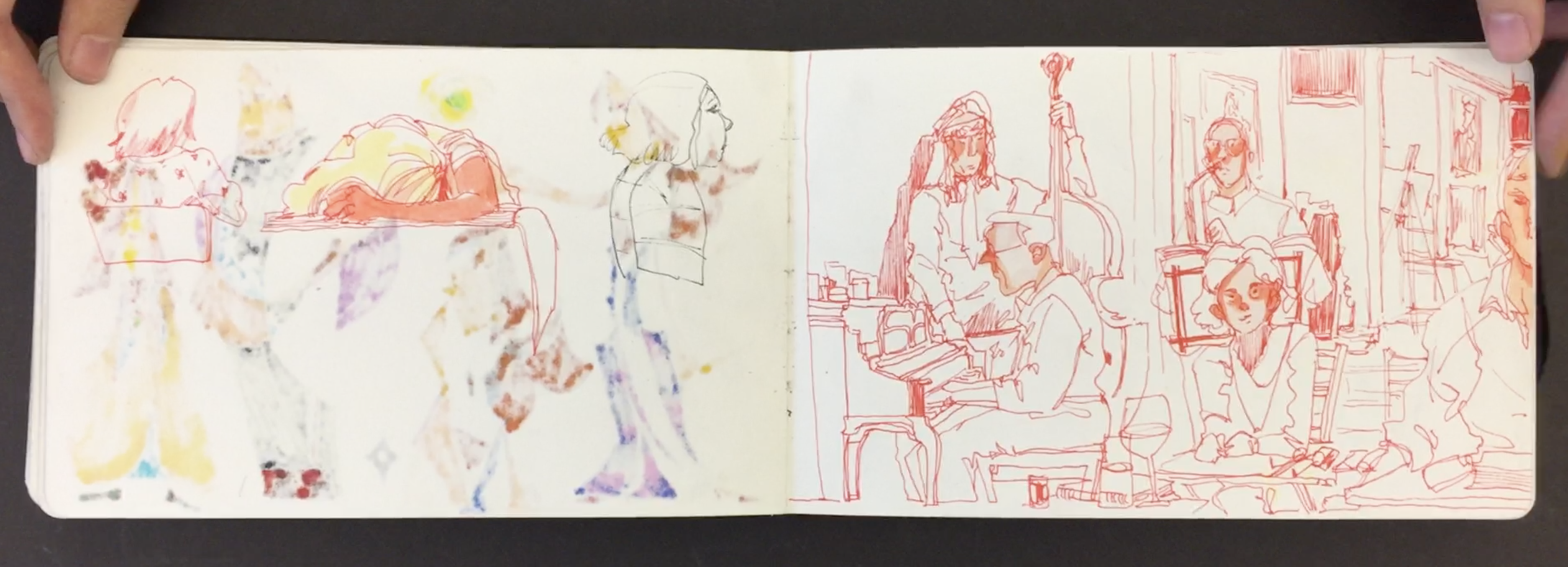
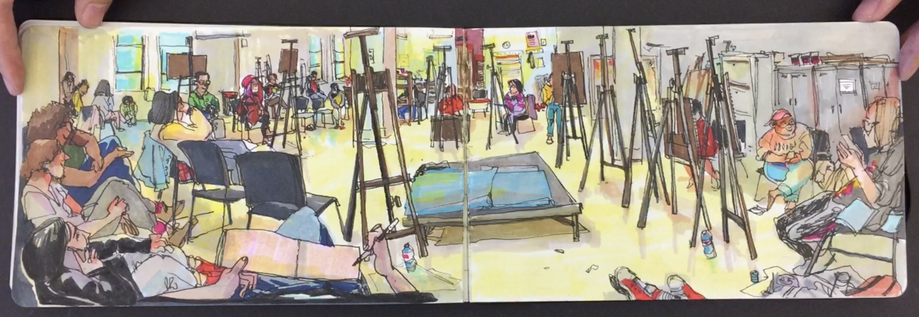
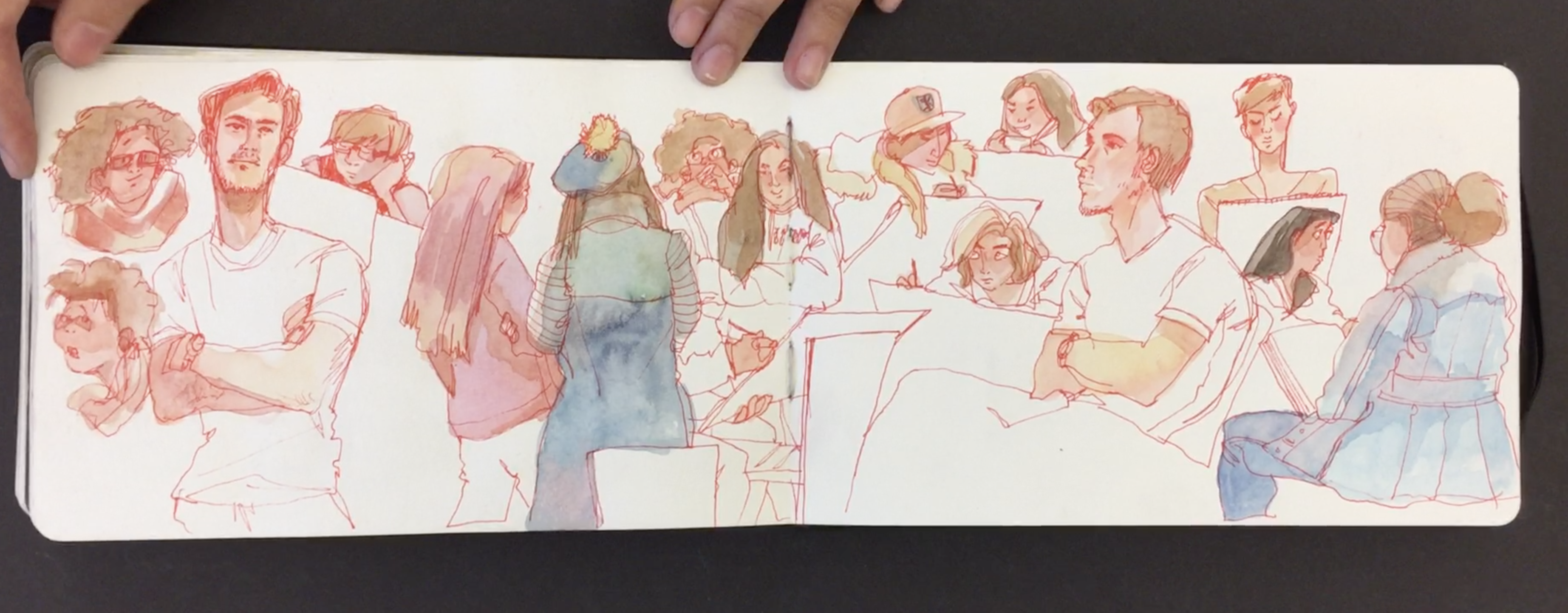
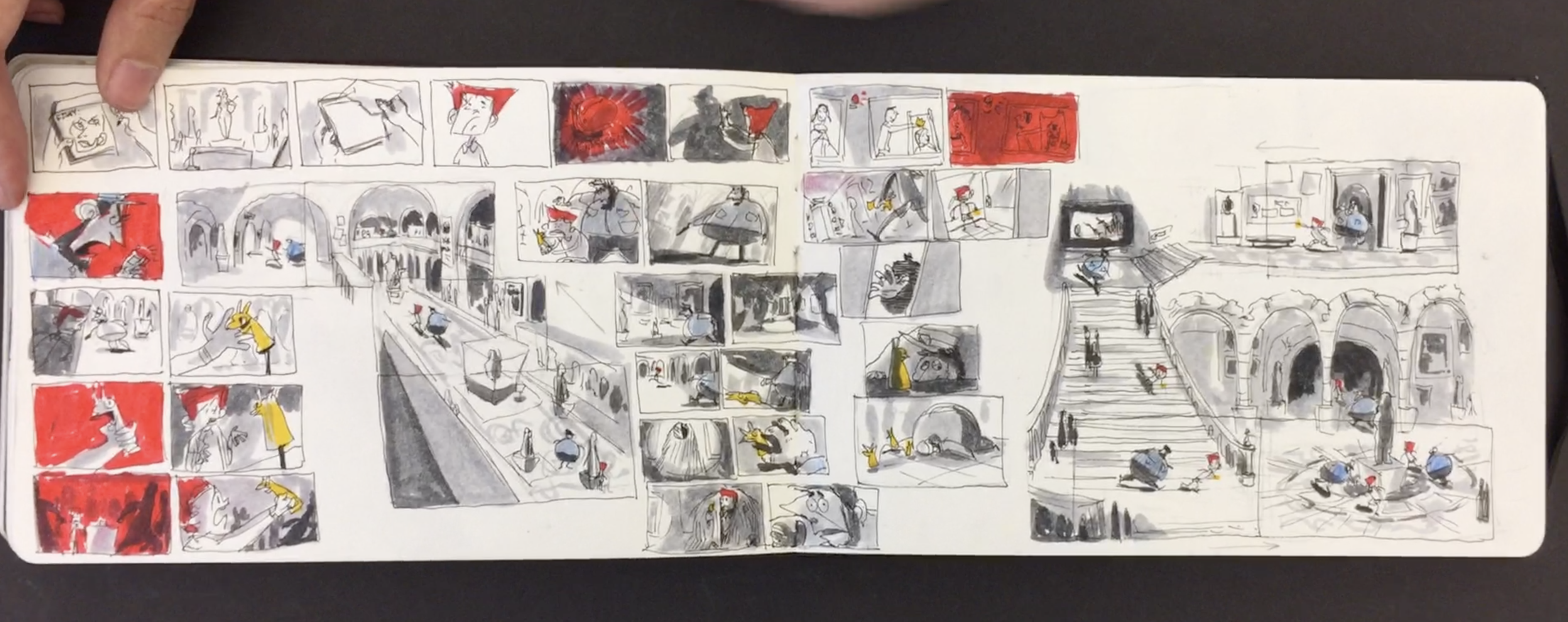
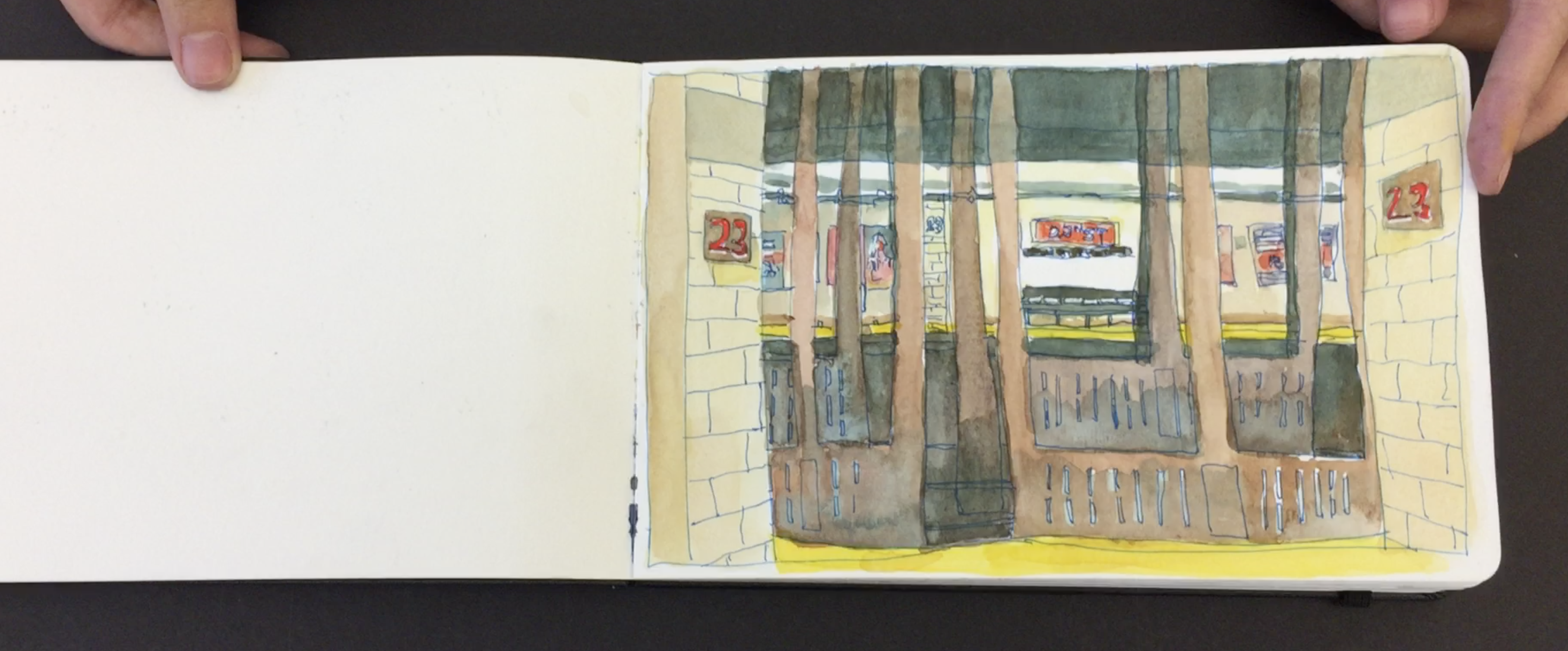
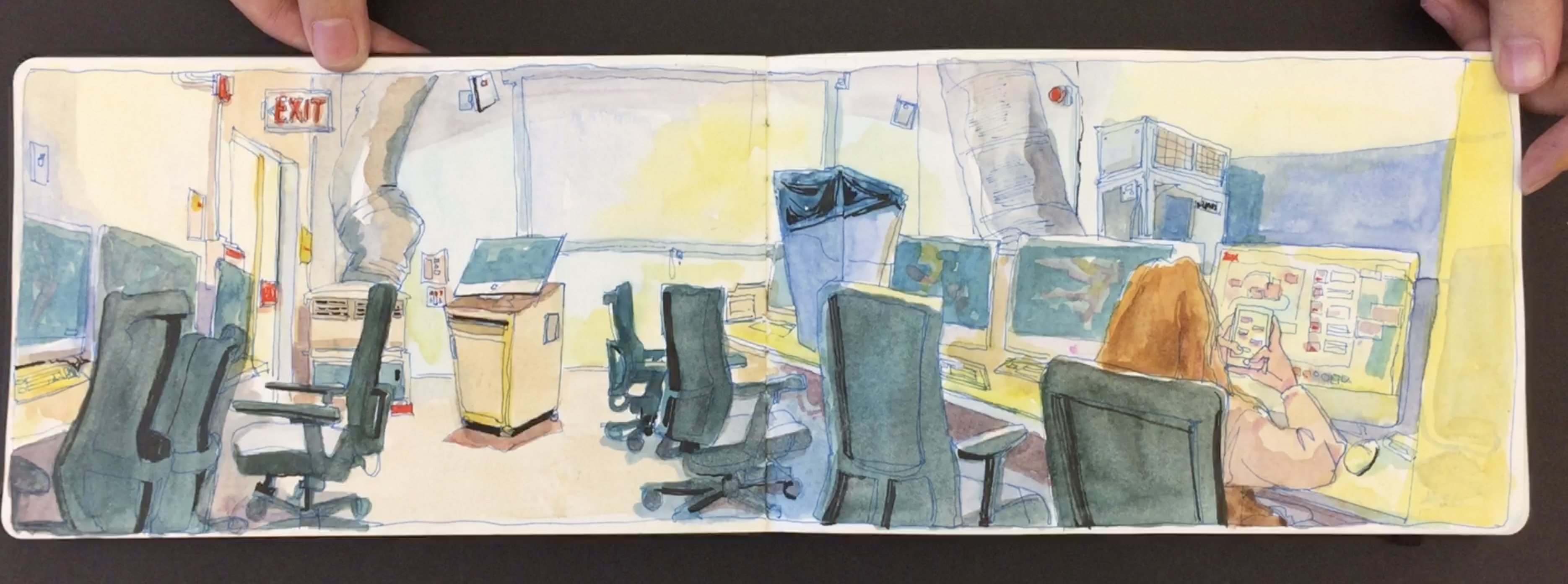
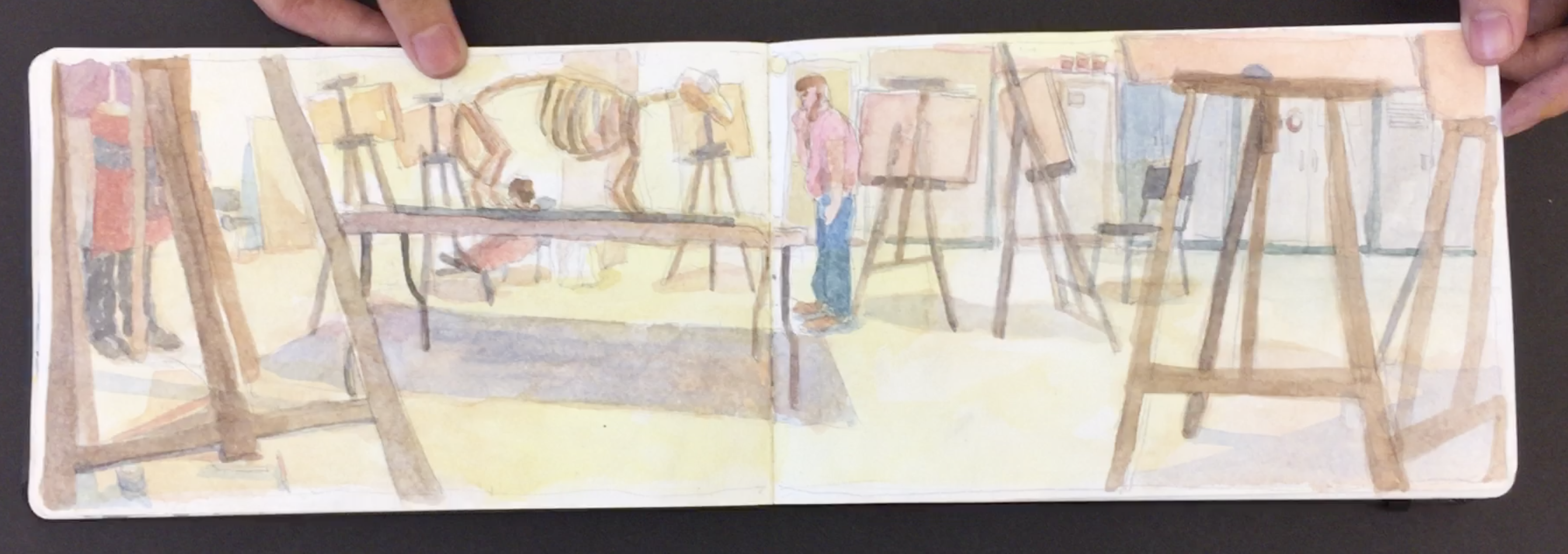
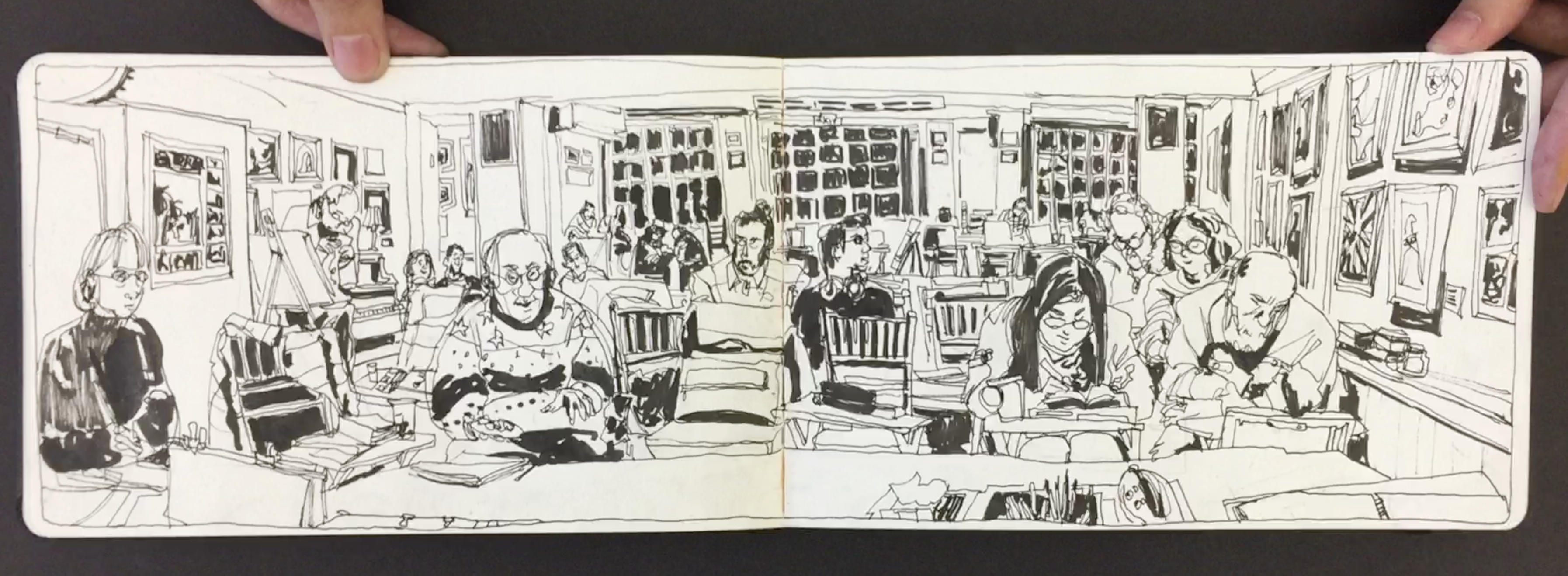
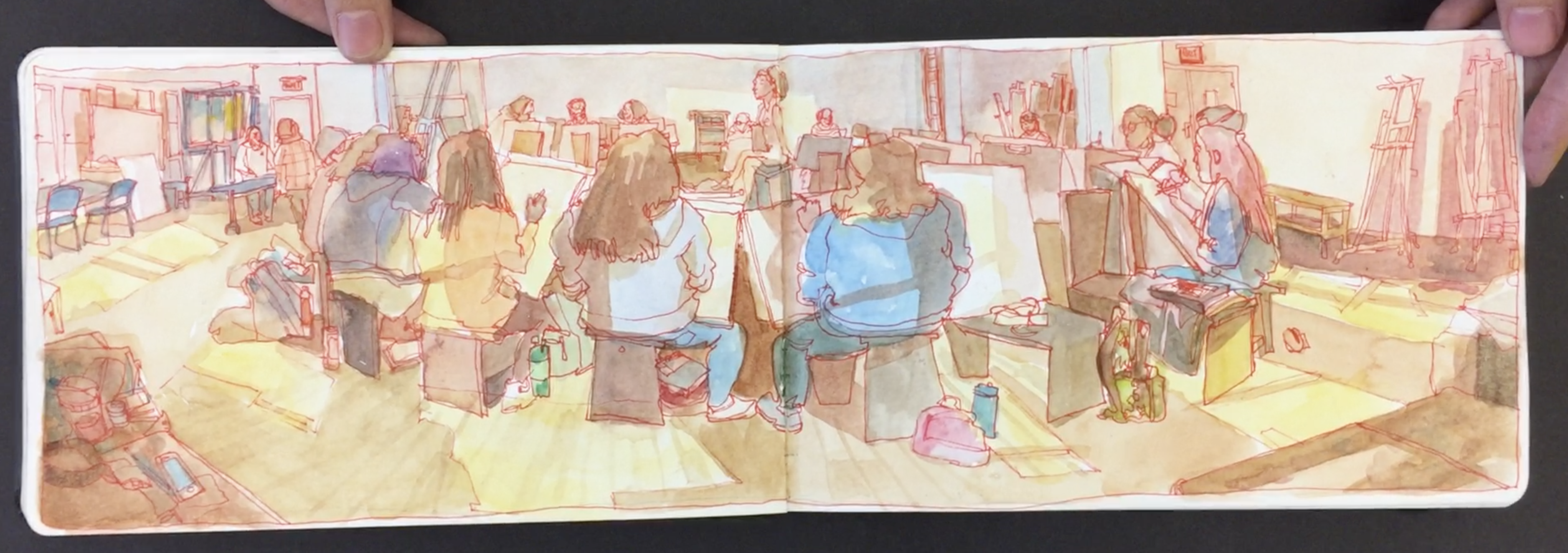
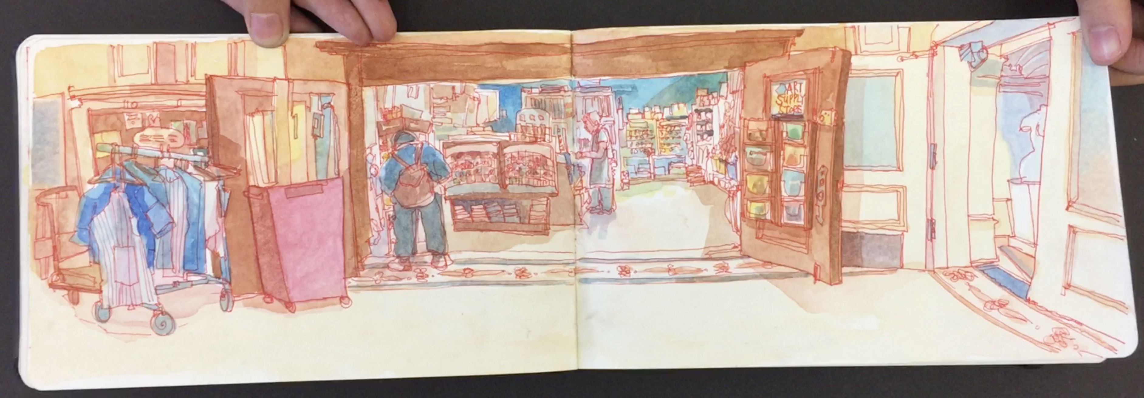
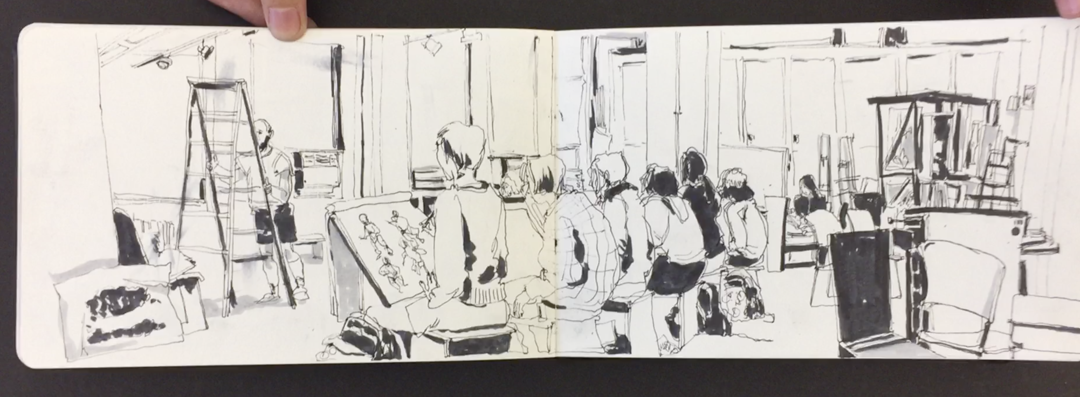
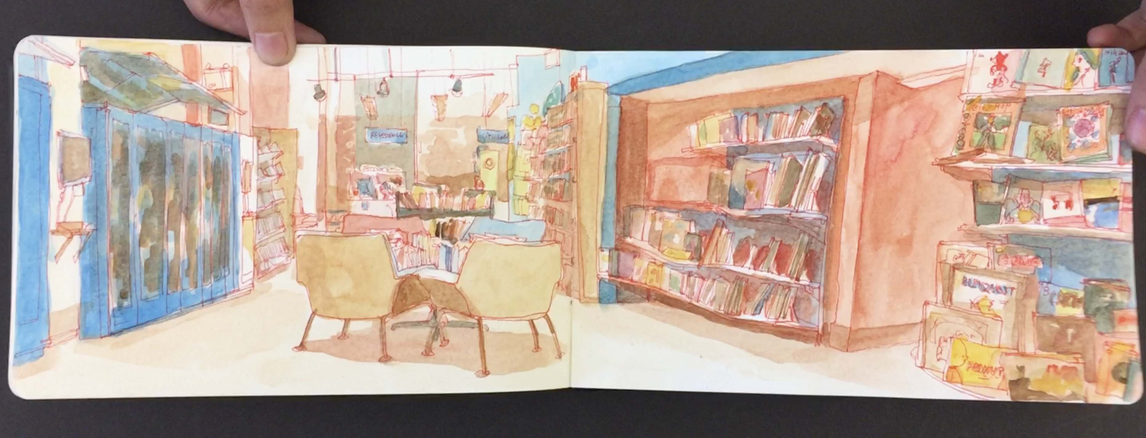
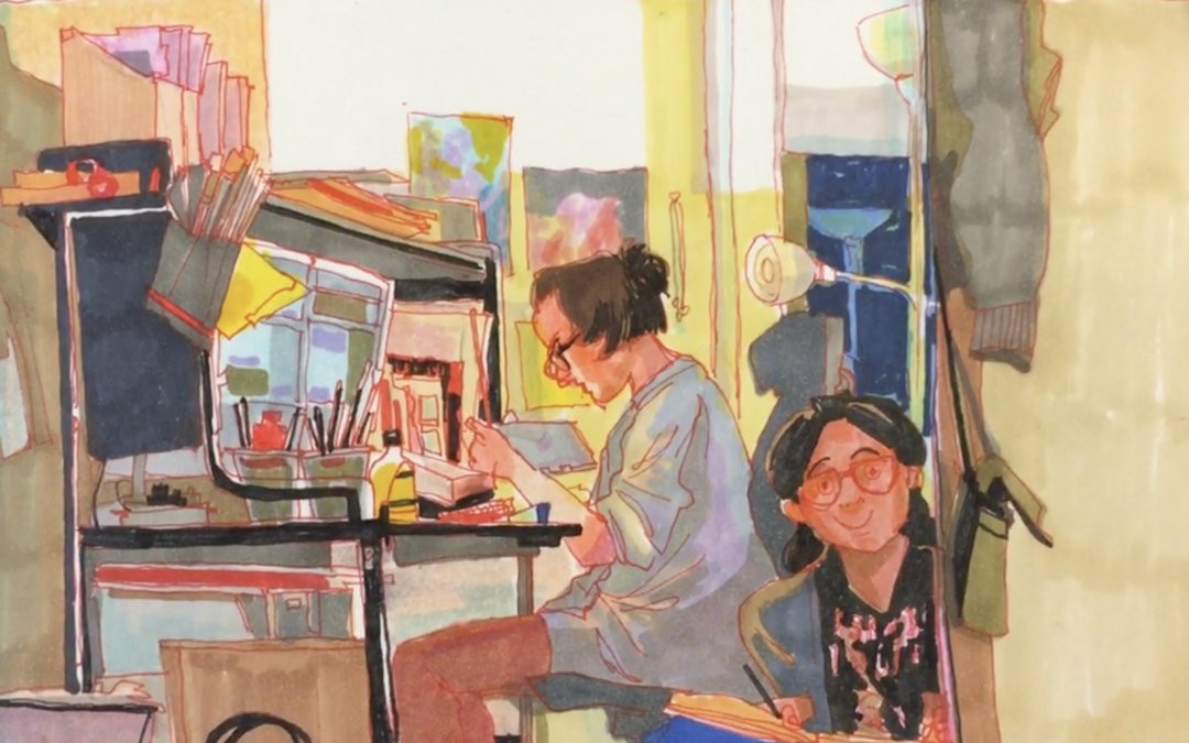
Since the first day I met Phoebe back in 2015 wow has she really grown into an amazing artist. Her location watercolor paintings are just to die for.

The way she crams so much information into one painting in just so awesome. I love sitting with her work investigating all of the incredible details.

I’ve been teaching art since 1997 and every year there are always one or two students that really stand out. Phoebe is certainly a student I will always remember. Both for her extreme work ethic and incredible talent.

It’s unbelievable to see how Phoebe can’t sit down, focus and observe her environment the way that she does. The fact that she has so much self discipline is most impressive to me. In the age of the iPhone we are all sometimes a bit scatterbrained jumping from one thing to another. To see Phoebe focus the way she does gives me much inspiration.

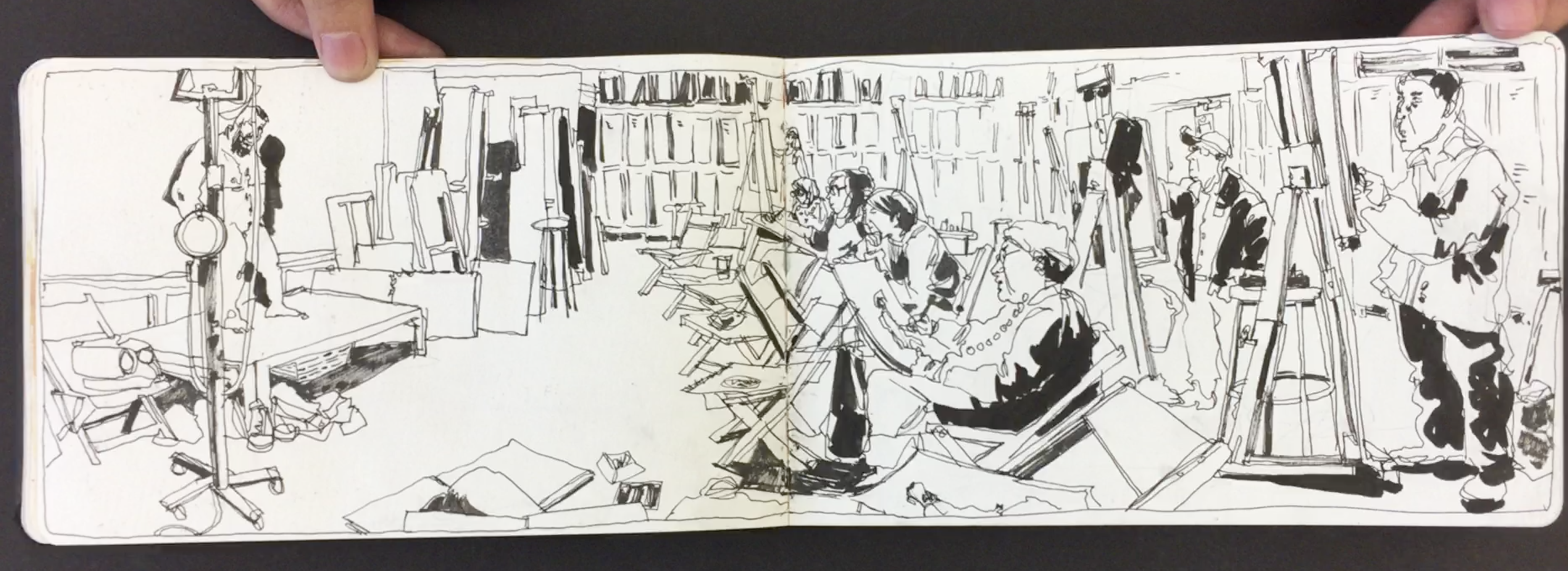
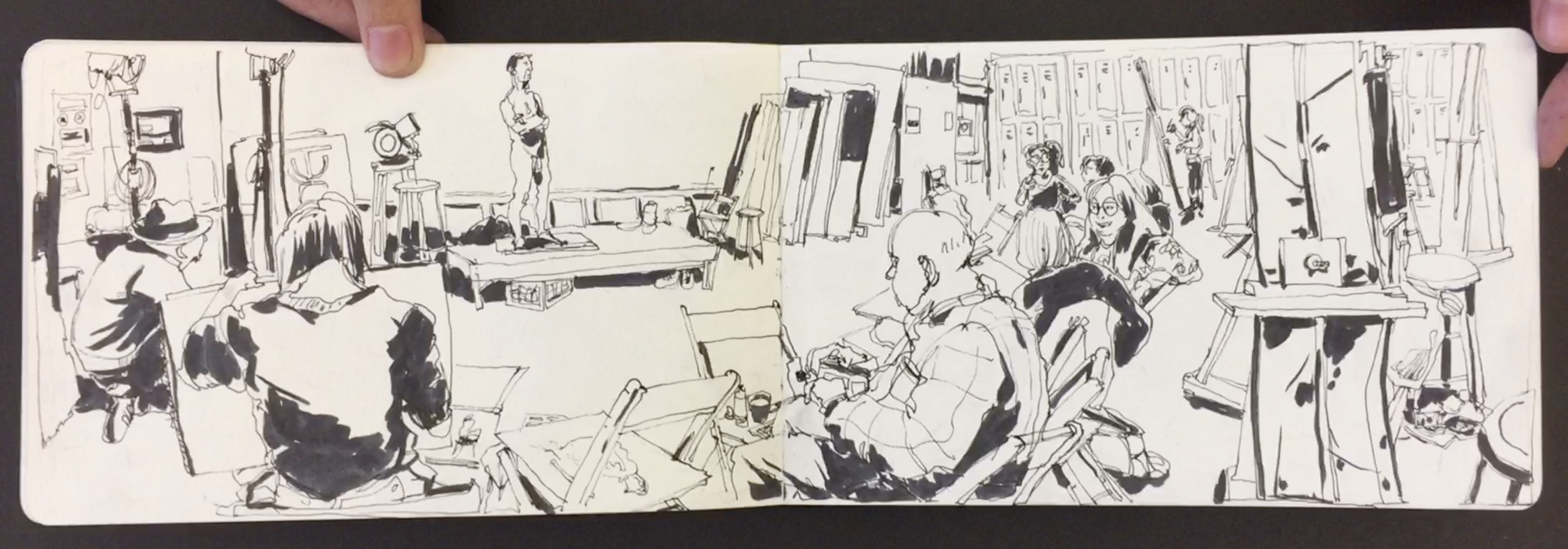
The other great thing about Phoebe has been her willingness to try new things. She is certainly not a one hit wonder. When she first joined my class she was mainly into drawing just short gesture poses. The fact that she is now experimenting with detailed watercolor interiors is a huge leap.

My two key takeaways from Phoebe, one, be willing to get out of your comfort zone and two, develop the self discipline to sit and work.

Thanks for reading!


Check out Phoebe’s Instagram. Thanks again Phoebe for sharing your work. Good luck at Cal-Arts!


Check out stills of Phoebe’s sketchbook below.


Why Are My Portrait Drawings Flat?

Why Are My Portrait Drawings Flat?

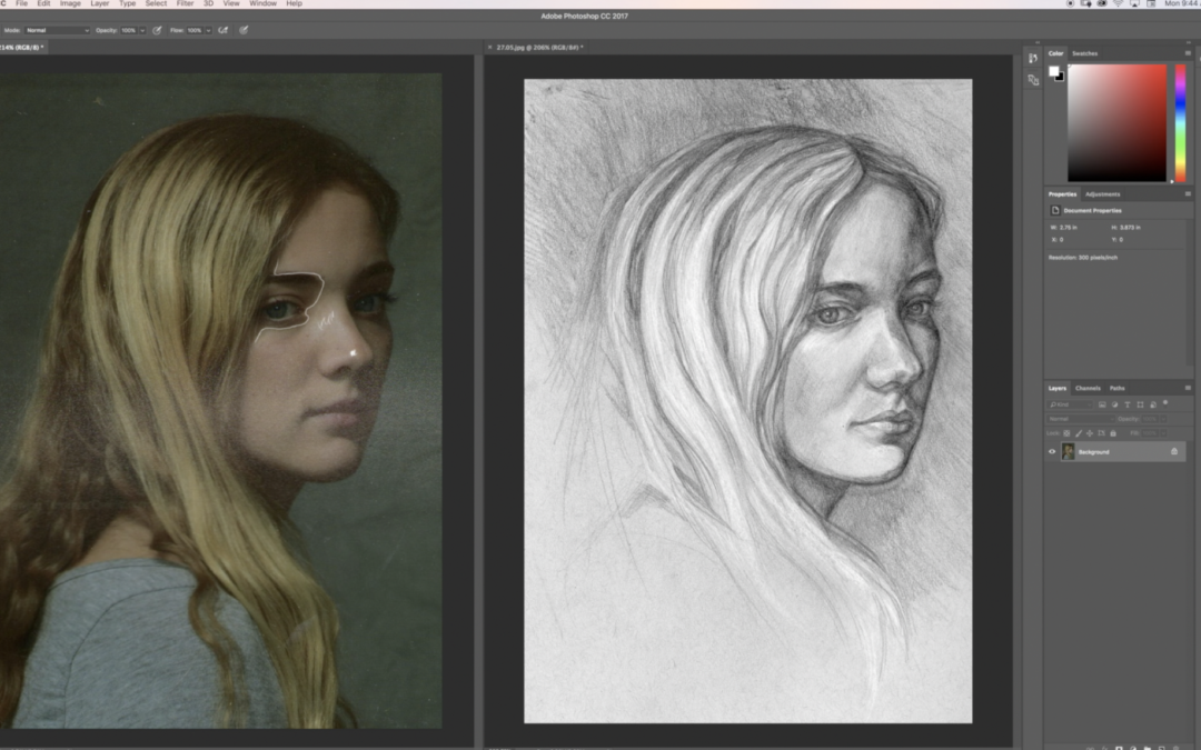
Recently Maria, a member of Drawing Tutorials Online, posted up a portrait drawing for feedback. Her main question, why is the drawing flat?

First off I want to thank you Maria for presenting this awesome teaching opportunity. There are many reasons why a portrait drawing can look flat. Let’s touch on four of them.

  • There is no background tone. With no tone in the background you have no foreground and background. Thus your portrait drawing is just sitting on white paper. Plus a tone or gradation placed in the background can provide you with an opportunity to soften the hair’s edge. Soft hair equals depth.
  • There are no gradations within the skin tone. When you have no shading from the light side to the dark side of the face your portrait drawings will look flat. There is most likely always a light hitting the model. If there is a light source there is definitely a gradation from side to side or top to bottom. Including gradations with create much more three dimension in your portrait drawings.
  • There are too many outlines. Line is awesome. However line alone can be flat in some cases. Drawing with a consistent outline will almost always create a flat outlined look. Combining tone with line promotes much more dimension.
  • There is no modeling with tone. Yes you can model with line. However modeling with line and tone is much better for creating dimension. What exactly are you modeling? You are modeling how light hits the form of the face. Understanding how surface planes work is super important. Understanding how to implement the modeling factors is vital as well.

I want to thank you so much for watching this video critique. If you are looking for a critique on your work just like this one consider a membership to Drawing Tutorials Online.

Our critique gallery is a kind nurturing place for you to learn and grow fast.

Thanks again for watching. Questions or comments, I would love to hear from you! Leave a comment below.

Portrait Drawing Tips – Getting A Likeness

Portrait Drawing Tips – Getting A Likeness

Are you passionate about drawing portraits? Do you strive to draw a likeness correctly? If you do you watching this video will really help you.

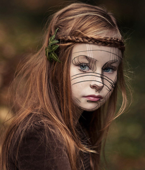
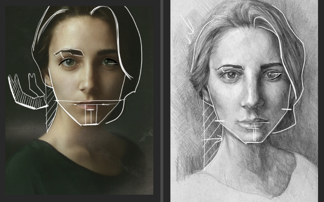
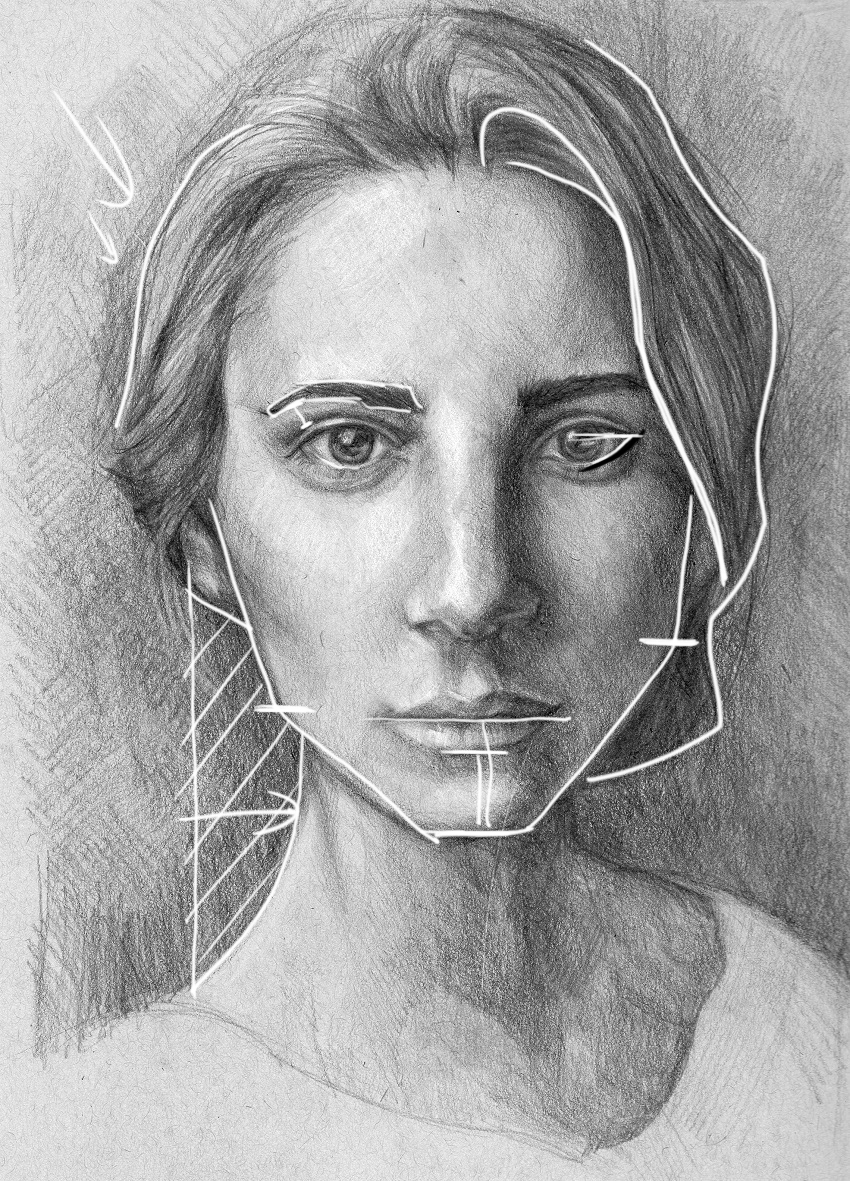
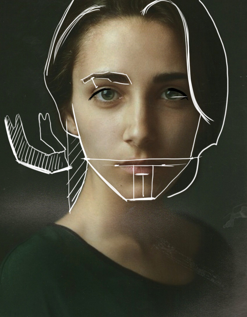
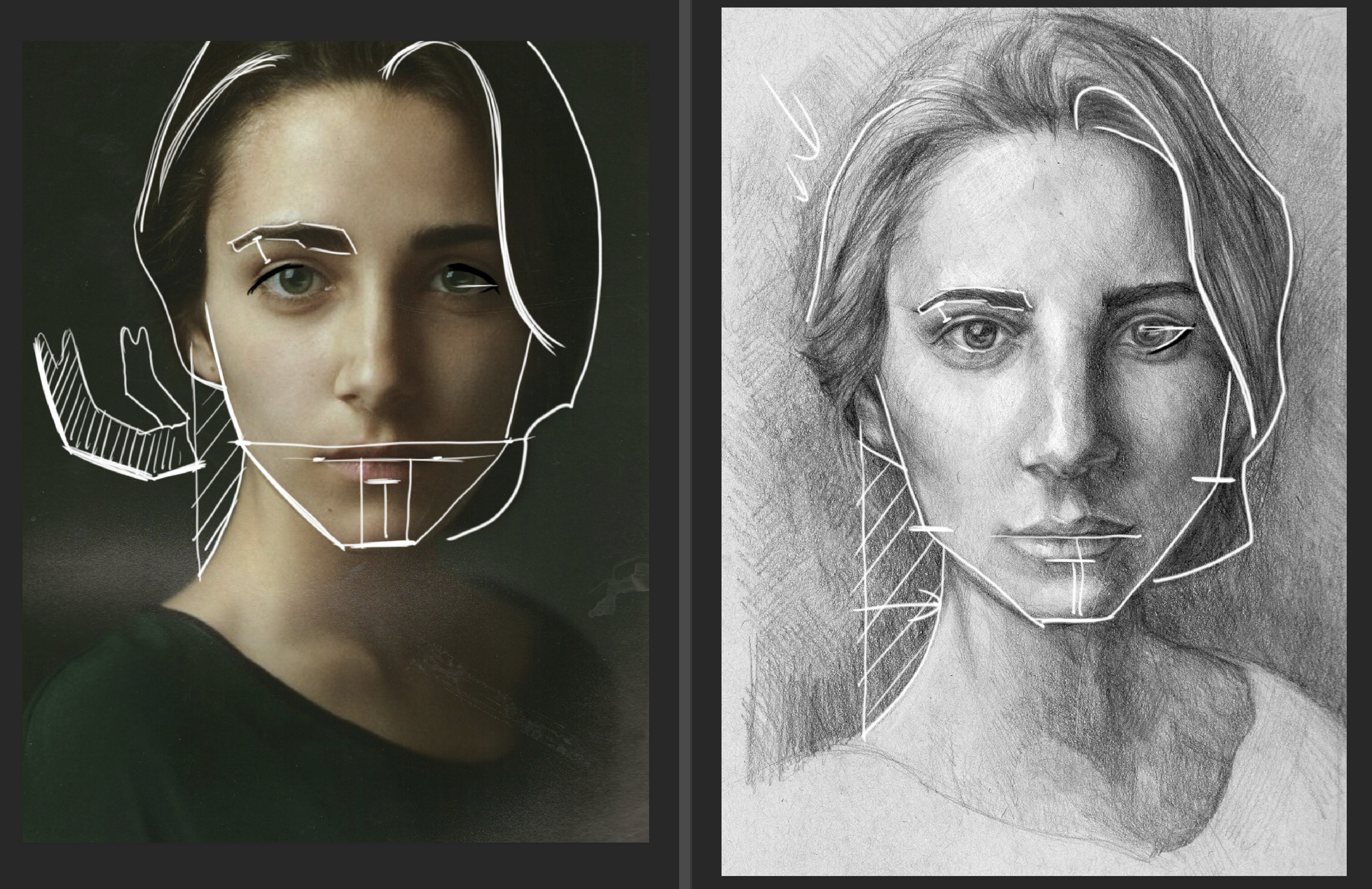
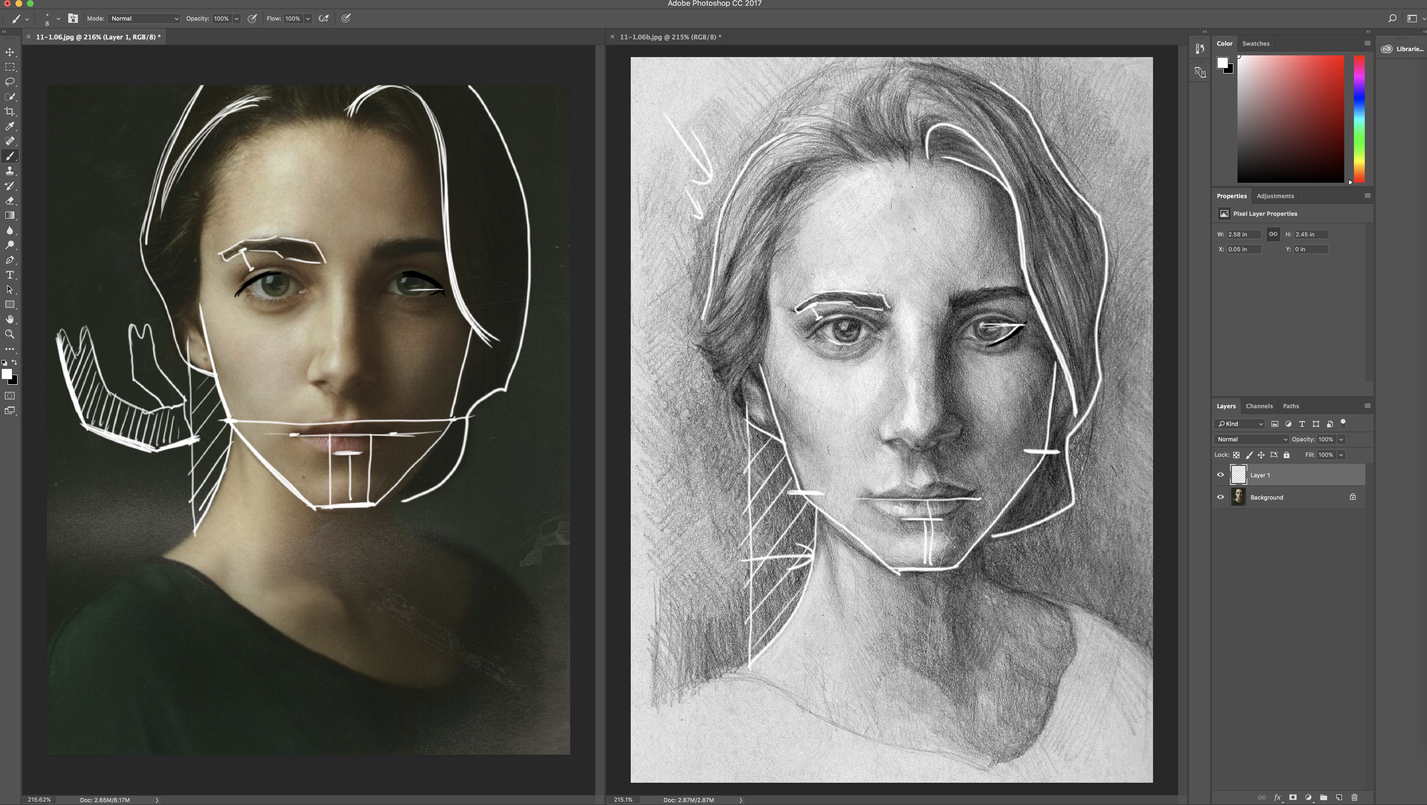
One of the biggest portrait drawing techniques I teach in the classroom is shape of hair versus the shape of face. If you can draw the shape of the models hair, that is half the battle to drawing a likeness.

In this video I talk to the gesture of the models hair as well as the edge. If you can find the gesture or flow to the models hair that will help you tremendously. If you can establish a clear, soft outside edge to the hair that will help you too.

When drawing the jaw bone aka the mandible, with three simple angles, this will go a long way in creating a likeness as well.

Plus measure, measure, then measure some more. There are some simple techniques in the video that I use all the time. I trust if you master these techniques you will be able to draw anyone’s likeness with ease.

Thanks so much for watching!!

To find out how you can get your drawings critiqued visit Drawing Tutorials Online.

Understanding How To See Surface Planes

Understanding How To See Surface Planes

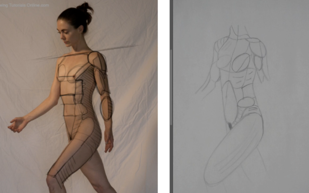
Understanding form is paramount when trying to incorporate three dimension into your figure drawings. We have a pretty cool lesson for members of Drawing Tutorials Online in our Begin Here Step By Step course titled, you guessed it, “Understanding Form”.

I really enjoyed creating this lesson. It brought me back to my George Bridgman days. I’m a big fan of Bridgman. Studying his books over the years has really helped me to understand form.

However trying to see, then draw form from looking at the figure is a whole other can of worms. It’s super hard for a lot of artist to see the exact location of where the front plane meets the side plane. Not to mention all of the layers including shallow ovals.

Hopefully in this video critique you can see how I start to map out the surface planes on this models body. If you struggle with this always try to draw from a model that has form light. Yes you should be able to see surface planes in front light, but form light is best for this exercise.

If you need both feedback and photo reference we are here to help you.

Consider a membership to Drawing Tutorials Online. You can post your art up for a critique and download our figure photo reference!


I’d love to hear what you have to say about this video critique. Leave a comment below!!

Thanks for watching.

Do You Draw With Too Much Detail?

Do You Draw With Too Much Detail?

Have you ever looked at your drawings and something seemed not quite right? The drawing was beautiful but a touch flat. I know I certainly have. Both my paintings and drawings had a flat look at one time.

After many years of trial and error I finally learned why my paintings and drawings looked flat. I was putting much too much detail everywhere. I was putting detail in the light, I was also rendering detail in the shadows. I was putting details in the background as well as the foreground.

If you are detail orientated like me you most likely love to render. You love to put details all over your images. You might want to consider using less detail to create more depth and atmosphere.

For example keep your shadows shapes fairly simple. Add details and texture in the light instead. Another tip, don’t put too many details in the background of your images. Think more shapes in the background, less texture. Render most of the texture and detail in the foreground.

These are simple tips for you to consider in order to create a well balanced drawing or painting. Letting go of detail in these two specific areas, the shadows and background will enable you to create an image that has depth and atmosphere.

If you have questions about this topic leave them in the comments section below.


Are you looking for feedback on your artwork? If you are check out what we have to offer in our membership area.

Thanks for watching!