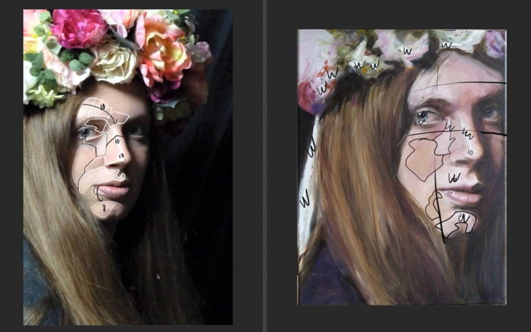
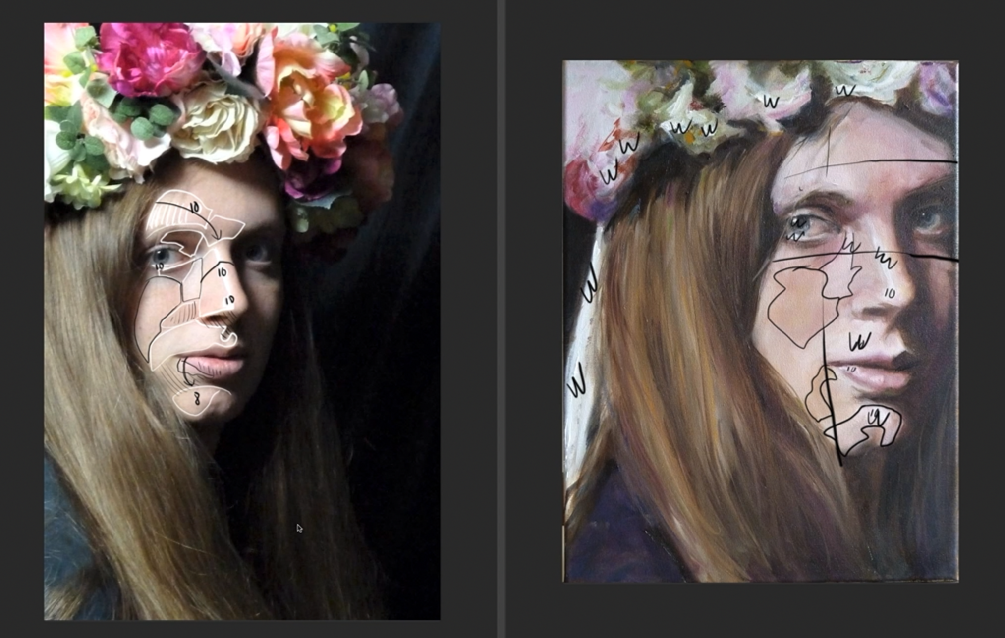
Do you find yourself struggling with painting even looking skin tones? Do the skin tones that you paint look blotchy? Yea sounds awful. I used to struggle with this big time.
Through years of practice and hard work I finally mastered both my palette and my brushes. However back in the day when I was learning how to paint there were no online video tutorials. So hopefully this video critique will provide you with a little bit of a head start in the knowledge department.
Once you understand the concept of keeping your lights light and your darks dark everything gets a little easier to understand. You also want to utilize a gradation in the light of your figure or portrait painting. For example the forehead should be lighter than the chin in form light.
Understand that subtle skin tone value shifts are usually surface plane shifts. You want to paint these value shifts less contrasty, especially in the light. This will help you to avoid drastic value shifts in the light. Drastic value shifts in the light cause blotchy skin tones.
These techniques apply to pencil drawing, traditional painting as well as digital painting. Of course practice makes perfect so get at it.
Have questions about your artwork? We are here to help. A subscription to Drawing Tutorials Online will get you instant access to our member Critique Gallery. We film member critiques every Monday.
Last week I started teaching my students all about how light hits form. Ultimately that involves shading. So the question I asked them after their first shading exercise was, are you light handed or heavy handed? There were some insane results. It was a pretty fun exercise.
How about you? When you shade something light in your drawing does it always look a little too dark? How about the opposite? When you are drawing something very dark, for example a characters dark shirt, do you make it look completely too light?
When I was a college student I was super heavy handed. Everything I drew and painted was super dark and super contrasty. Let’s just say I didn’t have a clue about the value ratios. I wasn’t even close to developing my touch yet.
That’s why I wanted to share this video critique with you. It absolutely highlights the need to understand and apply the value ratios.
Try these two simple exercises below.
Practice shading an egg resting on white copy paper. Place it near a window for a soft light source. This is a great exercise to see if you can control your light values. There should be no darks on or near the egg.
Now do the opposite, shade something that is a dark value. It could be something as simple as a dark coffee mug. Once again make sure there is a light source. You definitely want a light side and a shadow side on the object. Apply the value ratio rules spoken to in the video critique. Use middle tones for the light side of the object. The light side should have no whites.
There are many variables. Is the object you are drawing shinny and reflective? Well then there will be very light highlights even on a dark object. So whichever object you choose to draw make sure it has a matte non reflective surface. This will help you be true to the exercise.
Lastly make sure your light source is not too powerful. Don’t use a powerful spotlight. That will change the value ratios as well. A normal lamp or a north facing window would be perfect. If you want to learn more about how to control the value ratios consider a subscription to Drawing Tutorials Online. If painting is your thing we have an extensive list of tutorials covering this topic over at our sister site Painting Tutorials Online.
Let us know what you think. Leave a comment below..