First Lines When Drawing A Portrait – Process

First Lines When Drawing A Portrait – Process

I just recently added a brand new portrait drawing course in the member’s area over at Drawings Tutorials Online. This particular course focuses on drawing smaller portraits.

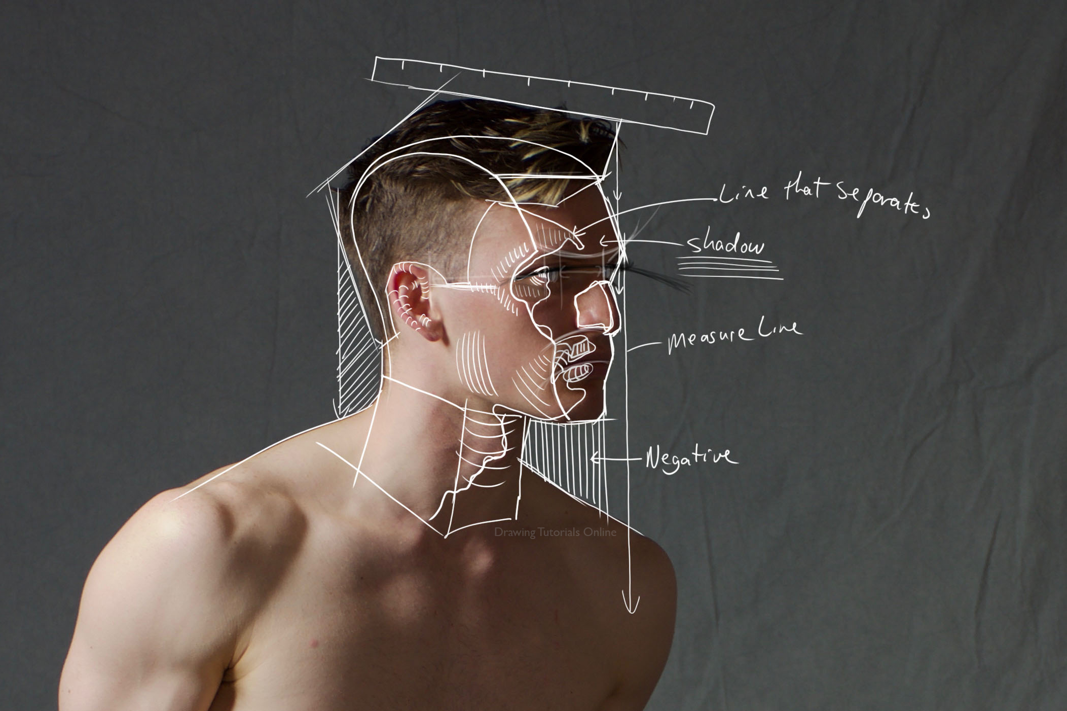
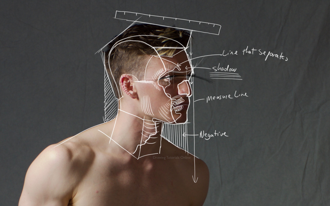
With every course, I like to review certain techniques via a screencast video. This particular video reviewed how I start a portrait drawing. Especially a smaller one, say about two inches tall.

I always start with the angles, combined with measure lines and negative space. Nothing new right?

No, it’s not new, I have been teaching these same techniques for many years. Unfortunately, I still see many artists who struggle with drawing a likeness. Don’t fall into the trap of just knowing the techniques because you have heard about them.

You have to constantly practice these portrait drawing techniques over and over again until you master them. It’s not enough to just know them in theory. You need to put them into practice.

Just replace the white lines in the video within photoshop with pencil lines on your drawing pad. Start off with light pressure at first.

Enjoy the video.


If you are interested in learning many more techniques similar to these consider a membership to Drawing Tutorials Online.


Do You Draw With Too Much Detail?

Do You Draw With Too Much Detail?

Have you ever looked at your drawings and something seemed not quite right? The drawing was beautiful but a touch flat. I know I certainly have. Both my paintings and drawings had a flat look at one time.

After many years of trial and error I finally learned why my paintings and drawings looked flat. I was putting much too much detail everywhere. I was putting detail in the light, I was also rendering detail in the shadows. I was putting details in the background as well as the foreground.

If you are detail orientated like me you most likely love to render. You love to put details all over your images. You might want to consider using less detail to create more depth and atmosphere.

For example keep your shadows shapes fairly simple. Add details and texture in the light instead. Another tip, don’t put too many details in the background of your images. Think more shapes in the background, less texture. Render most of the texture and detail in the foreground.

These are simple tips for you to consider in order to create a well balanced drawing or painting. Letting go of detail in these two specific areas, the shadows and background will enable you to create an image that has depth and atmosphere.

If you have questions about this topic leave them in the comments section below.


Are you looking for feedback on your artwork? If you are check out what we have to offer in our membership area.

Thanks for watching!