Do you love figure drawing as much as I do? I’m certainly most passionate about drawing the figure. But when I first started my drawings looked flat. My figure drawings had hard edged outlines.
Back in the day when I first started out as an illustrator I certainly wasn’t getting a lot of work. My agents introduced me to one of their established illustrators. He was so busy they suggested that I help him out while they were trying to get me work.
I agreed and I’m glad I did. He turned me onto the whole whole convex line thing. He actually did it through painting. Specifically portraits. It was like the floodgates of form driven art had opened up for me. That old saying is pretty true, you don’t know what you don’t know. All of my drawings had that awful hard edged flat outline. I also outlined items in my paintings too.
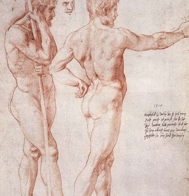
Now through years of life drawing I almost take for granted the whole convex line thing. If you study the work of the old masters you’ll see what I mean. The line they use on the edge of the body roles into the figure creating three dimensional form. Just like I demonstrated in the video critique.
I highly recommend that you complete a copy of the old master drawing up above. You can download a copy of the original here. Then compare the copy to your own work. You will immediately notice the difference. Especially in the contour line.
Raphael is certainly a master at merging his line and tone.
Knowing where to put these form lines in and around the figure can be a bit confusing. Especially if you haven’t taken the time to study anatomy. I see this big time with my students. They are freshman, so most of them haven’t had the chance yet to study anatomy. When they draw a clothed figure I see that they use form driven convex line, but drawing the figure, no way. It just doesn’t click for them.
I suggest to my students to study one bone a week. Where you see bone close to the surface of the skin, that’s where the convex lines are. Mostly at the joints of the body. The knee, ankle, elbow etc.
So be conscious of your line. Study anatomy and use form driven convex line to create three dimension within your drawings.
Thanks for reading.
Looking to learn more about line? We have a whole mini course on how to utilize line over at Drawing Tutorials Online.
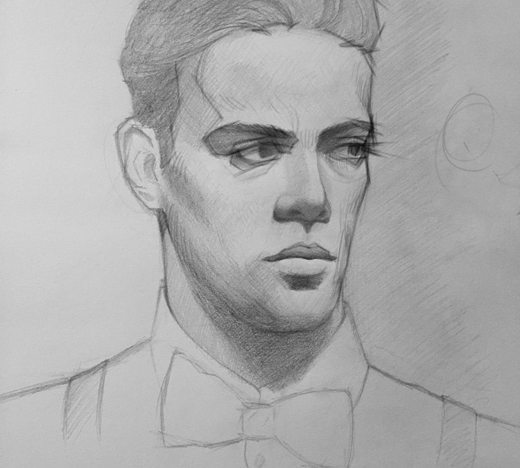
Have you ever looked at your portrait drawings and wonder why they don’t look realistic? Part of the reason they do not look realistic is because the edges within and around the portrait are too simplistic. Specifically the edges of the eyes, edges of the hair and the edges of the face in relationship to the background.
When it gets down to brass tacks, there aren’t enough angles within the drawing. There are too many macro angles and not enough micro angles. Think of Macro angles as broad strokes. Think of micro angles as detailed rendering with a fine brush.
One definitely needs to look more at the subject they are drawing. In this case a portrait of a male model drawn from life. You definitely want to get into the habit of looking at what you are drawing at least 50 to 60 percent of the time. A lot of artists have unintentionally developed the very bad habit of looking down at their pad too much.
Another contributing factor to overly simplistic edges, sitting too far away from the subject. In this case once again a male model drawn from life. When drawing someone’s portrait from life you want to be no further than six to eight feet away from the model.
Think about it, if you are trying to draw an iris which is a half an inch wide, sitting ten to fourteen feet away is not going to help you.
So the next time you analyze your drawings ask yourself the question, do I have enough angles? Are my edges too simplistic looking? Do I need to make my drawings more complicated by adding more angles to my edges?
Let us know what you think. Leave us a comment below.
If you need a helping hand analyzing your own artwork take a peek at our One Time Coaching. We can help you figure out how to take your drawings up to higher level of quality today!
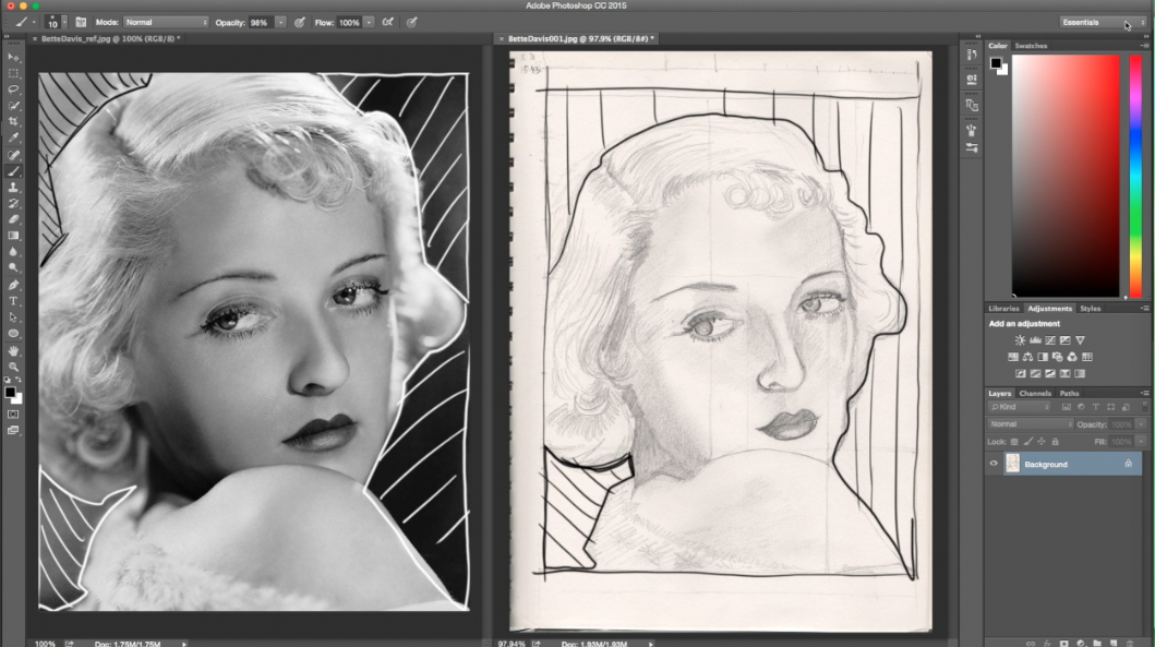
Recently a member posted up a drawing to our Group Coaching Gallery over at Drawing Tutorials Online. The question this member posed was, how do I draw a likeness of Bette Davis in under an hour?
Great question! I’m guessing you have drawn a portrait or two. I guessing you didn’t get the likeness every time. I know there have been many times that I struggled with drawing the likeness of someone too.
There is a combination of drawing techniques that you can use to help solve this problem.
The first technique, draw a boarder. Draw a boarder on your paper to the exact proportions of the boarder of your portrait reference. So if the photo reference has a boarder of 8 x 10, draw an 8 x 10 boarder on your paper. Yes use an old school ruler.
Second, place your photo reference right next to your drawing. A big mistake I see, many artists keep there photo reference far away from their drawing. Keep it super close.
Third, draw the abstract negative shapes that surround the head and shoulders. If these abstract negative shapes are not correct, you guessed it, no bueno. You will never get the likeness of someone’s portrait if you do not draw these negative shapes correctly first.
Fourth technique, draw angles or use a continuous line to separate the hair from the face. Just being conscious of drawing the shape of the hair verses the shape of the face is half of the battle.
Fifth, definitely start to draw in the shadow shapes of both the hair and face. Put some tone in. Don’t make the mistake of just drawing with line alone.
In terms of the features, it totally depends on the type of light. Was the portrait reference taken in form light, rim light or front light? Each one of these light sources requires a different skill set to get the likeness.
So the next time your want to draw Bette Davis or the girl next door start with a boarder.
This techniques works. It has helped many of my coaching students. It has taken the mystery out of how to draw a likeness when drawing a portrait.
Did you need help with learning how to draw a better portrait? We have dozen’s of portrait drawing tutorials within our member area at Drawing Tutorials Online. Those tutorials combined with weekly coaching will help you improve with speed and confidence.
Last week I started teaching my students all about how light hits form. Ultimately that involves shading. So the question I asked them after their first shading exercise was, are you light handed or heavy handed? There were some insane results. It was a pretty fun exercise.
How about you? When you shade something light in your drawing does it always look a little too dark? How about the opposite? When you are drawing something very dark, for example a characters dark shirt, do you make it look completely too light?
When I was a college student I was super heavy handed. Everything I drew and painted was super dark and super contrasty. Let’s just say I didn’t have a clue about the value ratios. I wasn’t even close to developing my touch yet.
That’s why I wanted to share this video critique with you. It absolutely highlights the need to understand and apply the value ratios.
Try these two simple exercises below.
Practice shading an egg resting on white copy paper. Place it near a window for a soft light source. This is a great exercise to see if you can control your light values. There should be no darks on or near the egg.
Now do the opposite, shade something that is a dark value. It could be something as simple as a dark coffee mug. Once again make sure there is a light source. You definitely want a light side and a shadow side on the object. Apply the value ratio rules spoken to in the video critique. Use middle tones for the light side of the object. The light side should have no whites.
There are many variables. Is the object you are drawing shinny and reflective? Well then there will be very light highlights even on a dark object. So whichever object you choose to draw make sure it has a matte non reflective surface. This will help you be true to the exercise.
Lastly make sure your light source is not too powerful. Don’t use a powerful spotlight. That will change the value ratios as well. A normal lamp or a north facing window would be perfect. If you want to learn more about how to control the value ratios consider a subscription to Drawing Tutorials Online. If painting is your thing we have an extensive list of tutorials covering this topic over at our sister site Painting Tutorials Online.
Let us know what you think. Leave a comment below..
Do you know how to tell stories with your images? Whether it be a drawing or a painting, being able to control where the viewer looks first, second and third is crucial for storytelling. A lot of artists don’t even take into consideration where the viewer looks first. Now I’m not talking about a figure drawing, although this applies there too.
I’m talking about a finished piece of art.
A finished illustration, a commissioned portrait as well as fine art for a gallery show. The difference between a beautiful piece of art and one that tells a story is all about controlling the viewers eye. How do you control where the viewer looks first? Well there are many ways, controlling color, texture and edges are a few.
But for today we are talking to value contrast. You control where the viewer looks first by placing a light next to a dark. A lot of artists do this by accident. A person within their painting could have white socks with black shoes. Where do you think the viewers eye is going? You bet, the persons shoes. Unless those shoes are telling a story, you do not want the viewer to look at the bottom of your image first.
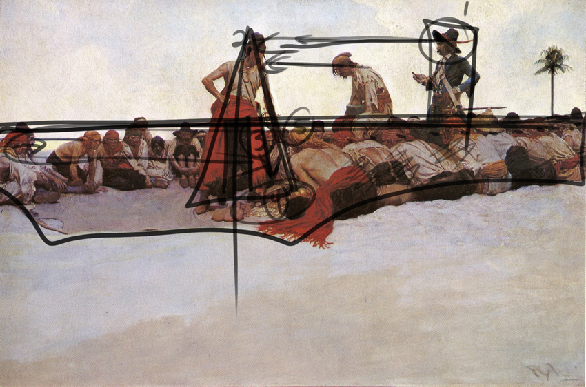
Pyle was a master illustrator. Illustrators tell stories usually with one image. It’s hard. But just by utilizing this simple image making technique you gain some sense of control. You can see it right away. The pirate with the dark hat against the empty sky is where the viewer looks first. Now if his hat was a middle tone next to a light middle tone sky, well, you get the picture.
So just remember. To control where the viewer looks first in your image, drawing or painting, place your lightest light right next to your darkest dark. Where you want the viewer to look last, use similar values, middle tone next to middle tone.
Try analyzing some of your own artwork. The first thing you can try is to turn your image upside down. Where do you look first?
Try placing your image on an easel or on the floor leaning against a wall. Now walk at least ten to fifteen feet away, turn around, where do you look first?
Lastly do the same thing, maybe place your image at the end of dark hallway, dim the lights. Which part of your image attracts your eye? If you said the elbow, you need to start rethinking how you approach image making. Everything counts.
If you need help in this area there is help on the way. I put together a package of three Master Class videos. I analyze the work of three incredible artists breaking some of their best images down in detail. You will learn how to incorporate these very cool compositional techniques into your own art.
Plus I made it incredibly inexpensive for you with no monthly commitment.
Thanks for reading. Now get working on telling some really inspiring stories!
A question I get asked all the time, why does my art look flat? Why doesn’t my image have any pop?
Most members of Drawing Tutorials Online draw and or paint for a hobby. It’s terrible to put so much time and effort into a piece of art only to realize it has that flat faded look. Of course you most likely notice this when the drawing or painting is complete. After that you feel as though you wasted your time working on something that you are not happy with.
There are multiple factors that can contribute to your artwork looking flat and faded. Paper pencil combinations are a major contributing factor. Perhaps you are drawing with a 2H pencil on paper that has no texture for the pencil to grab onto.
Concerning a painting there too could be a multitude of reasons why your image looks flat and faded. Perhaps you haven’t cleaned your palette nor brushes during a long painting session. That could contribute to everything becoming muddy, therefore flat.
The antidote to a flat faded image is planning out a value study ahead of time. You don’t have to spend a lot of time doing this. You literary can sketch out a small one inch by two inch value study in your sketchbook. You’ll definitely want to use a soft 2B pencil.
When you work on your value study force yourself to use only three values. Use a dark, middle tone and a light value. At first this might seem super difficult to condense everything into three values. However the goal is to simplify, figuring everything out ahead of time. So when you start working on your final there won’t be any disappointing surprises.
If three values is too restricting for you then try a five value study.
Just be self aware. Are you light handed or heavy handed? Just being conscious of the three value system will solve this issue.
Now of course I can go on forever here about art materials. But the three value study transcends art materials. It works with any traditional medium, even digital.
So the next time you spend you Saturday working on a drawing or painting, take a moment to plan out a value study. You can spend five minutes on it or fifty. Depending on your process and style.
If you want in depth instruction on how to utilize three value studies, color studies, value patterns, compositional shapes and a whole lot more take a closer look at our Master Class Series.
For the price of two Starbucks coffees you can learn some pretty incredible image making techniques. Your drawings and paintings will never look flat and faded again.