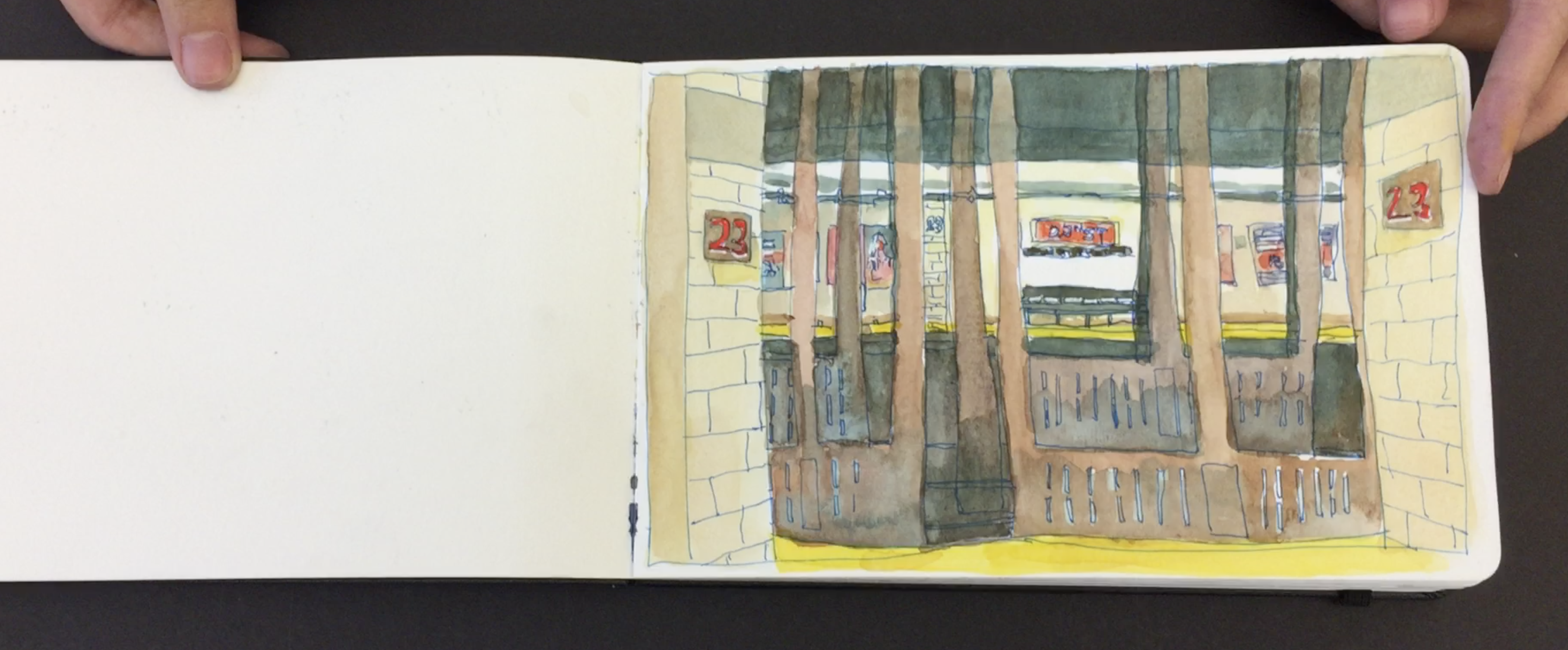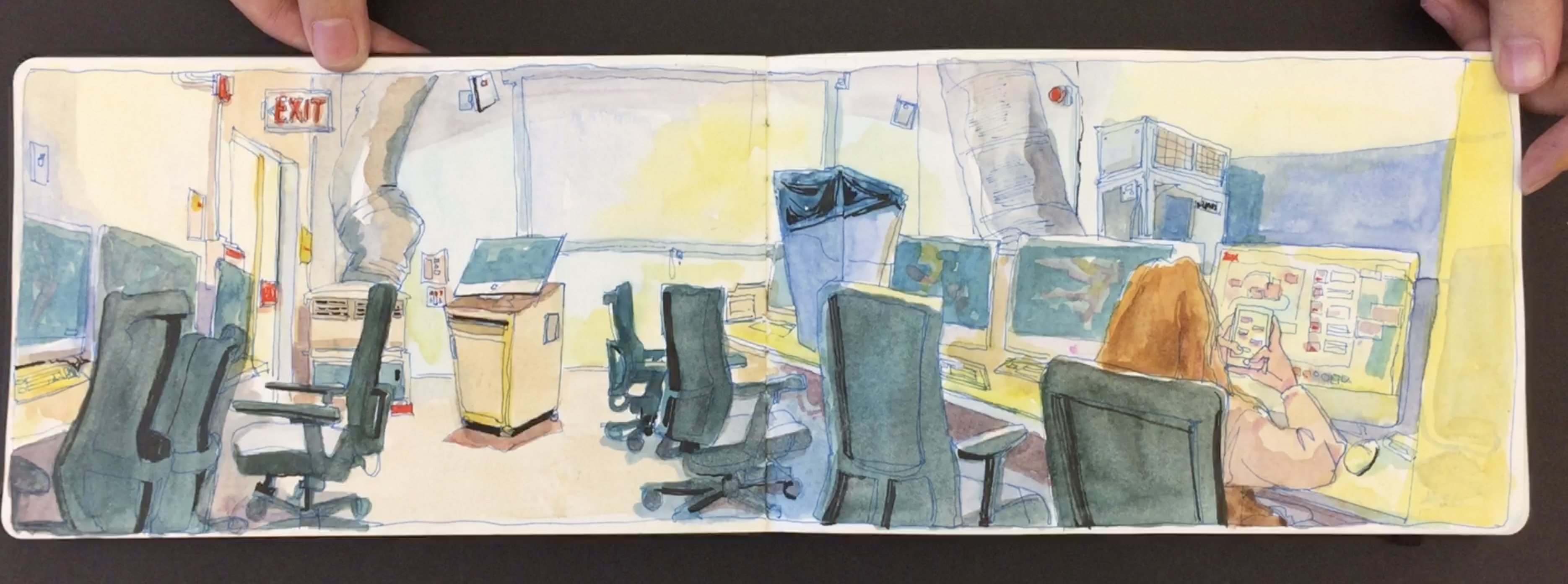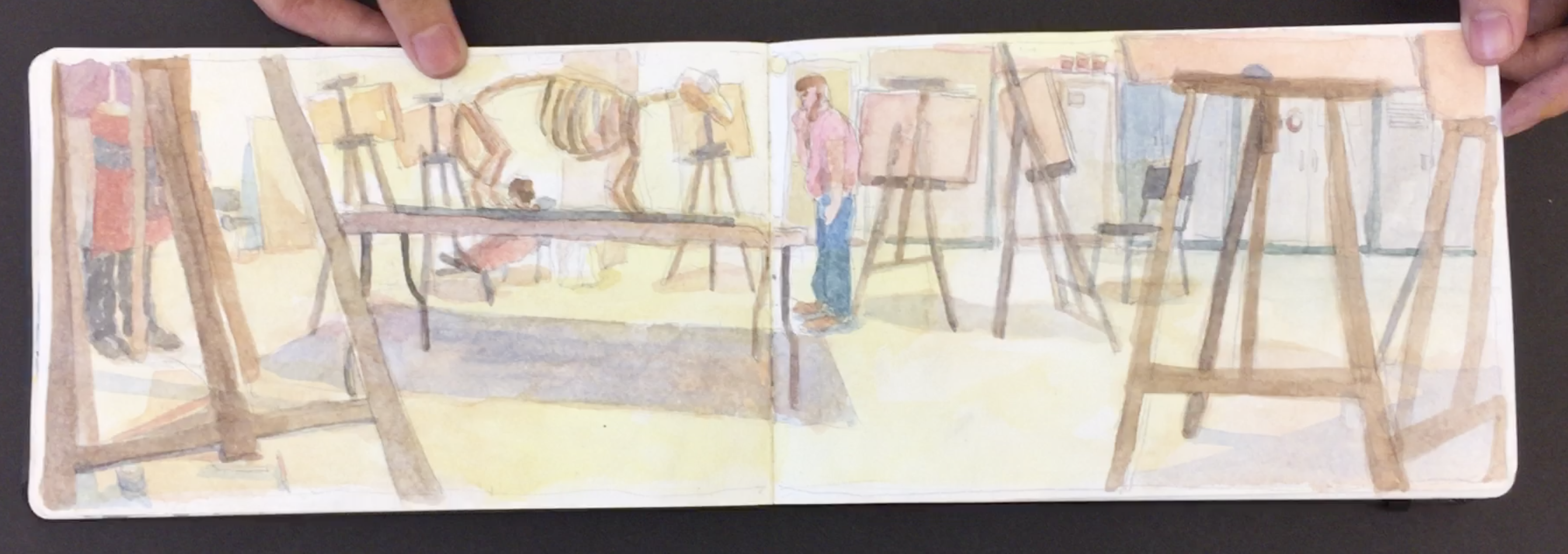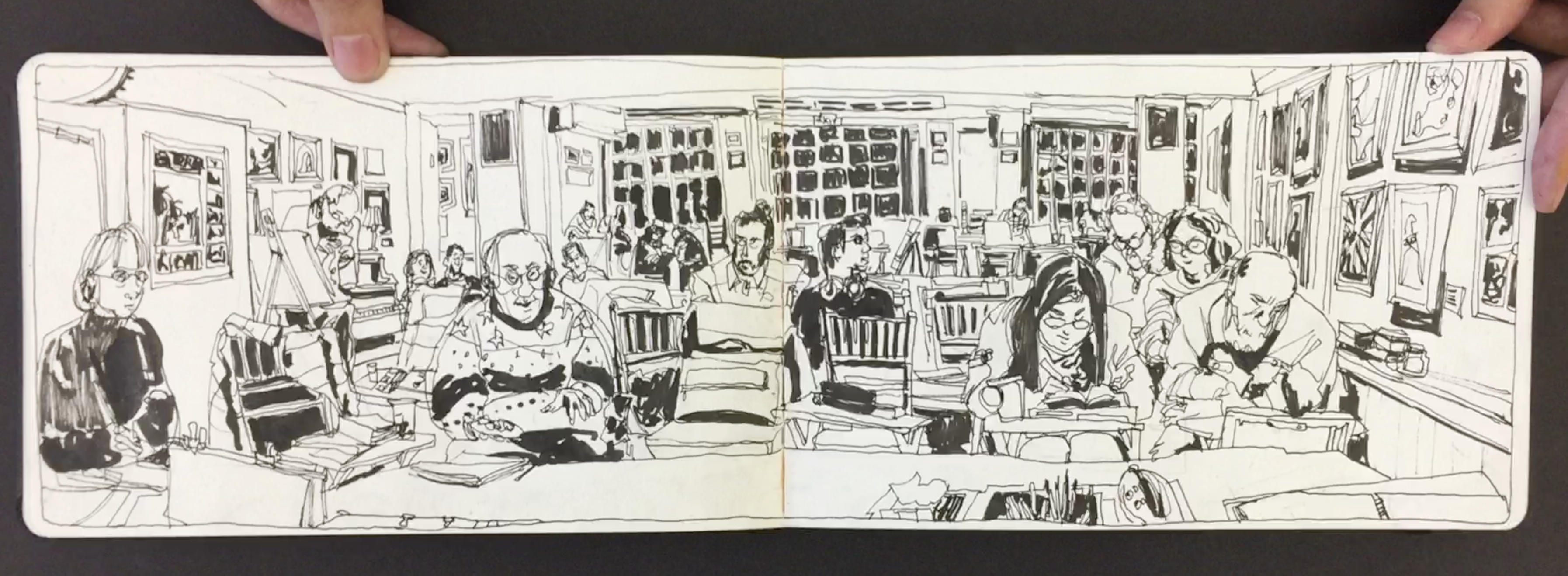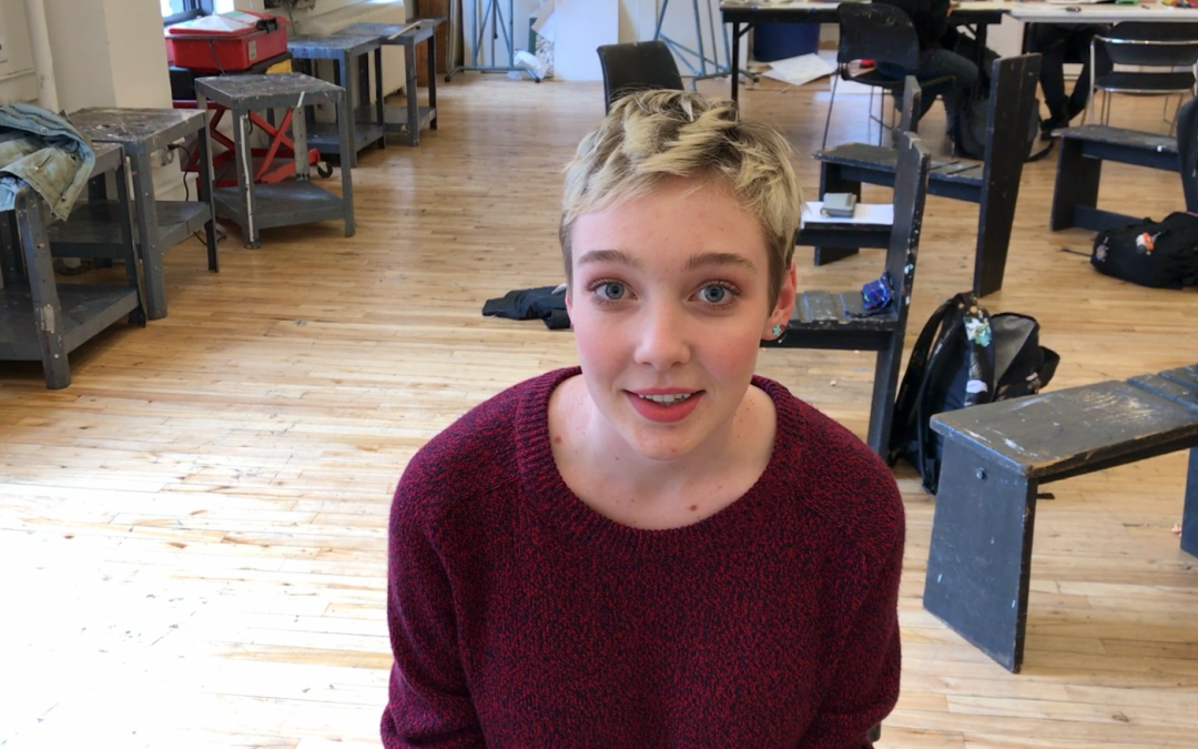
Phoebe’s Sketchbook Part III – Incredible Interiors
Since the first day I met Phoebe back in 2015 wow has she really grown into an amazing artist. Her location watercolor paintings are just to die for.
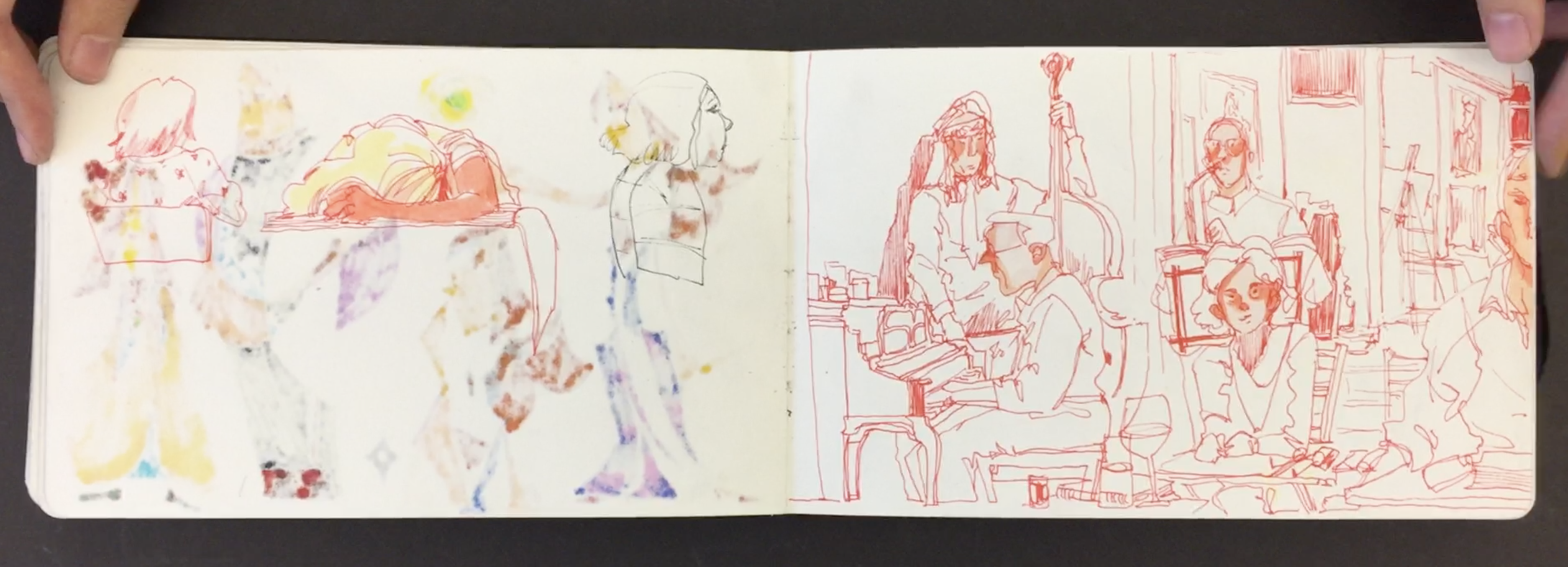
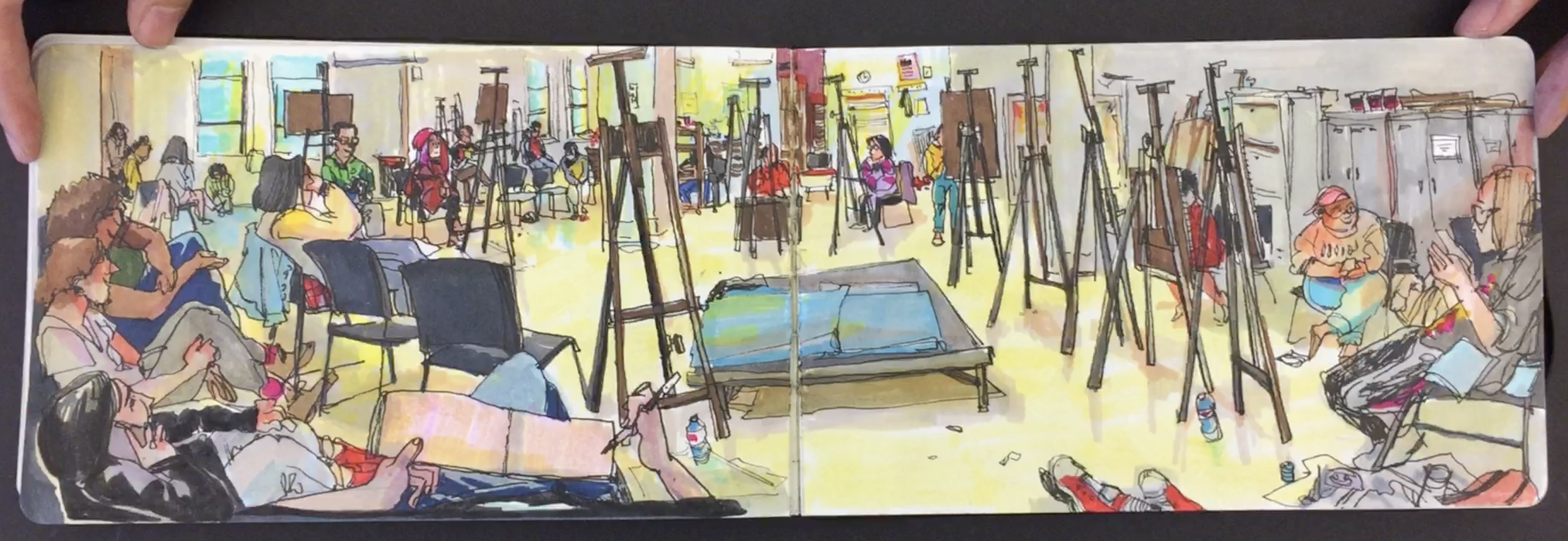
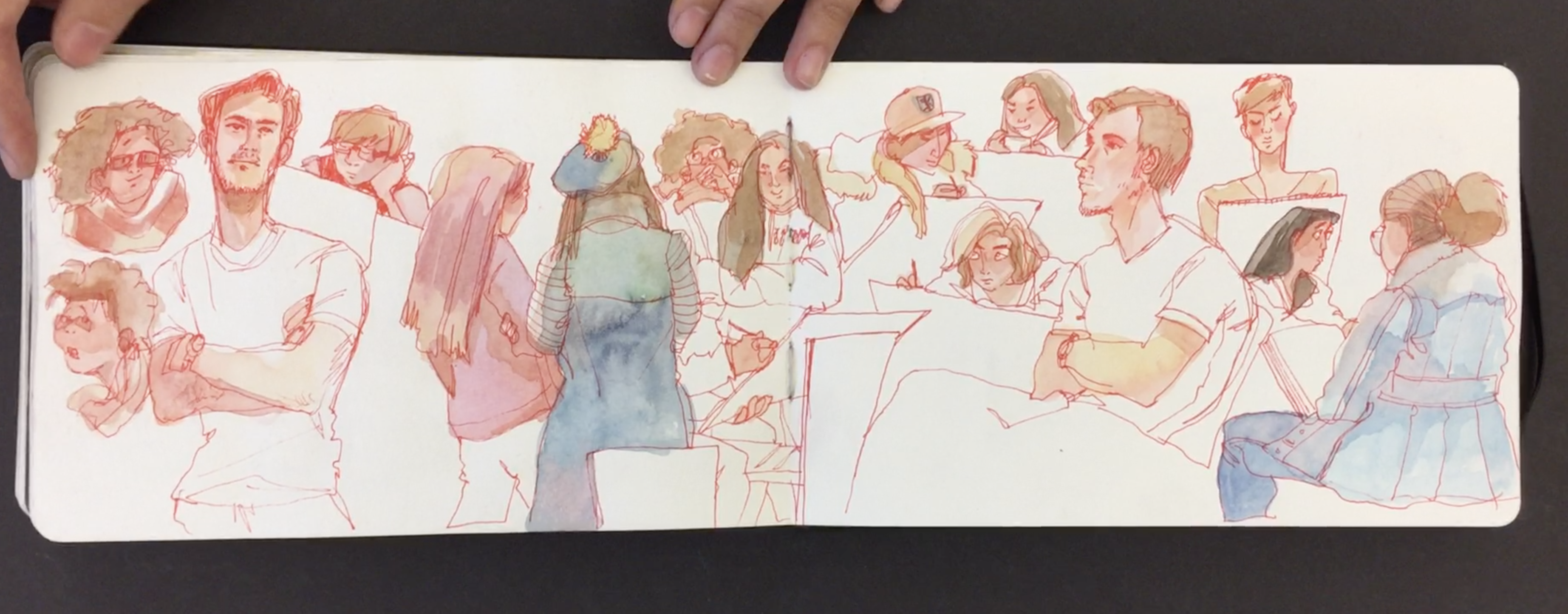
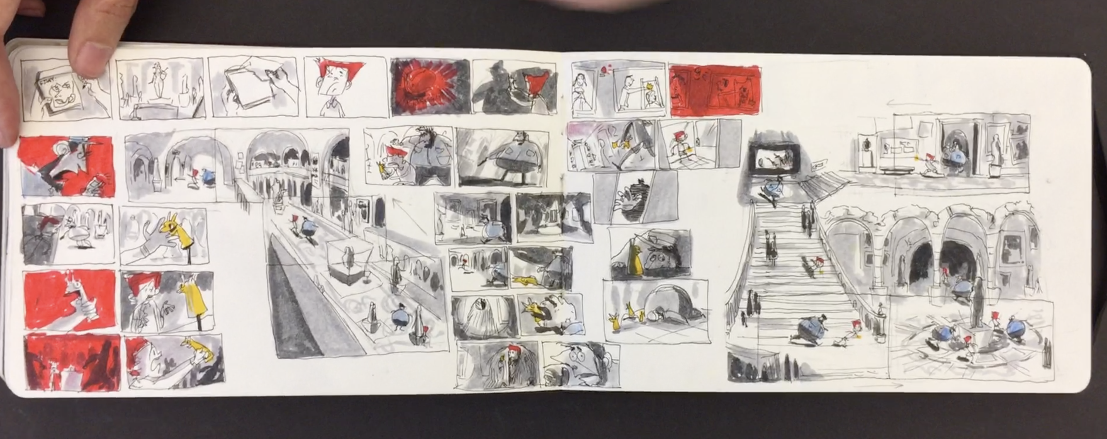
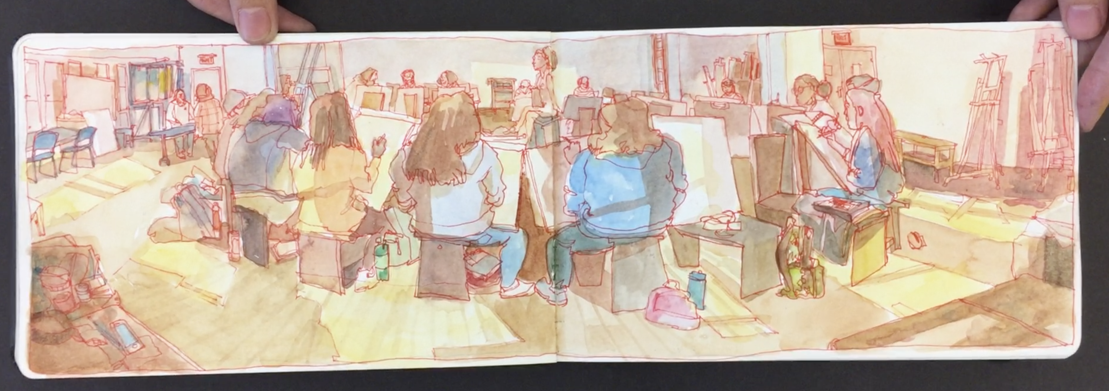
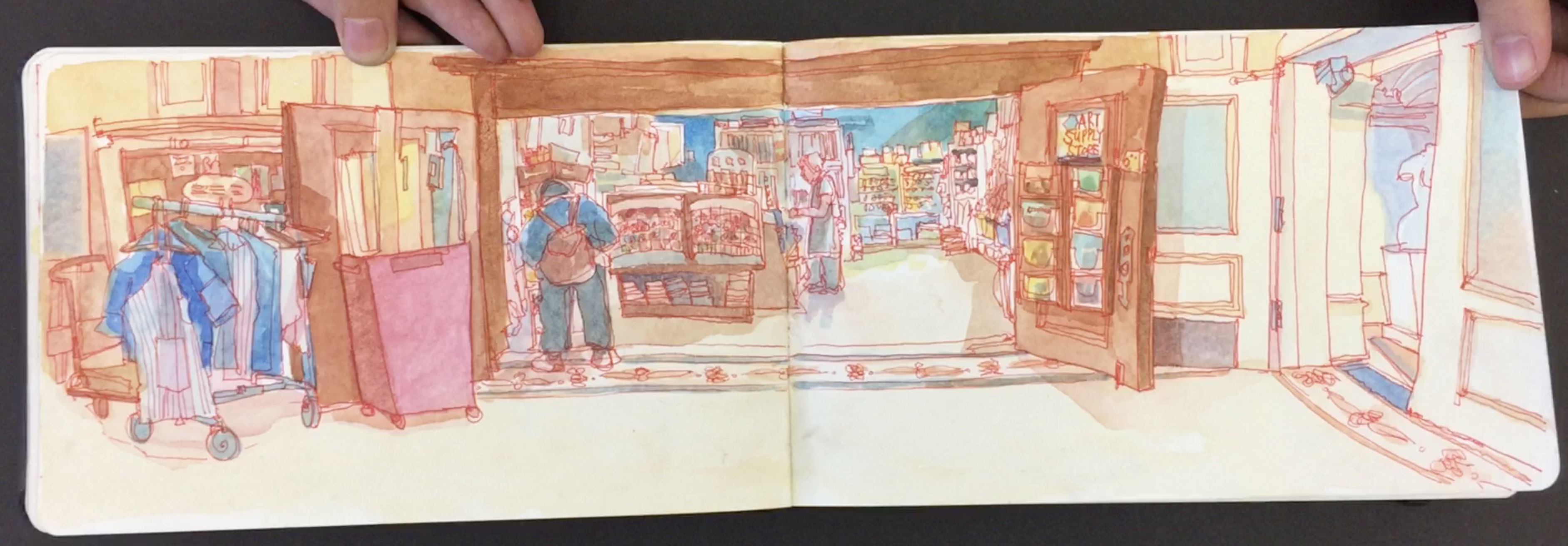
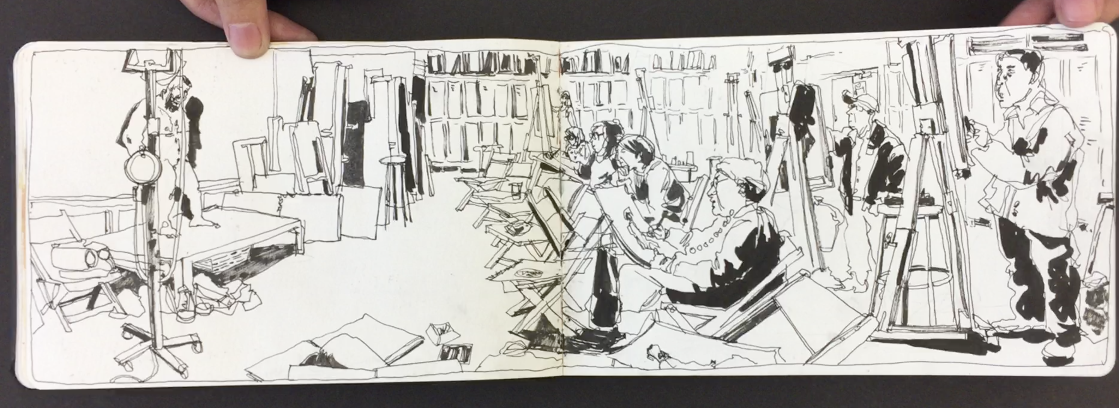
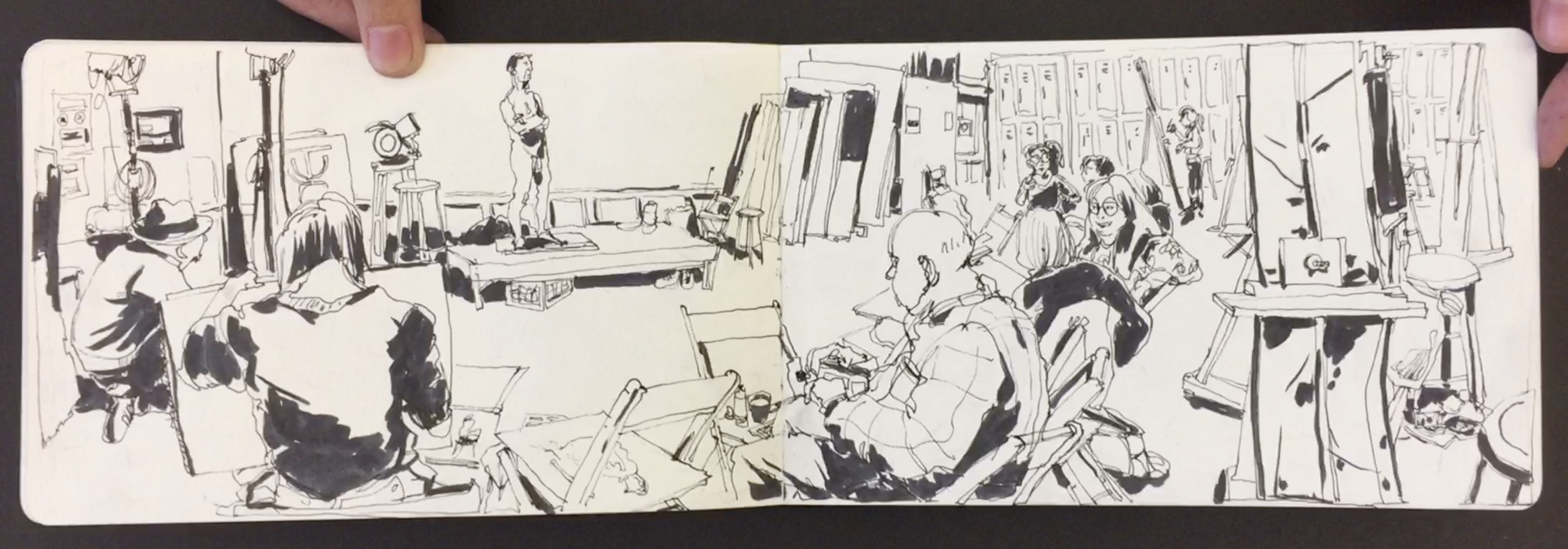
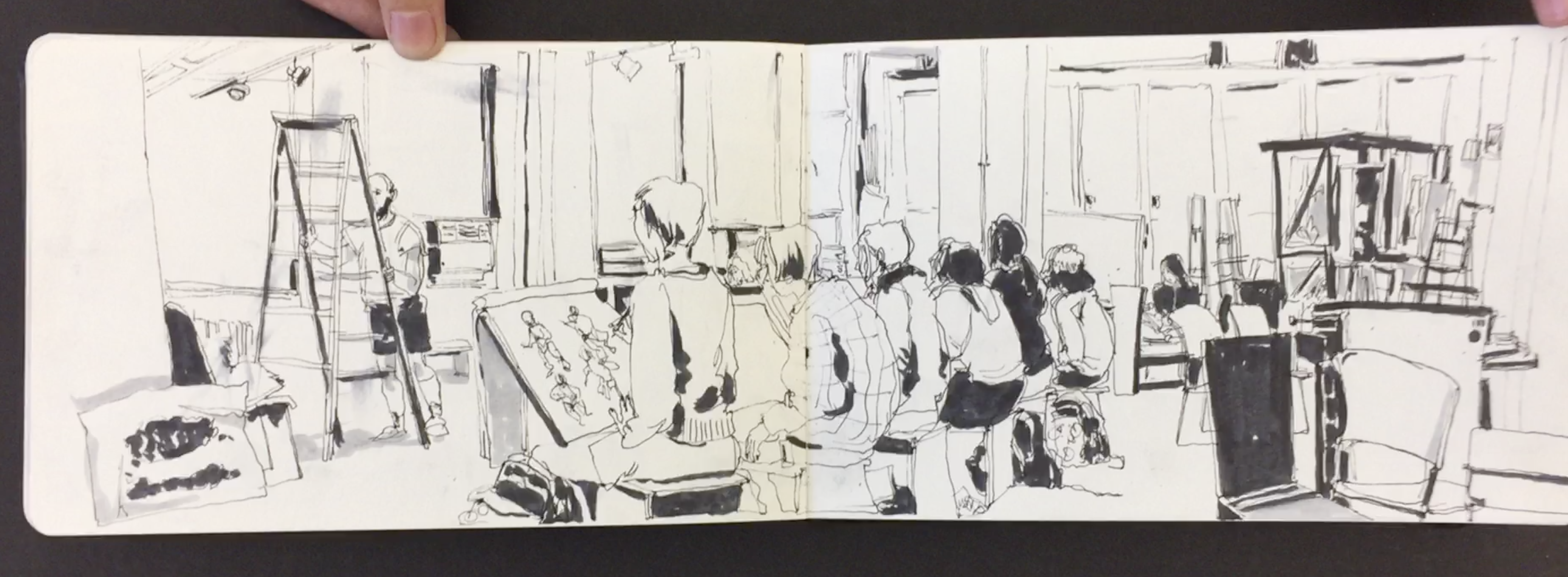
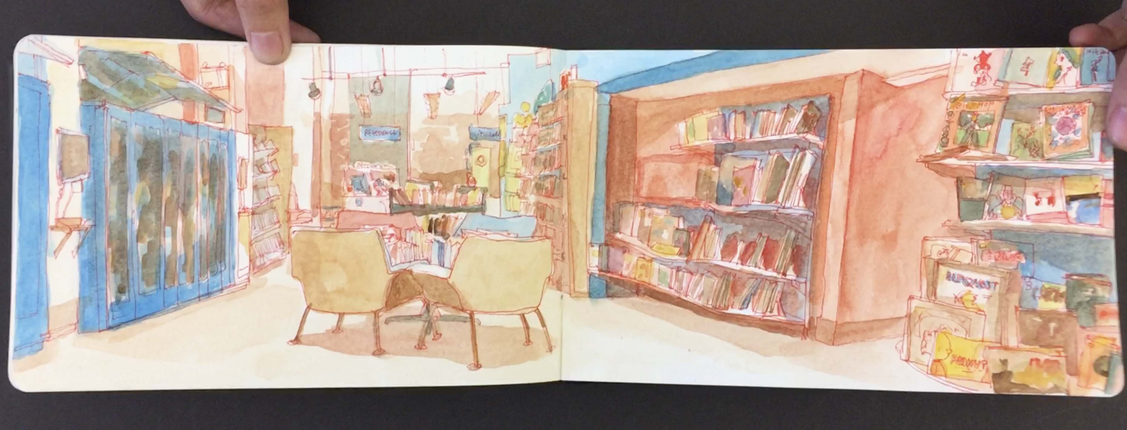
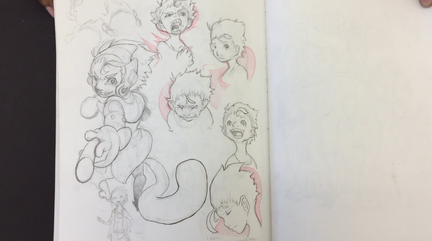
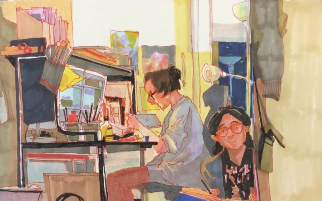
The way she crams so much information into one painting in just so awesome. I love sitting with her work investigating all of the incredible details.
I’ve been teaching art since 1997 and every year there are always one or two students that really stand out. Phoebe is certainly a student I will always remember. Both for her extreme work ethic and incredible talent.
It’s unbelievable to see how Phoebe can’t sit down, focus and observe her environment the way that she does. The fact that she has so much self discipline is most impressive to me. In the age of the iPhone we are all sometimes a bit scatterbrained jumping from one thing to another. To see Phoebe focus the way she does gives me much inspiration.
The other great thing about Phoebe has been her willingness to try new things. She is certainly not a one hit wonder. When she first joined my class she was mainly into drawing just short gesture poses. The fact that she is now experimenting with detailed watercolor interiors is a huge leap.
My two key takeaways from Phoebe, one, be willing to get out of your comfort zone and two, develop the self discipline to sit and work.
Thanks for reading!
Check out Phoebe’s Instagram. Thanks again Phoebe for sharing your work. Good luck at Cal-Arts!
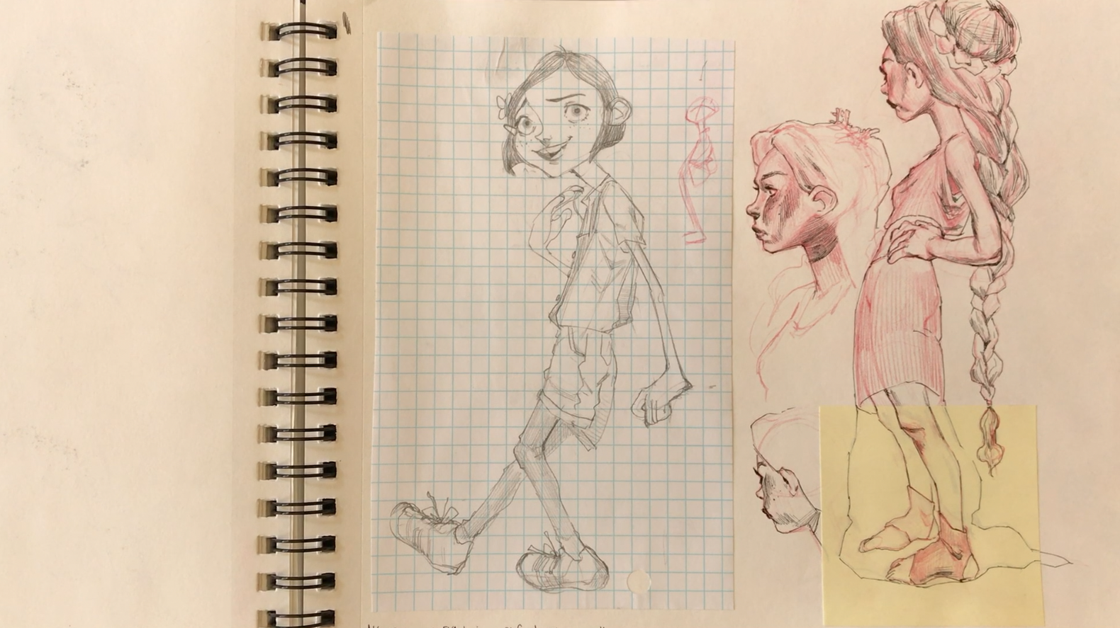
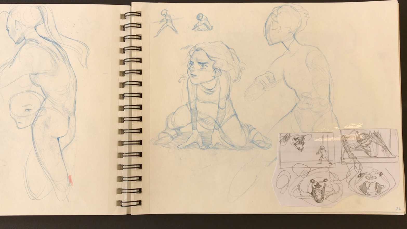
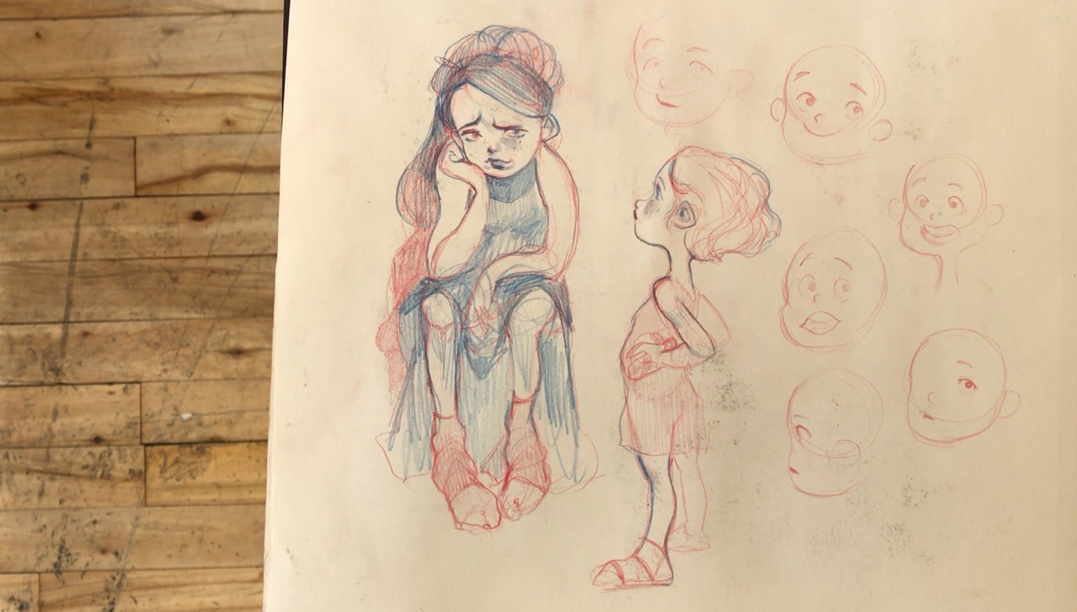
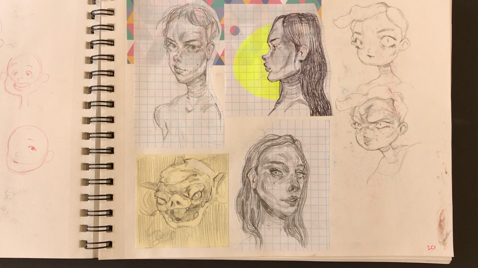
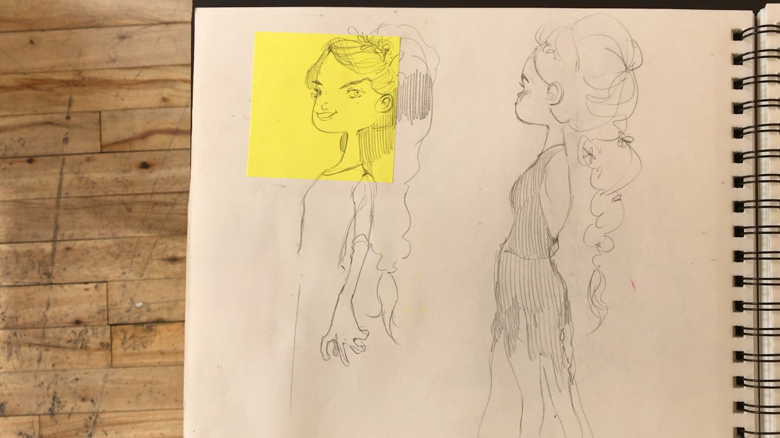
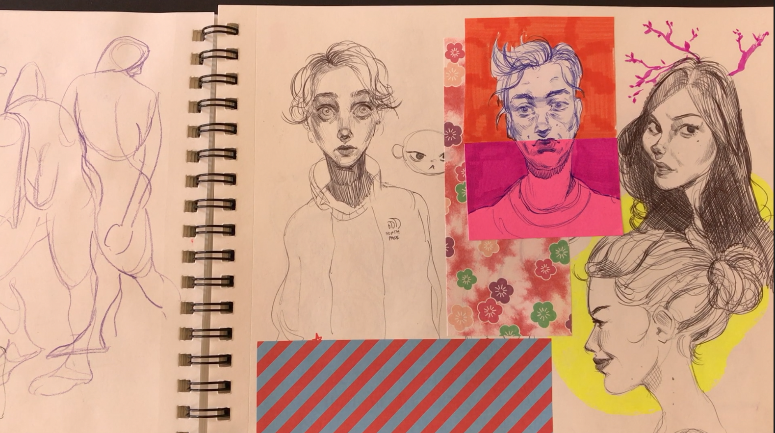
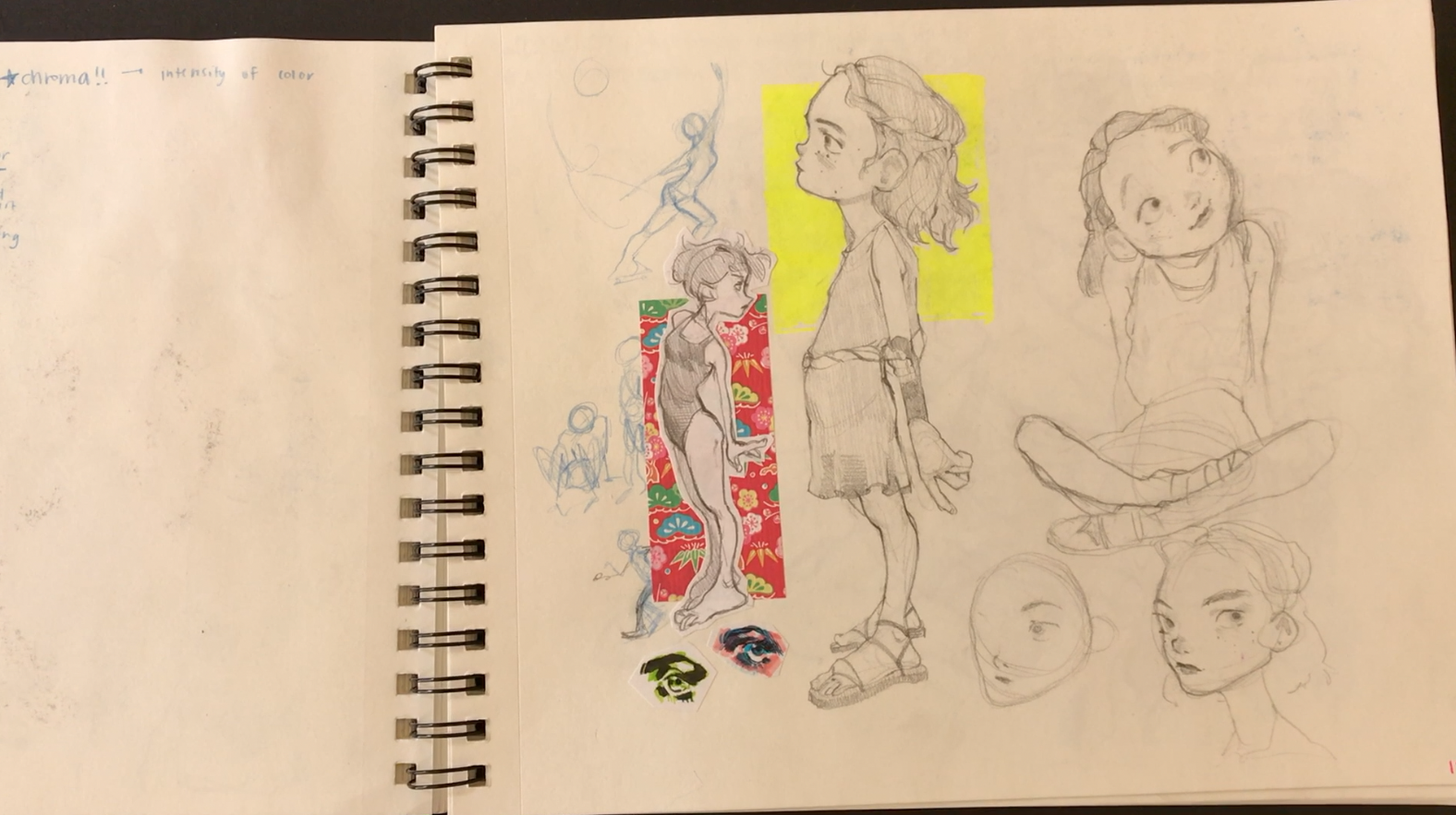
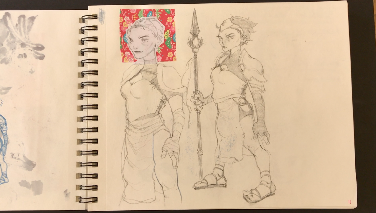
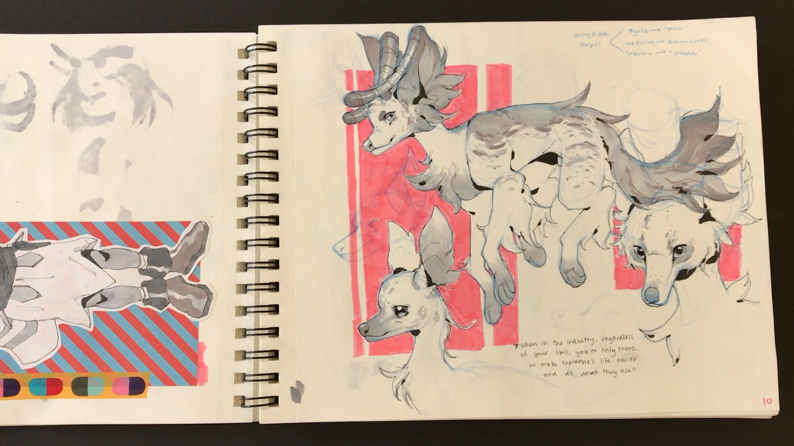
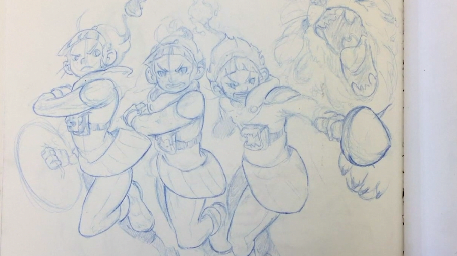
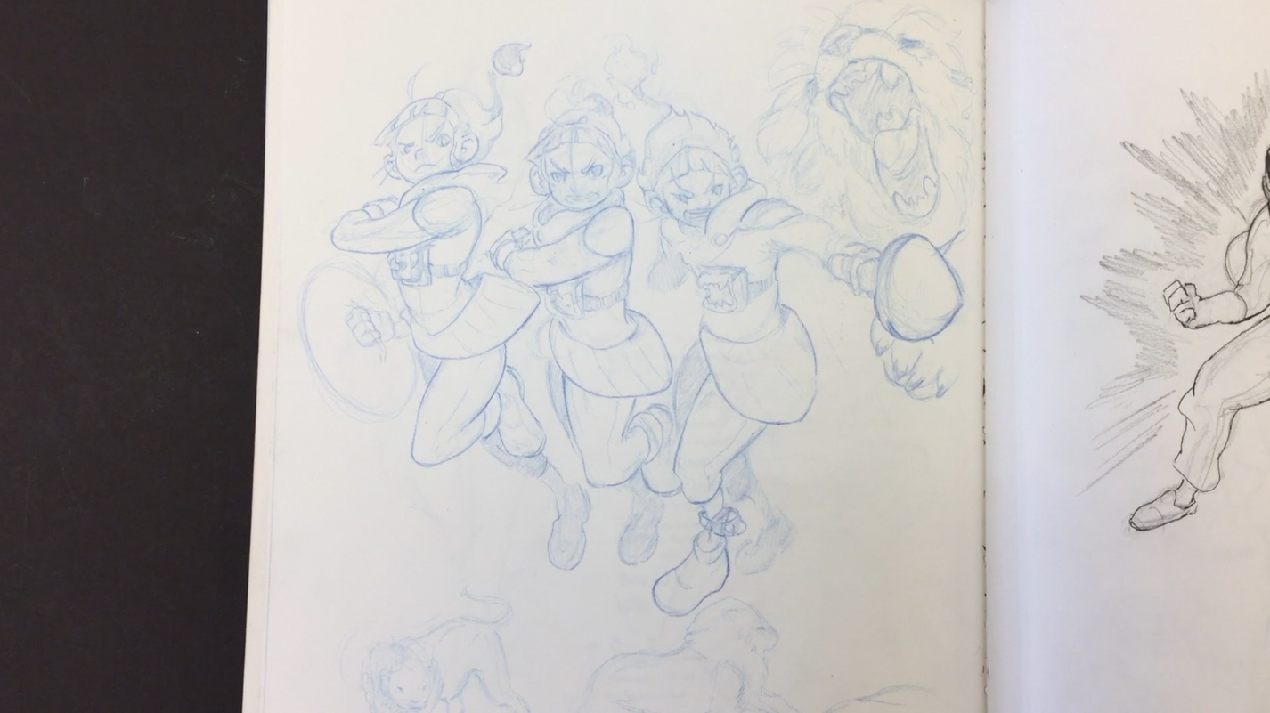
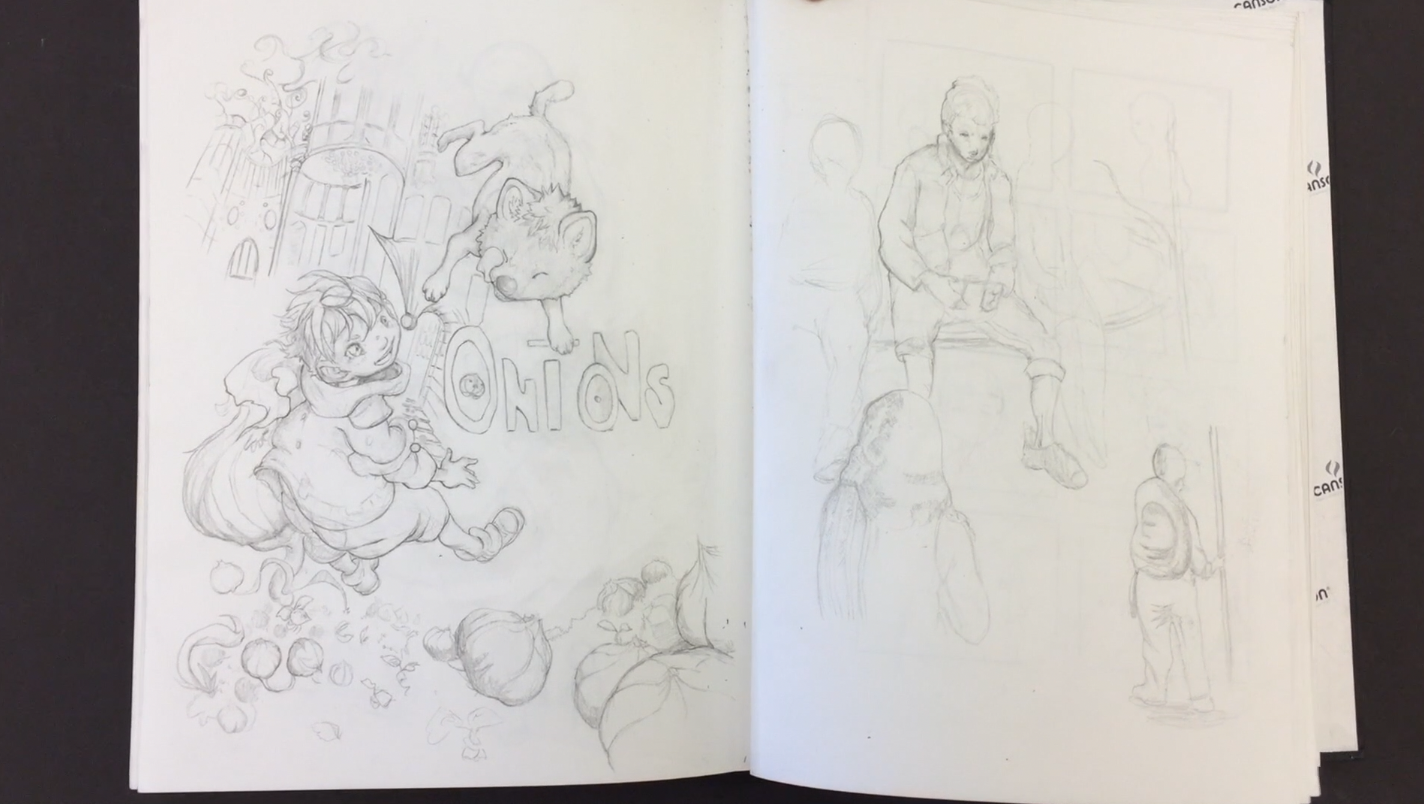
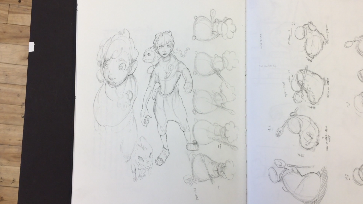
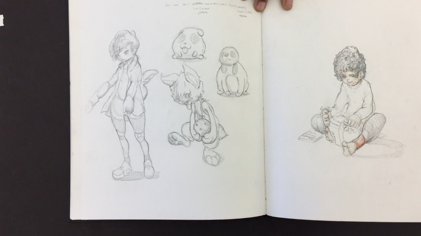
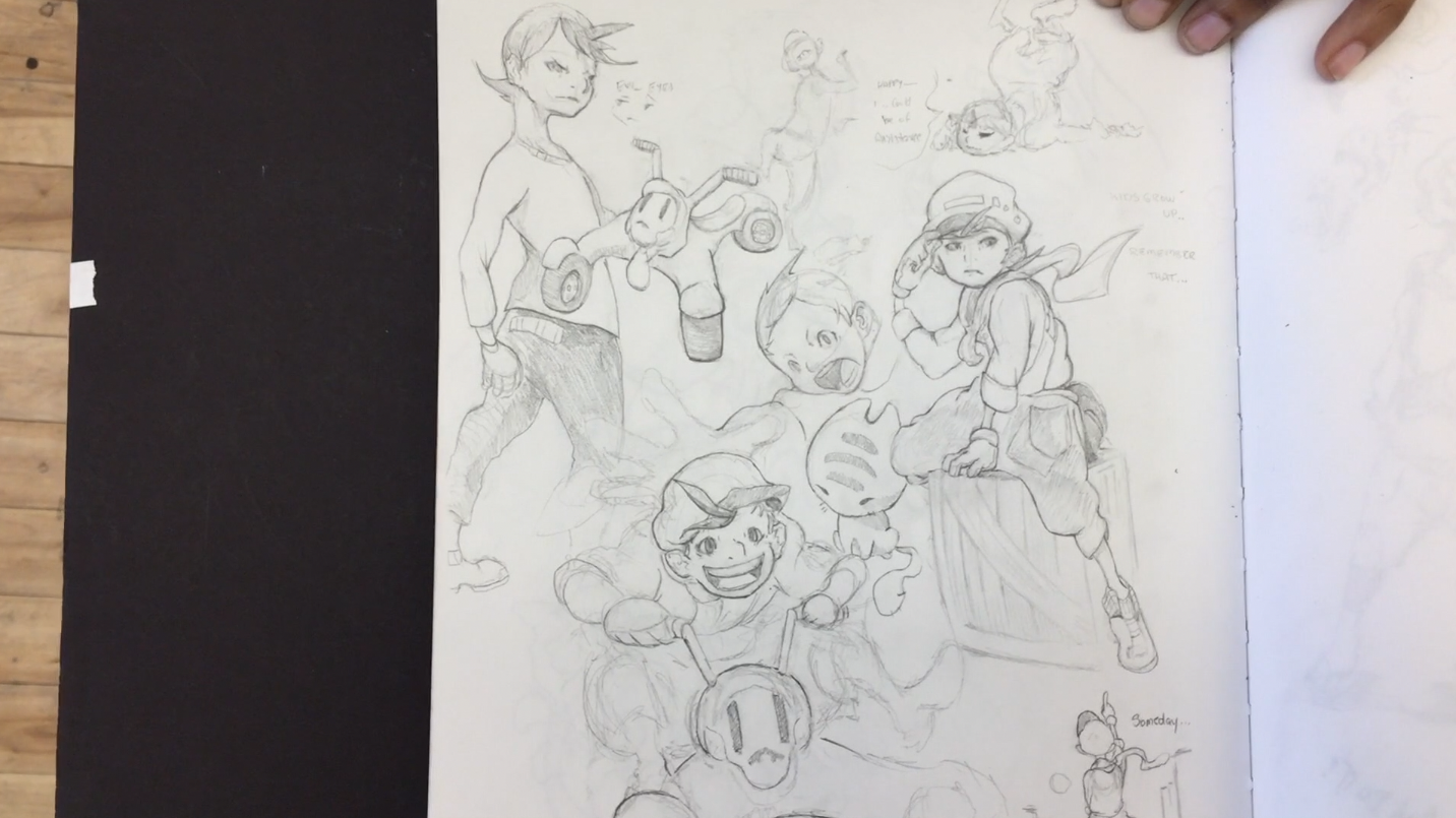
Check out stills of Phoebe’s sketchbook below.