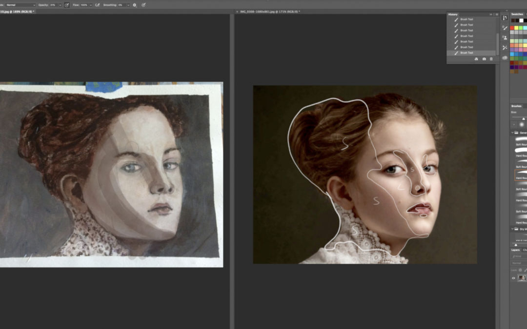
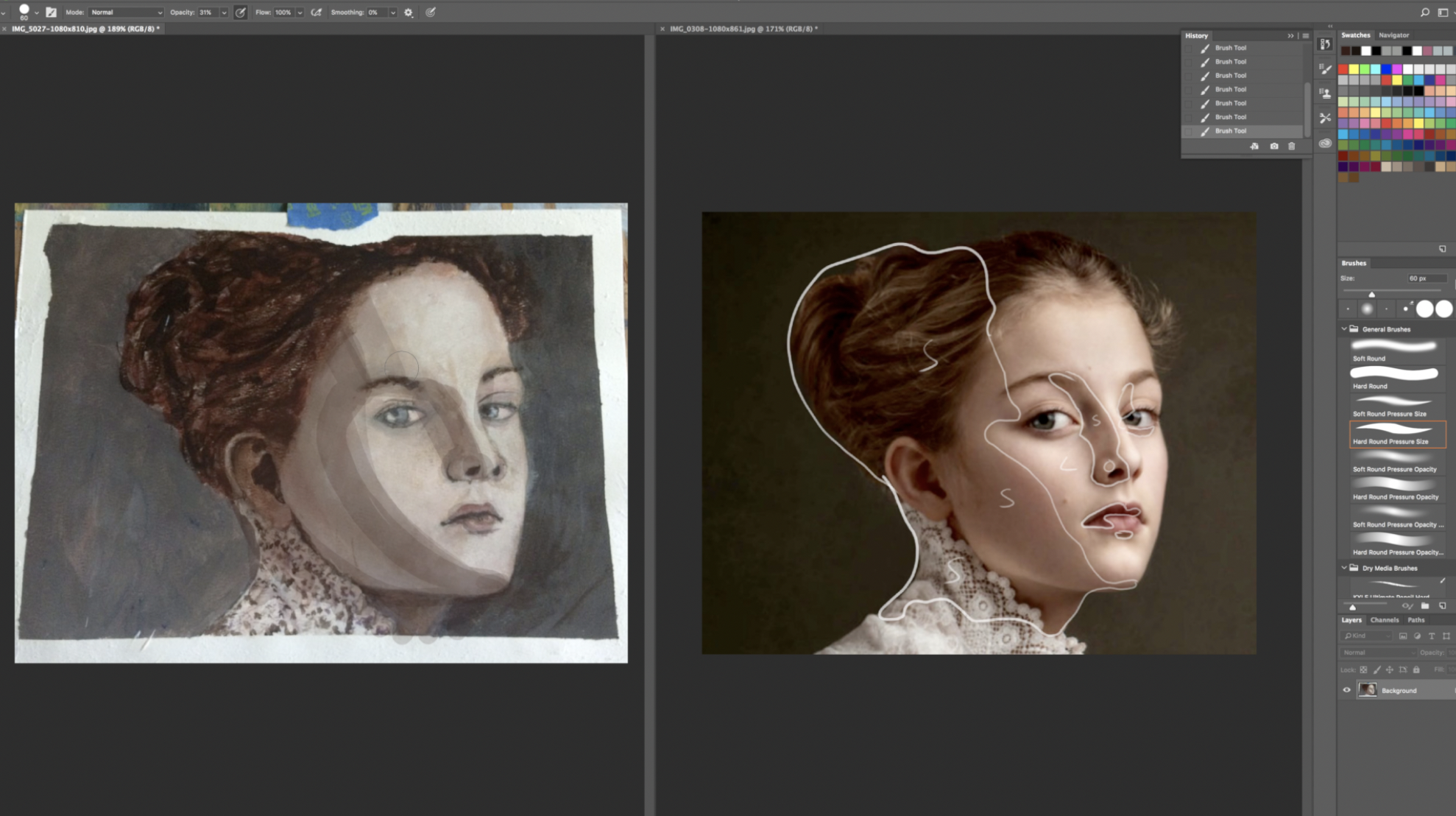
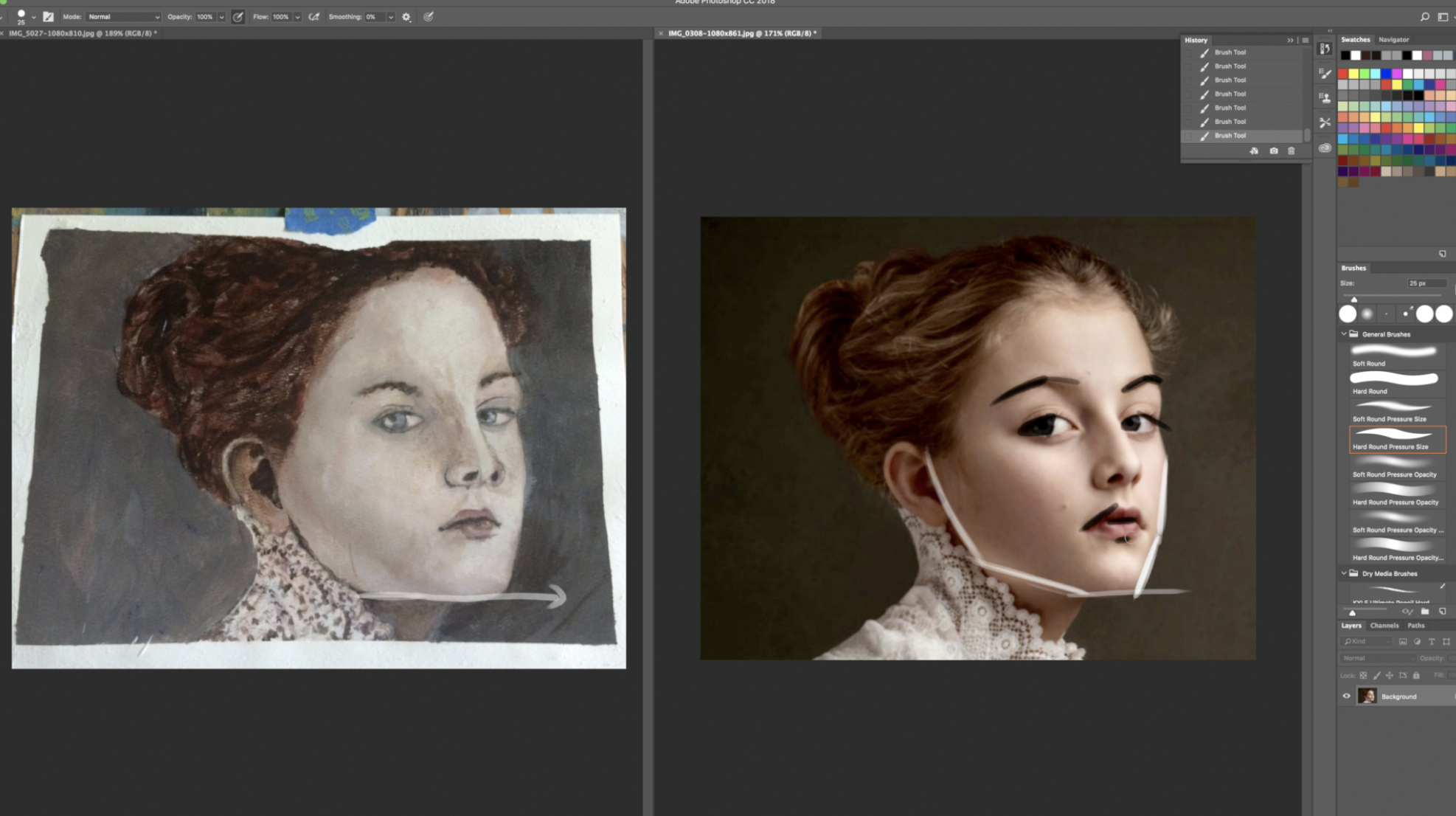
Yvon is a current member of Drawing Tutorials Online. I recently critiqued her acrylic portrait painting. The main suggestion was to utilize the line that separates the light from the dark. In essence blocking in the shadow shapes.
Without shadow shapes a portrait can become quite flat. In this particular case Yvon chose pretty amazing photo reference. If you have trouble with seeing the shadow shapes try squinting. When you squint you eliminate the small details and focus on the big light and shadow shapes.
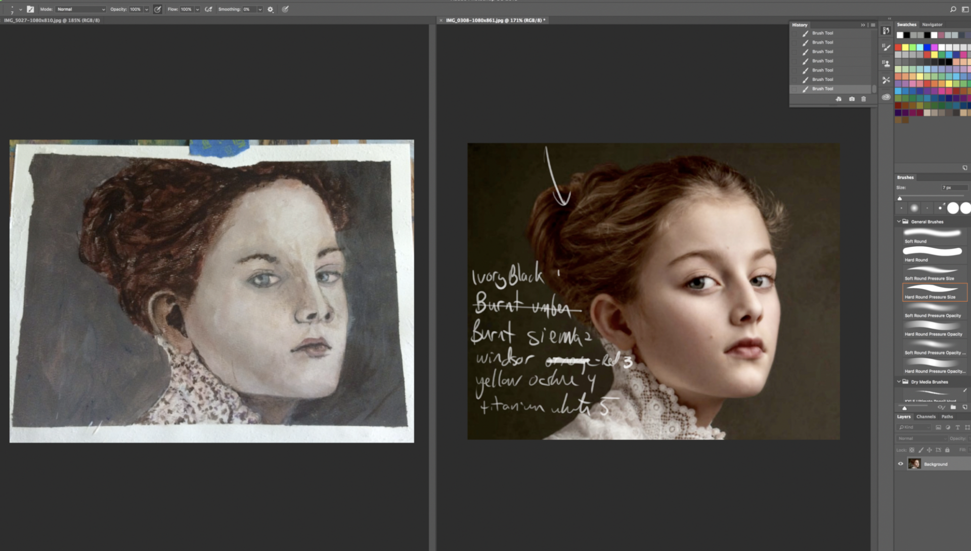
The other main suggestion was to work with a limited color palette. Yvon had asked about using transparent tones.
My suggestion with paint, use translucency in the shadows, opacity in the lights. This will help to create form and depth.
Take a moment to check out the video below. It will definitely give you some useful painting tips.
If you are looking for feedback on your artwork, I’m here to help. I devote every single Monday to critiquing member artwork. Through the use of Drawing Tutorials Online weekly critiques you will improve faster. You will know what to start looking for.
Sometimes we can get too close to our own artwork. Another set of eyes is always helpful. Thanks for sharing Yvon!


Working with a five colour pallet makes sense; I’m assuming to bring the piece together and make it flow with the same tones. I’ll be moving onto painting in a while. Although I do oil paint, I really want to work on my drawing skills first then start to create some paintings. It’s been a while. The critiques that you offer are extremely helpful.
Matt’s critique contained a lot of invaluable information.
I did want to mention one thing that bothered me a bit was the opaque darkness of the inner ear, and the darker pupil of one eye.
Your overall use of color is very pleasing. Matt’s suggestions will
work beautifully.
Hi Jean,
Thanks for pointing that out. I did not even see that. Yes it’s best to treat ears in a translucent middle tone sort of way.
Hi Lorna,
Thanks so much for taking the time to watch the critique. Working with a limited palette will be a great way to get started with painting. It makes it so much simpler.
I am an acrylic artist. In reference to transparent colors. All brands make them. I use Golden Heavy Body.
Specifically:
Transparent Pyrrole Prange
Transparent Red Oxide (similar to burnt sienna)
Alizarin Crimson
Transparent Yellow Iron Oxide (similar to yellow ochre)
Transparent Brown Iron Oxide
Ultramarine Blue (really water it down if you want a soft glow)
I hope this helps.
Nice suggestions Donna. Much appreciated.
Manuel September14 1:44 a.m.i I have seen the work of he portrait and it is interesting the comentary on the shadows by squinting the eyes to distinguish and make the volumes an other details about the thick lights and transparent sadows. etc.