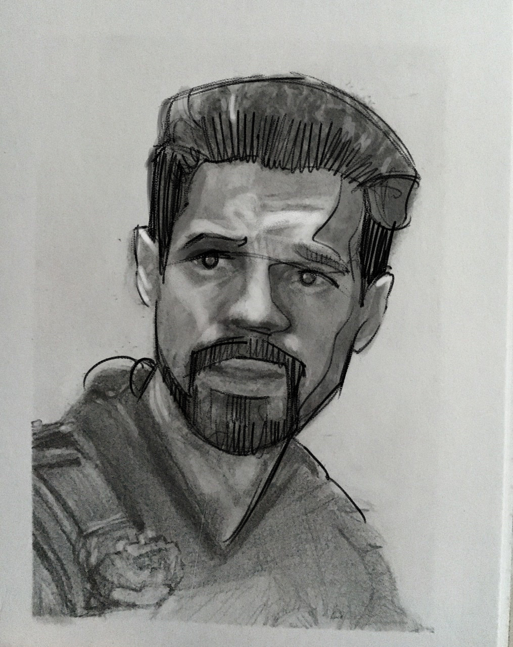
Nancy has been getting her artwork critiqued weekly for a while now. The biggest struggle I see for Nancy is her photo reference choices.
Nancy usually takes screenshots from her favorite Netflix series. Sometimes the lighting is just , well, horrible. However, as of late Nancy has been making better picks in terms of photos
What I stress over and over again in the critique gallery is repetition. I’m a big believer in systems. Most artists hate systems, they think they are too restrictive.
I find the opposite to be true. Let’s use portrait drawing as an example. When you start a portrait draw the same way every time, you will improve faster.
My system for portrait drawing is simple, first draw the outer edge hair, second draw the inner edge of the hair where it touches the skin. Then draw the shape of the face. The features should fit inside the container of the face.
In Nancy’s portrait drawing the features did not fit inside the container of the face. After a couple of tweaks we can see that Nancy was not that far off. Looking forward to the next one Nancy.
Sometimes it is the little things that make a huge difference. I am here to help you improve your artwork. You can get feedback in Drawing Tutorials Online member critique gallery. I also offer one to one coaching if you prefer that route.
Thanks Nancy!

