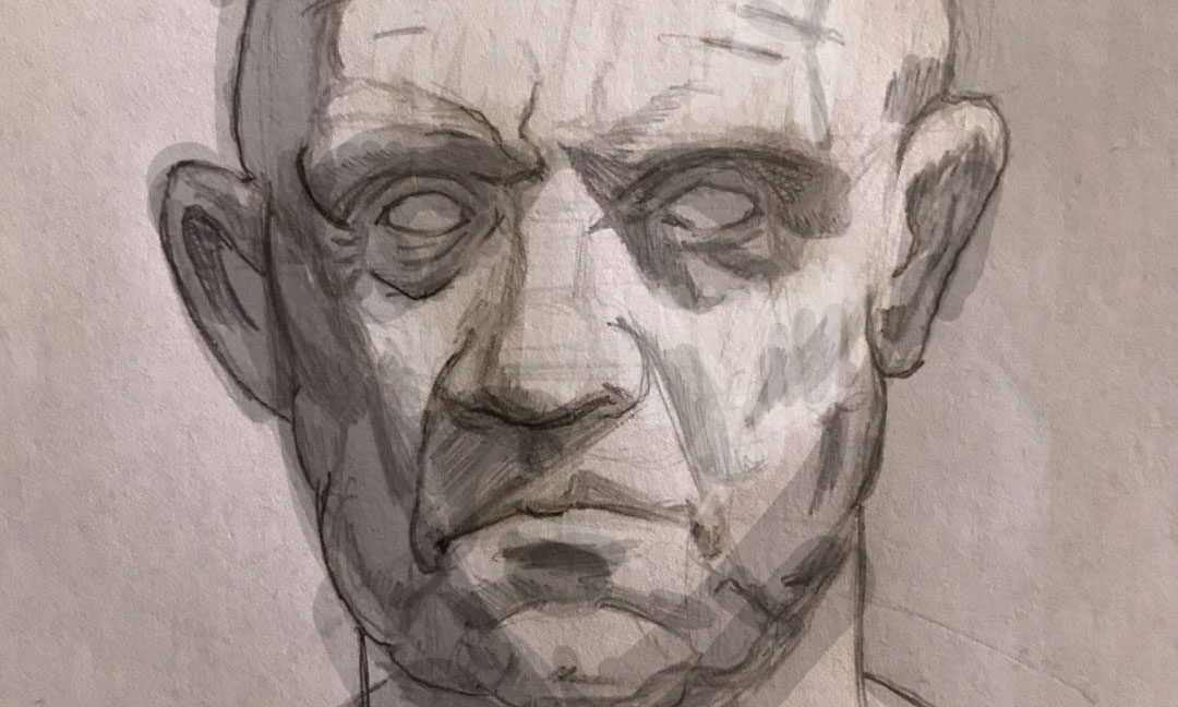
Milos recently uploaded his art to our critique gallery for the first time. I thought his drawing was pretty cool.
The main suggestion was to simplify how to apply shadow shapes. When you place shadow shapes everywhere in essence you muddy up your portrait drawing. It’s always best to simplify where you decide to put your shadow shapes.
Use a minimalistic approach when thinking about light direction. Where is the light coming from? Is it front light, side light, rim light, or form light? Form light is best for three dimension.
Once you make a decision on which direction the light is hitting your subject you start heading in the right direction.
Enjoy the video critique.
Thank so much for watching. If you are looking for a video critique just like this one for your work read more about what Drawing Tutorials Online has to offer you.
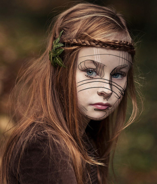
Recently Maria, a member of Drawing Tutorials Online, posted up a portrait drawing for feedback. Her main question, why is the drawing flat?
First off I want to thank you Maria for presenting this awesome teaching opportunity. There are many reasons why a portrait drawing can look flat. Let’s touch on four of them.
There is no background tone. With no tone in the background you have no foreground and background. Thus your portrait drawing is just sitting on white paper. Plus a tone or gradation placed in the background can provide you with an opportunity to soften the hair’s edge. Soft hair equals depth.
There are no gradations within the skin tone. When you have no shading from the light side to the dark side of the face your portrait drawings will look flat. There is most likely always a light hitting the model. If there is a light source there is definitely a gradation from side to side or top to bottom. Including gradations with create much more three dimension in your portrait drawings.
There are too many outlines. Line is awesome. However line alone can be flat in some cases. Drawing with a consistent outline will almost always create a flat outlined look. Combining tone with line promotes much more dimension.
There is no modeling with tone. Yes you can model with line. However modeling with line and tone is much better for creating dimension. What exactly are you modeling? You are modeling how light hits the form of the face. Understanding how surface planes work is super important. Understanding how to implement the modeling factors is vital as well.
I want to thank you so much for watching this video critique. If you are looking for a critique on your work just like this one consider a membership to Drawing Tutorials Online.
Our critique gallery is a kind nurturing place for you to learn and grow fast.
Thanks again for watching. Questions or comments, I would love to hear from you! Leave a comment below.
Are you really good at drawing portraits? Are you pretty good at drawing a likeness of the person too? However there is that one little thing about your portrait drawing that does not look quite right. Perhaps there is a dark under the person’s eye.
However in reality if they had that dark under their eye they would have a bruised eye?
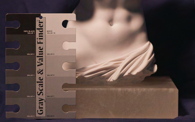
The dirty little secret about drawing killer portraits is being able to match values.
Back in the day when I first started painting book covers for various publishing companies I struggled big time with matching values. I would drop off a painting and the art director would tell me the face was too light. Or perhaps the forehead was too dark. I really struggled big time with simply being able to match the values on the persons face.
On a book cover this was a huge deal.
If the character on the cover looked like they had a black eye, well that wasn’t cool.
So the first place to start is to mainly be conscious of the value scale. For those of you who are members of Drawing Tutorials Online we have multiple tutorials on how to match the value scale.
Being aware of the value scale comes first. Then practicing matching the values on the value scale comes second. You might be super heavy handed which means your light values will look dark. Or you might be light handed which means your dark values will look too light.
You get where I am going with this?
Here is a profound statement. “All of drawing realistically in tone is being able to match the value of any particular shape”. If you can draw a shape and match it’s value you are golden.
That shape could be the shadow under the nose or the white of the eye.
So the next time you draw a portrait be highly aware of the the values. If you are attempting to draw a realistic portrait constantly analyze the values of shapes. Keep your value scale nearby, it’s a life saver.